Linear Regression Diagnostics
Contents
Linear Regression Diagnostics#
from datascience import *
from cs104 import *
import numpy as np
%matplotlib inline
0. Review#
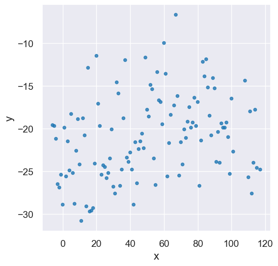
Let’s load our Greenland data one more time, and create the same x_y_table as we used in the last lecture.
greenland_climate = Table().read_table('data/climate_upernavik.csv')
tidy_greenland = greenland_climate.where('Air temperature (C)',
                                         are.not_equal_to(999.99))
feb = tidy_greenland.where('Month', are.equal_to(2))
x = feb.column('Year') - 1880
y = feb.column('Air temperature (C)')
x_y_table = Table().with_columns("x", x, "y", y)
x_y_table.scatter('x', 'y')
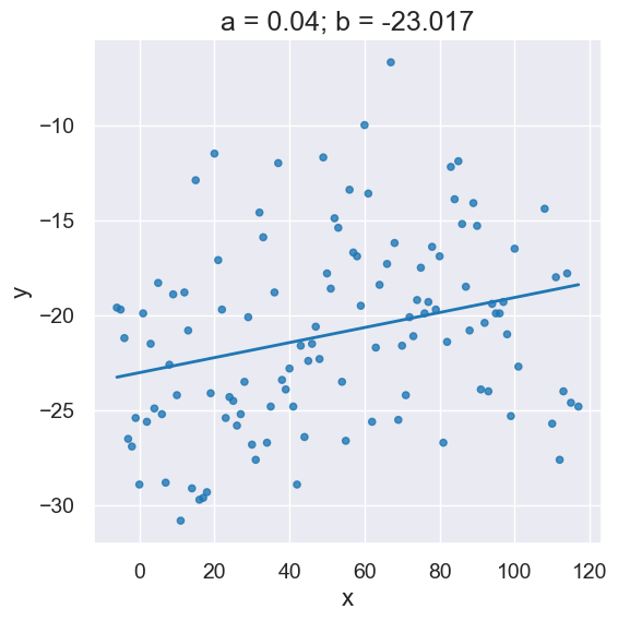
Here’s the slope and intercept computed by our linear regression function.
optimal = linear_regression(x_y_table, 'x', 'y')
a = optimal.item(0)
b = optimal.item(1)
plot_scatter_with_line(x_y_table, 'x', 'y', a, b)

The following is short-hand to call linear_regression and initializes variables a and b all in one line:
a,b = linear_regression(x_y_table, 'x', 'y')
plot_scatter_with_line(x_y_table, 'x', 'y', a, b)
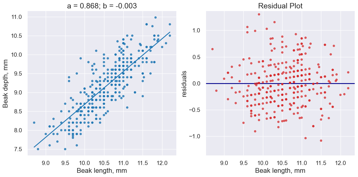
1. \(R^2\) Score#
The \(R^2\) score measures how much better our predictions \(\hat{y}\) for each \(x\) are when compared to just always predicting \(\bar{y}\) (the average of all \(y\)’s) for each \(x\)?
fortis = Table().read_table("data/finch_beaks_1975.csv").where('species', 'fortis')
fortis_a, fortis_b = linear_regression(fortis, 'Beak length, mm', 'Beak depth, mm')
print("R^2 Score is", r2_score(fortis, 'Beak length, mm', 'Beak depth, mm',
                               fortis_a, fortis_b))
R^2 Score is 0.6735536808265523
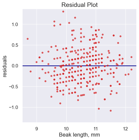
2. Residual plots#
Residual plots help us make visual assessments of the quality of a linear regression analysis
plot_residuals(fortis, 'Beak length, mm', 'Beak depth, mm',
               fortis_a, fortis_b)
Typically, we like to look at the regression plot and the residual plot at the same time.
plot_regression_and_residuals(fortis, 'Beak length, mm', 'Beak depth, mm',
                              fortis_a, fortis_b)

Notice how the residuals are distributed fairly symmetrically above and below the horizontal line at 0, corresponding to the original scatter plot being roughly symmetrical above and below.
The residual plot of a good regression shows no pattern. The residuals look about the same, above and below the horizontal line at 0, across the range of the predictor variable.
Diagnostics and residual plot on other datasets#
Greenland with an outlier#
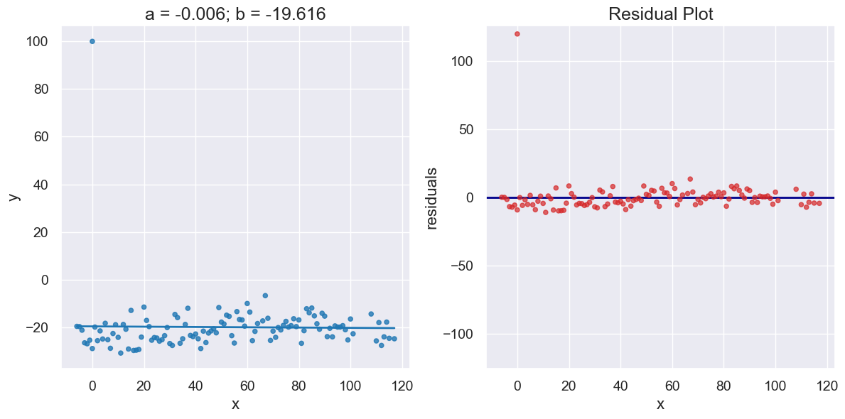
Here’s our temperate data again, this time with one outlier added to the data set. Notice the impact on the regresssion line and residuals.
x_y_table_outlier = x_y_table.copy().append((0,100))
a_outlier, b_outlier = linear_regression(x_y_table_outlier, 'x', 'y')
print("R^2 Score is", r2_score(x_y_table_outlier, 'x', 'y',
                               a_outlier, b_outlier))
R^2 Score is 0.0002883031971390171
plot_regression_and_residuals(x_y_table_outlier, 'x', 'y',
                              a_outlier, b_outlier)
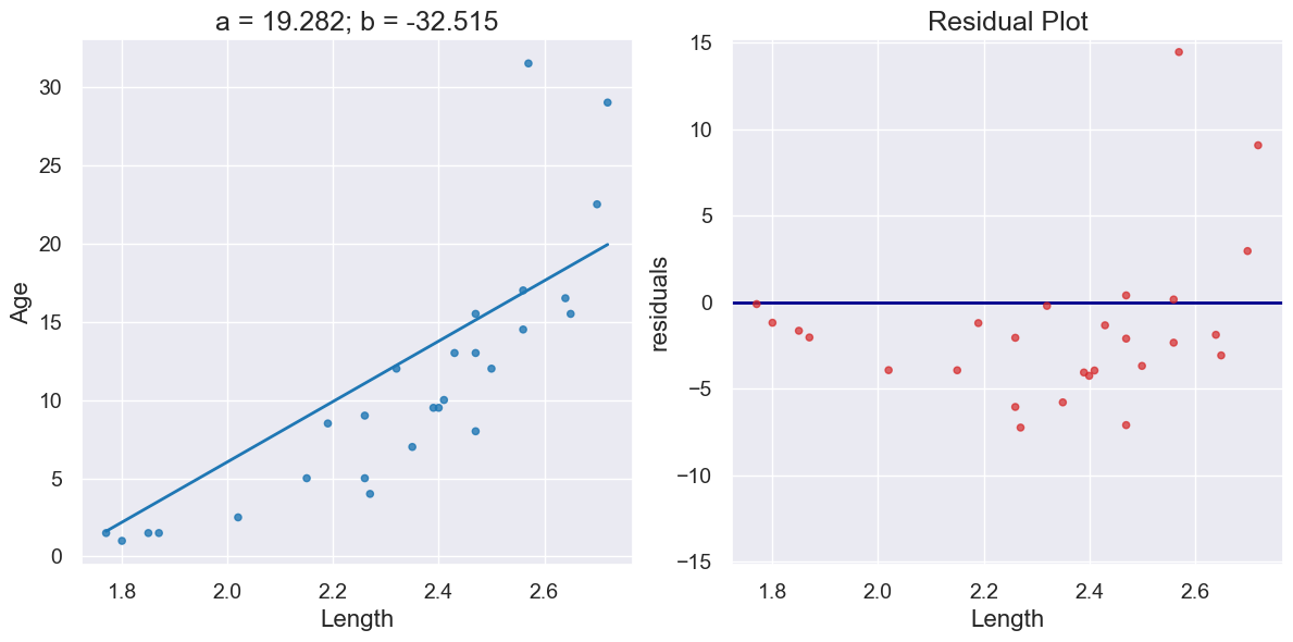
Dugongs#
dugong = Table().read_table('data/dugong.csv')
dugong.show(3)
| Length | Age |
|---|---|
| 1.8 | 1 |
| 1.85 | 1.5 |
| 1.87 | 1.5 |
... (24 rows omitted)
a_dugong, b_dugong = linear_regression(dugong, 'Length', 'Age')
print("R^2 Score is", r2_score(dugong, 'Length', 'Age',
                               a_dugong, b_dugong))
R^2 Score is 0.6226150570567414
plot_regression_and_residuals(dugong, 'Length', 'Age',
                              a_dugong, b_dugong)
Hybrids#
cars = Table().read_table('data/hybrid.csv')
cars.show(3)
| vehicle | year | msrp | acceleration | mpg | class |
|---|---|---|---|---|---|
| Prius (1st Gen) | 1997 | 24509.7 | 7.46 | 41.26 | Compact |
| Tino | 2000 | 35355 | 8.2 | 54.1 | Compact |
| Prius (2nd Gen) | 2000 | 26832.2 | 7.97 | 45.23 | Compact |
... (150 rows omitted)
a_cars, b_cars = linear_regression(cars, 'acceleration', 'mpg')
print("R^2 Score is", r2_score(cars, 'acceleration', 'mpg',
                               a_cars, b_cars))
R^2 Score is 0.25610723394360513
plot_regression_and_residuals(cars, 'acceleration', 'mpg',
                              a_cars, b_cars)
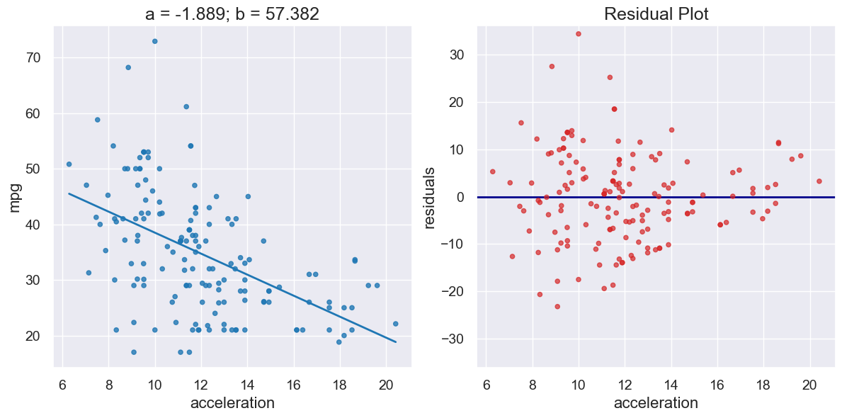
If the residual plot shows uneven variation about the horizontal line at 0, the regression estimates are not equally accurate across the range of the predictor variable.
The residual plot shows that our linear regression for this dataset is heteroscedastic, that x and the residuals are not independent.
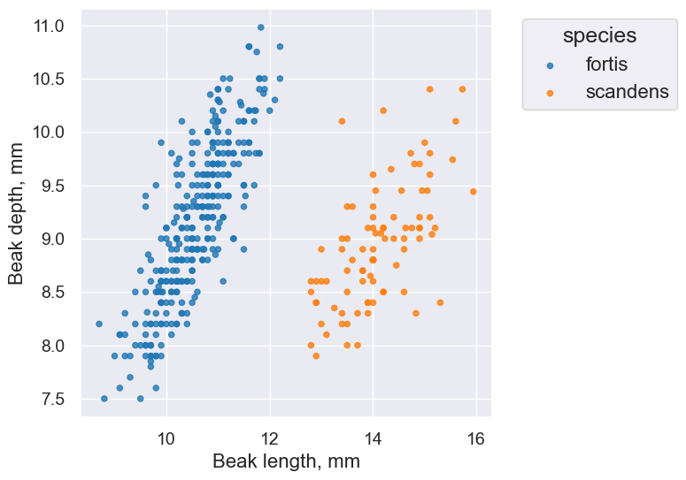
3. Confidence Intervals for Predictions#
# Load finch data
finch_1975 = Table().read_table("data/finch_beaks_1975.csv")
fortis = finch_1975.where('species', 'fortis')
scandens = finch_1975.where('species', 'scandens')
finch_1975.scatter('Beak length, mm', 'Beak depth, mm', group='species')
fortis_a, fortis_b = linear_regression(fortis, 'Beak length, mm', 'Beak depth, mm')
print("R^2 Score is", r2_score(fortis, 'Beak length, mm', 'Beak depth, mm',
                               fortis_a, fortis_b))
R^2 Score is 0.6735536808265523
plot_regression_and_residuals(fortis, 'Beak length, mm', 'Beak depth, mm',
                              fortis_a, fortis_b)
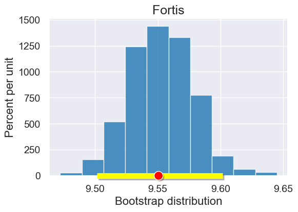
Note that we are starting with a sample of all Fortis finches. We’ll use bootstrapping and the percentile method to create a confidence interval for our predictions
def bootstrap_prediction(x_target_value, observed_sample, x_label, y_label, num_trials):
    """
    Create bootstrap resamples and predict y given x_target_value
    """

    bootstrap_statistics = make_array()

    for i in np.arange(0, num_trials):

        simulated_resample = observed_sample.sample()

        a,b = linear_regression(simulated_resample, x_label, y_label)
        resample_statistic = line_predictions(a,b,x_target_value)

        bootstrap_statistics = np.append(bootstrap_statistics, resample_statistic)

    return bootstrap_statistics
x_target_value = 11 # the x-value for which we want to predict y-values
bootstrap_statistics = bootstrap_prediction(x_target_value, fortis, 'Beak length, mm', 'Beak depth, mm', 1000)
results = Table().with_columns("Bootstrap distribution", bootstrap_statistics)
plot = results.hist()
plot.set_title('Fortis')

left_right = confidence_interval(95, bootstrap_statistics)
plot.interval(left_right)

plot.dot(line_predictions(fortis_a, fortis_b, x_target_value), 0)
Prediction estimates for Different x targets#
The following animation illustrates how our prediction confidence interval grows as we move toward the limits of our observed values.
The width of our confidence intervals are also impacted by how well the optimal regression line fits the data. The Scandens regression line has a lower \(R^2\) score than the Fortis regression.
scandens_a, scandens_b = linear_regression(scandens, 'Beak length, mm', 'Beak depth, mm')
print("R^2 Score is",
      r2_score(scandens, 'Beak length, mm', 'Beak depth, mm', scandens_a, scandens_b))
R^2 Score is 0.39023631624966537