Correlation Coefficients
Contents
Correlation Coefficients#
from datascience import *
from cs104 import *
import numpy as np
%matplotlib inline
1. Finch data#
# Load finch data
finch_1975 = Table().read_table("data/finch_beaks_1975.csv")
finch_1975.show(6)
| species | Beak length, mm | Beak depth, mm |
|---|---|---|
| fortis | 9.4 | 8 |
| fortis | 9.2 | 8.3 |
| scandens | 13.9 | 8.4 |
| scandens | 14 | 8.8 |
| scandens | 12.9 | 8.4 |
| fortis | 9.5 | 7.5 |
... (400 rows omitted)
fortis = finch_1975.where('species', 'fortis')
fortis.num_rows
316
scandens = finch_1975.where('species', 'scandens')
scandens.num_rows
90
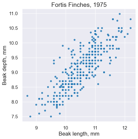
plot = fortis.scatter('Beak length, mm', 'Beak depth, mm')
plot.set_title('Fortis Finches, 1975')
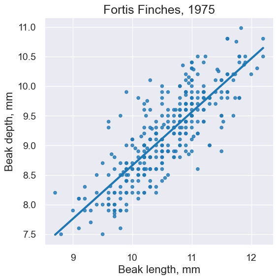
plot = fortis.scatter('Beak length, mm', 'Beak depth, mm', fit_line=True)
plot.set_title('Fortis Finches, 1975')
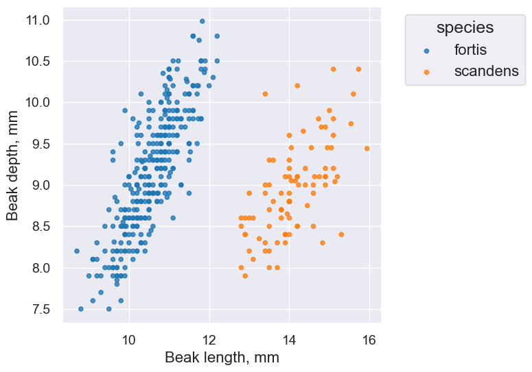
finch_1975.scatter('Beak length, mm', 'Beak depth, mm', group='species')
plot.set_title('Fortis Finches, 1975')
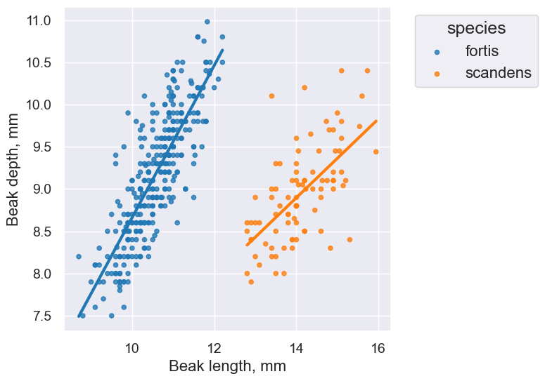
finch_1975.scatter('Beak length, mm', 'Beak depth, mm', group='species', fit_line=True)
plot.set_title('Fortis Finches, 1975')
2. Correlation Intuition#
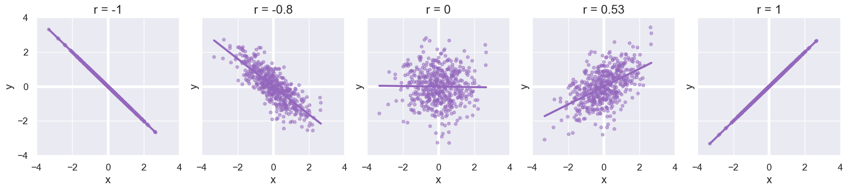
Visualize different values of r:
def make_table(r, x_mean, y_mean, size, seed=10):
    """
    Make a table of size random (x,y) points with a
    correlation coefficient of approximately r.
    The points will be centered at (x_mean,y_mean).
    """
    rng = np.random.default_rng(seed)
    x = rng.normal(x_mean, 1, size)
    z = rng.normal(y_mean, 1, size)
    y = r*x + (np.sqrt(1-r**2))*z

    # Make sure the mean is *exactly* what we want :).
    table = Table().with_columns("x", x - np.mean(x) + x_mean, "y", y - np.mean(y) + y_mean)

    return table

def plot_table(table, color='C4', fit_line=True, **kwargs):
    """
    Plot a table of (x,y).
    """
    plot = table.scatter("x", "y",alpha=0.5, fit_line=fit_line, color=color, **kwargs)
    plot.line(x = 0, color='white', width=4, zorder=0.9)
    plot.line(y = 0, color='white', width=4, zorder=0.9)
    plot.set_xlim(-4, 4)
    plot.set_ylim(-4, 4)
    return plot

def r_scatter(r):
    "Generate a scatter plot with a correlation approximately r"
    table = make_table(r, 0, 0, 500)
    plot = plot_table(table)
    plot.set_title('r = '+str(r))
interact(r_scatter, r = Slider(-1,1,0.01))
Here are several scatter plots with representative values of r.
Formula for r#
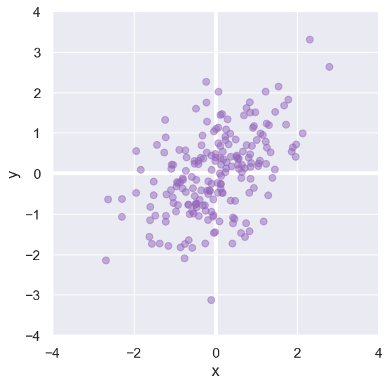
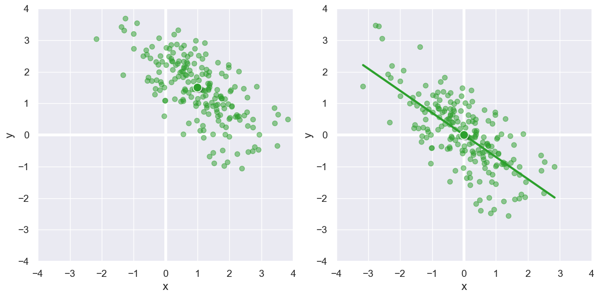
Here is a small data set we’ll use to develop a formula for computing Pearson’s correlation coefficient \(r\).
We first note that the blue points in the top-right and bottom-left quadrants reflect positive correlation between x and y. The red points in the other two quadrents reflect negative correlation.
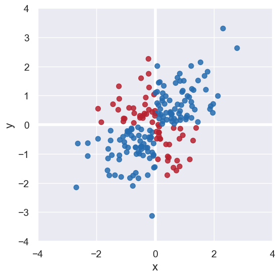
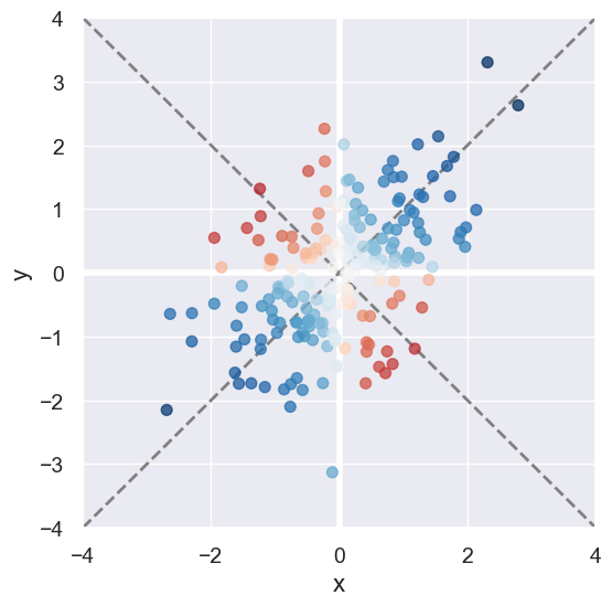
We can determined whether a point \((x,y)\) contributes to a positive/negative association by inspecting the sign if \(x \cdot y\). Also points close to the diagonals and further away from the origin reflect much stronger correlation than those near the origin.
This leads us to our first way to quantify correlation: \( \sum_i x_i y_i = x_0 y_0 + x_1 y_1 + \ldots + x_n y_n \).
However, this formula can produce arbitrarily large or small numbers. For our sample data, that formula produces 93.1.
We must normalize it to be in the range -1 to 1 to ensure our coefficient is interpretable:
With that adjustment, our data set yields 0.48.
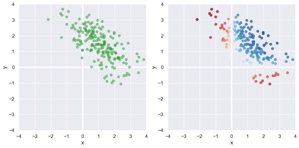
Now consider the data set on the left below. Unlike those above, this data is not “centered” at (0,0). That is the mean \(x\) and mean \(y\) values are not both 0. Our formula produces the correlation coefficient 0.24, but \(x\) and \(y\) are not positively correlated, but rather negatively! The issue can be seen with the plot on the right: we’ve mis-classified many points as showing positive correlation instead of negative because where they line on the plane.
To handle this, we must recenter that data at (0,0) by subtract the mean x and mean y values \((\bar{x},\bar{y})\) from each point with our final formula for \(r\):
We see that adjustment visually below, and the formula above shows \(r\) to be -0.70.
3. Implementing Pearson’s Correlation Coefficient#
Here is our formula for \(r\), given a set of points \((x_i, y_i)\):
where \(\bar{x}\) is the mean of all \(x\), and \(\bar{y}\) is the mean of all \(y\).
And its implementation:
def pearson_correlation(table, x_label, y_label):
    """
    Return the correlation coefficient capturing the sign
    and strength of the association between the given columns in the
    table.
    """
    x = table.column(x_label)
    y = table.column(y_label)
    x_mean = np.mean(x)
    y_mean = np.mean(y)
    numerator = sum((x - x_mean) * (y - y_mean))
    denominator = np.sqrt(sum((x - x_mean)**2)) * np.sqrt(sum((y - y_mean)**2))
    return numerator / denominator
fortis_r = pearson_correlation(fortis, 'Beak length, mm', 'Beak depth, mm')
fortis_r
0.8212303385631524
scandens_r = pearson_correlation(scandens, 'Beak length, mm', 'Beak depth, mm')
scandens_r
0.624688975610796
finch_1975.scatter('Beak length, mm', 'Beak depth, mm', fit_line=True, group="species")

Switching axes shouldn’t change anything.
scandens_r = pearson_correlation(scandens, 'Beak depth, mm', 'Beak length, mm')
scandens_r
0.624688975610796
One more example#
Median sale/rental prices for homes in various cities in July 2018. Want more data? Curious how these stack up to current prices? What may be driving any changes? Checkout out Zillow, for example.
homes = Table.read_table('data/homes.csv')
homes
| City | Median Sale Price | Median Rental Price |
|---|---|---|
| New York | 429700 | 2372 |
| Los Angeles | 643300 | 2752 |
| Chicago | 219800 | 1636 |
| Houston | 199300 | 1548 |
| Washington | 397500 | 2132 |
| Miami | 275700 | 1857 |
| Atlanta | 206300 | 1394 |
| Boston | 456400 | 2365 |
| Detroit | 156100 | 1194 |
| Portland | 391800 | 1834 |
... (2 rows omitted)
homes.scatter('Median Sale Price', 'Median Rental Price')
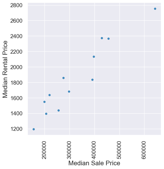
pearson_correlation(homes, 'Median Sale Price','Median Rental Price')
0.9516225800961086
4. Watch out for…#
Nonlinearity#
new_x = np.arange(-4, 4.1, 0.5)
nonlinear = Table().with_columns(
        'x', new_x,
        'y', new_x**2
    )
nonlinear.scatter('x', 'y', s=50, color='red')
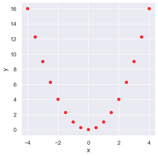
pearson_correlation(nonlinear, 'x', 'y')
0.0
Outliers#
What can cause outliers? What to do when you encounter them?
line = Table().with_columns(
        'x', make_array(1, 2, 3, 4,5),
        'y', make_array(1, 2, 3, 4,5)
    )
line.scatter('x', 'y', s=50, color='red')
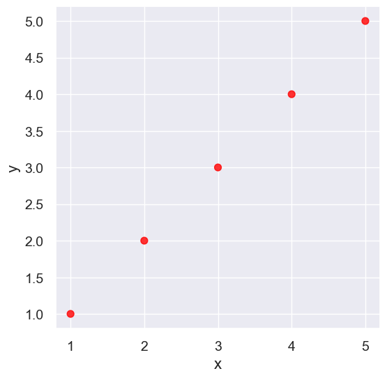
pearson_correlation(line, 'x', 'y')
0.9999999999999998
outlier = Table().with_columns(
        'x', make_array(1, 2, 3, 4, 5),
        'y', make_array(1, 2, 3, 4, 0)
    )
outlier.scatter('x', 'y', s=50, color='red')
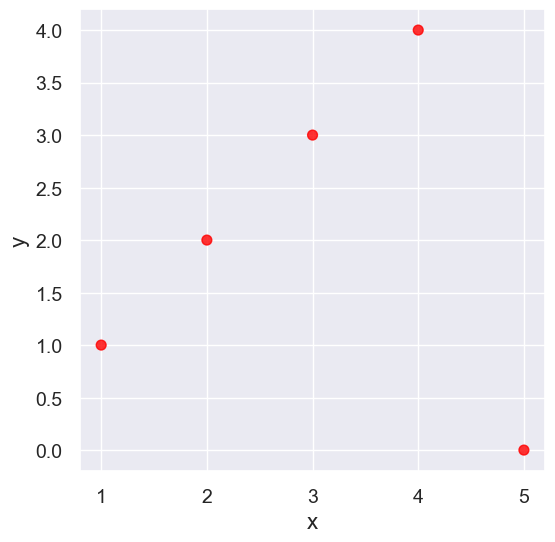
pearson_correlation(outlier, 'x', 'y')
0.0
False Correlations due to Data Aggregation#
sat2014 = Table.read_table('data/sat2014.csv').sort('State')
sat2014
| State | Participation Rate | Critical Reading | Math | Writing | Combined |
|---|---|---|---|---|---|
| Alabama | 6.7 | 547 | 538 | 532 | 1617 |
| Alaska | 54.2 | 507 | 503 | 475 | 1485 |
| Arizona | 36.4 | 522 | 525 | 500 | 1547 |
| Arkansas | 4.2 | 573 | 571 | 554 | 1698 |
| California | 60.3 | 498 | 510 | 496 | 1504 |
| Colorado | 14.3 | 582 | 586 | 567 | 1735 |
| Connecticut | 88.4 | 507 | 510 | 508 | 1525 |
| Delaware | 100 | 456 | 459 | 444 | 1359 |
| District of Columbia | 100 | 440 | 438 | 431 | 1309 |
| Florida | 72.2 | 491 | 485 | 472 | 1448 |
... (41 rows omitted)
sat2014.scatter('Critical Reading', 'Math')
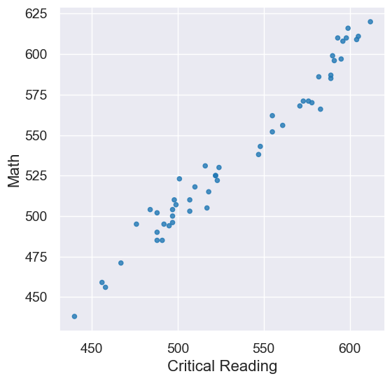
pearson_correlation(sat2014, 'Critical Reading', 'Math')
0.9847558411067432
Here is some fake data to illustrate this:
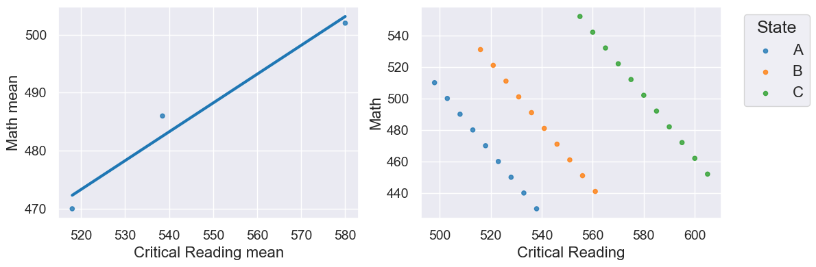
r is 0.98 on the left, but -0.09 for the un-aggregated data on the right!