Correlation
Contents
Correlation#
from datascience import *
from cs104 import *
import numpy as np
%matplotlib inline
Hypothesis Testing with Confidence Intervals: Biased Coin?#
Observed sample: 45 heads, 55 tails
Null Hypothesis: Coin is not biased, so expect 50% chance of heads on each flip
Alt Hypothesis: Coin is biased
observed_sample_size = 100
observed_num_heads = 45

observed_sample = Table().with_columns('flips',
                                       np.append(np.full(observed_num_heads, 'heads'),
                                                 np.full(observed_sample_size - observed_num_heads, 'tails')))
observed_sample.column('flips')
array(['heads', 'heads', 'heads', 'heads', 'heads', 'heads', 'heads',
       'heads', 'heads', 'heads', 'heads', 'heads', 'heads', 'heads',
       'heads', 'heads', 'heads', 'heads', 'heads', 'heads', 'heads',
       'heads', 'heads', 'heads', 'heads', 'heads', 'heads', 'heads',
       'heads', 'heads', 'heads', 'heads', 'heads', 'heads', 'heads',
       'heads', 'heads', 'heads', 'heads', 'heads', 'heads', 'heads',
       'heads', 'heads', 'heads', 'tails', 'tails', 'tails', 'tails',
       'tails', 'tails', 'tails', 'tails', 'tails', 'tails', 'tails',
       'tails', 'tails', 'tails', 'tails', 'tails', 'tails', 'tails',
       'tails', 'tails', 'tails', 'tails', 'tails', 'tails', 'tails',
       'tails', 'tails', 'tails', 'tails', 'tails', 'tails', 'tails',
       'tails', 'tails', 'tails', 'tails', 'tails', 'tails', 'tails',
       'tails', 'tails', 'tails', 'tails', 'tails', 'tails', 'tails',
       'tails', 'tails', 'tails', 'tails', 'tails', 'tails', 'tails',
       'tails', 'tails'], dtype='<U5')
def percent_heads(sample):
    return 100 * sum(sample == 'heads') / len(sample)

percent_heads(observed_sample.column('flips'))
45.0
# def bootstrap(observed_sample, num_trials):

#     bootstrap_statistics = make_array()

#     for i in np.arange(0, num_trials):

#         simulated_resample = observed_sample.sample()
#         resample_statistic = percent_heads(simulated_resample)

#         bootstrap_statistics = np.append(bootstrap_statistics, resample_statistic)

#     return bootstrap_statistics
# def percentile_method(ci_percent, bootstrap_statistics):
#     """
#     Return an array with the lower and upper bound of the ci_percent confidence interval.
#     """
#     # percent in each of the the left/right tails
#     percent_in_each_tail = (100 - ci_percent) / 2
#     left = percentile(percent_in_each_tail, bootstrap_statistics)
#     right = percentile(100 - percent_in_each_tail, bootstrap_statistics)
#     return make_array(left, right)
bootstrap_statistics = bootstrap_statistic(observed_sample.column('flips'), percent_heads, 1000)
results = Table().with_columns("Percent Heads", bootstrap_statistics)
plot = results.hist()
left_right = confidence_interval(95, bootstrap_statistics)
plot.interval(left_right)
plot.dot(percent_heads(observed_sample.column('flips')))
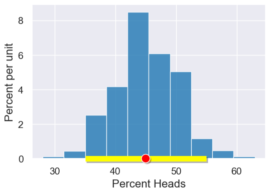
“50% heads” (Null Hypothesis) is in the 95% confidence interval, so we cannot reject the Null Hypothesis.
Finch data and visualizations#
# Load finch data
finch_1975 = Table().read_table("data/finch_beaks_1975.csv")
finch_1975.show(6)
| species | Beak length, mm | Beak depth, mm |
|---|---|---|
| fortis | 9.4 | 8 |
| fortis | 9.2 | 8.3 |
| scandens | 13.9 | 8.4 |
| scandens | 14 | 8.8 |
| scandens | 12.9 | 8.4 |
| fortis | 9.5 | 7.5 |
... (400 rows omitted)
fortis = finch_1975.where('species', 'fortis')
fortis.num_rows
316
scandens = finch_1975.where('species', 'scandens')
scandens.num_rows
90
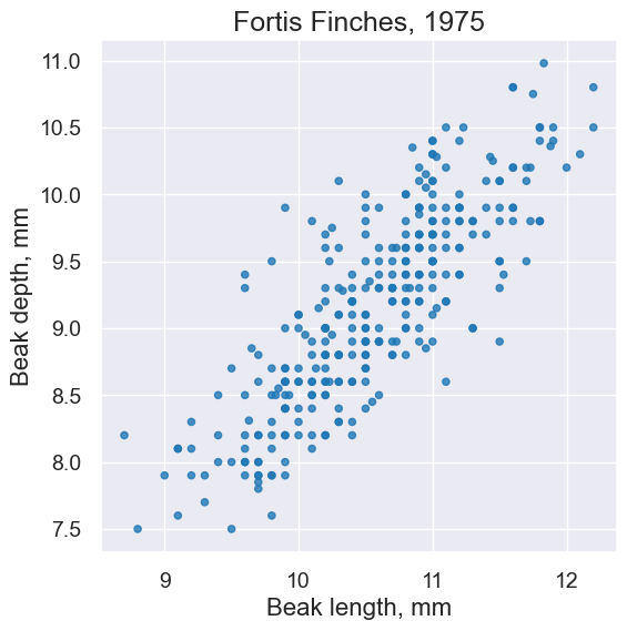
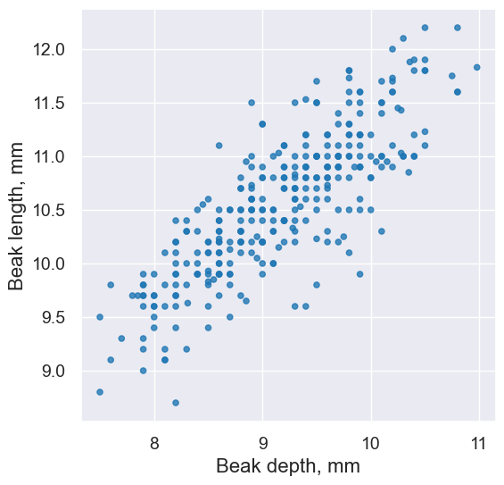
fortis.scatter('Beak length, mm', 'Beak depth, mm')
plots.title('Fortis Finches, 1975');
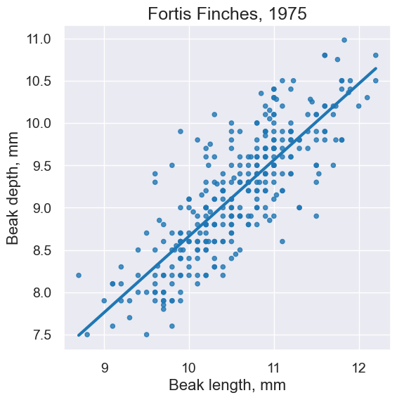
fortis.scatter('Beak length, mm', 'Beak depth, mm', fit_line=True)
plots.title('Fortis Finches, 1975');
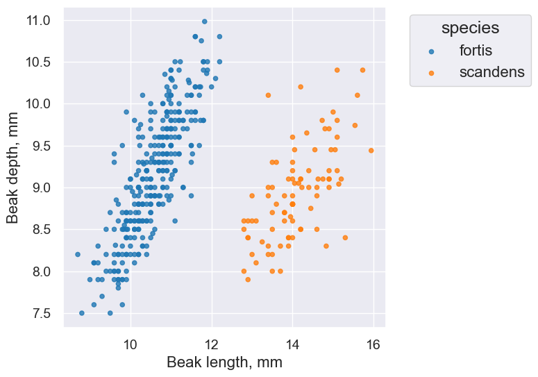
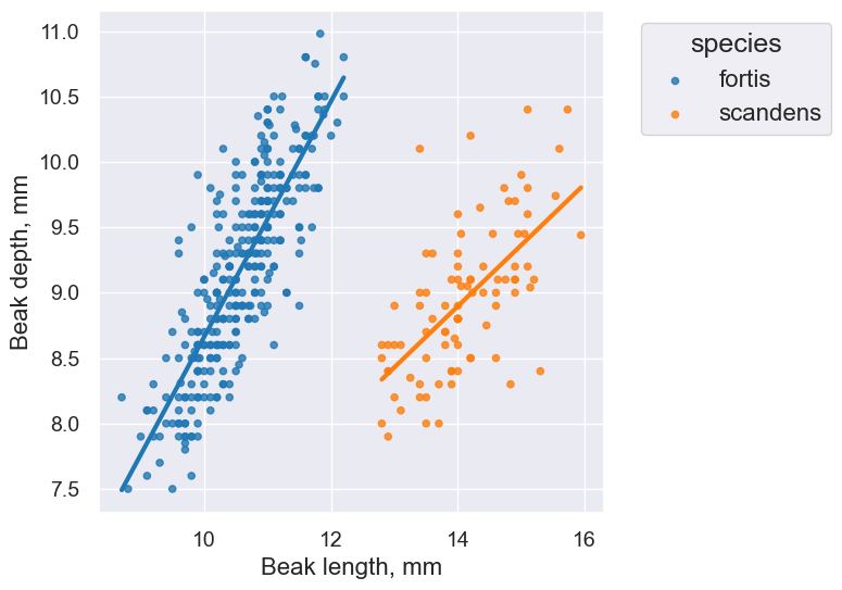
finch_1975.scatter('Beak length, mm', 'Beak depth, mm', group='species')
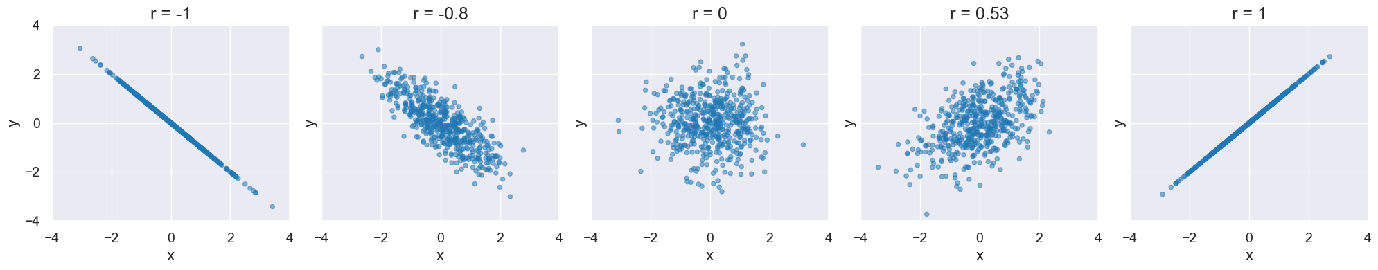
Correlation#
Visualize different values of r:
def r_scatter(r):
    "Generate a scatter plot with a correlation approximately r"
    x = np.random.normal(0, 1, 500)
    z = np.random.normal(0, 1, 500)
    y = r*x + (np.sqrt(1-r**2))*z
    table = Table().with_columns("x", x, "y", y)
    plot = table.scatter("x", "y",alpha=0.5)
    plot.set_xlim(-4, 4)
    plot.set_ylim(-4, 4)
    plot.set_title('r = '+str(r))
The following cell contains an interactive visualization. You won’t see the visualization on this web page, but you can view and interact with it if you run this notebook on our server here.
interact(r_scatter, r = Slider(-1,1,0.01))
Computing Pearson’s Correlation Coefficient#
The formula: \( r = \frac{\sum(x - \bar{x})(y - \bar{y})}{\sqrt{\sum(x - \bar{x})^2} \sqrt{\sum(y - \bar{y})^2}} \)
#Katie: I'd vote making this an API call
def pearson_correlation(table, x_label, y_label):
    x = table.column(x_label)
    y = table.column(y_label)
    x_mean = np.mean(x)
    y_mean = np.mean(y)
    numerator = sum((x - x_mean) * (y - y_mean))
    denominator = np.sqrt(sum((x - x_mean)**2)) * np.sqrt(sum((y - y_mean)**2))
    return numerator / denominator
fortis_r = pearson_correlation(fortis, 'Beak length, mm', 'Beak depth, mm')
fortis_r
0.8212303385631524
scandens_r = pearson_correlation(scandens, 'Beak length, mm', 'Beak depth, mm')
scandens_r
0.624688975610796
finch_1975.scatter('Beak length, mm', 'Beak depth, mm', fit_line=True, group="species")
CIs for Correlation coefficient via bootstrapping#
def bootstrap_finches(observed_sample, num_trials):

    bootstrap_statistics = make_array()

    for i in np.arange(0, num_trials):

        simulated_resample = observed_sample.sample()

        # this changes for this example
        resample_statistic = pearson_correlation(simulated_resample, 'Beak length, mm', 'Beak depth, mm')

        bootstrap_statistics = np.append(bootstrap_statistics, resample_statistic)

    return bootstrap_statistics
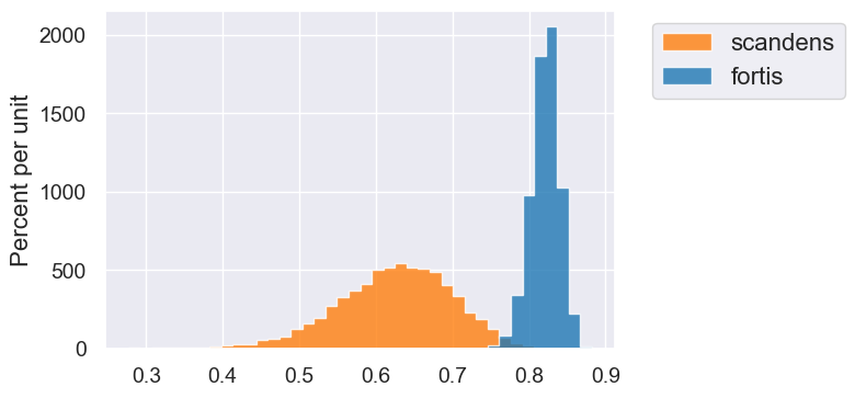
fortis_bootstraps = bootstrap_finches(fortis, 10000)
scandens_bootstraps = bootstrap_finches(scandens, 10000)
fortis_ci = percentile_method(95, fortis_bootstraps)
print('Fortis r = ', fortis_r)
print('Fortis CI=', fortis_ci)
---------------------------------------------------------------------------
NameError                                 Traceback (most recent call last)
Cell In[25], line 1
----> 1 fortis_ci = percentile_method(95, fortis_bootstraps)
      2 print('Fortis r = ', fortis_r)
      3 print('Fortis CI=', fortis_ci)

NameError: name 'percentile_method' is not defined
scandens_ci = percentile_method(95, scandens_bootstraps)
print('Scandens r = ', scandens_r)
print('Scandens CI=', scandens_ci)
---------------------------------------------------------------------------
NameError                                 Traceback (most recent call last)
Cell In[26], line 1
----> 1 scandens_ci = percentile_method(95, scandens_bootstraps)
      2 print('Scandens r = ', scandens_r)
      3 print('Scandens CI=', scandens_ci)

NameError: name 'percentile_method' is not defined
Table().with_columns('fortis', fortis_bootstraps, 'scandens', scandens_bootstraps).hist(bins=40)
Switching Axes#
fortis.scatter('Beak length, mm', 'Beak depth, mm')
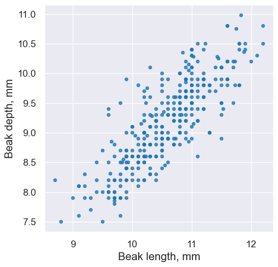
pearson_correlation(fortis, 'Beak length, mm', 'Beak depth, mm')
0.8212303385631524
fortis.scatter('Beak depth, mm','Beak length, mm')
pearson_correlation(fortis, 'Beak depth, mm', 'Beak length, mm')
0.8212303385631524
Watch out for…#
Nonlinearity#
new_x = np.arange(-4, 4.1, 0.5)
nonlinear = Table().with_columns(
        'x', new_x,
        'y', new_x**2
    )
nonlinear.scatter('x', 'y', s=50, color='red')
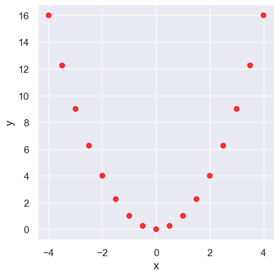
pearson_correlation(nonlinear, 'x', 'y')
0.0
Outliers#
What can cause outliers? What to do when you encounter them?
line = Table().with_columns(
        'x', make_array(1, 2, 3, 4,5),
        'y', make_array(1, 2, 3, 4,5)
    )
line.scatter('x', 'y', s=50, color='red')
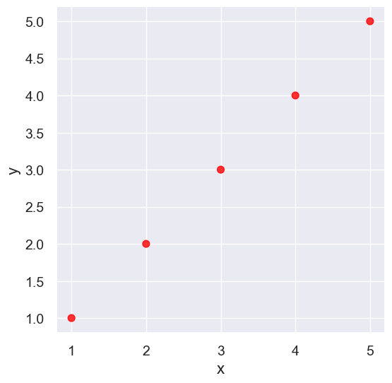
pearson_correlation(line, 'x', 'y')
0.9999999999999998
outlier = Table().with_columns(
        'x', make_array(1, 2, 3, 4, 5),
        'y', make_array(1, 2, 3, 4, 0)
    )
outlier.scatter('x', 'y', s=50, color='red')
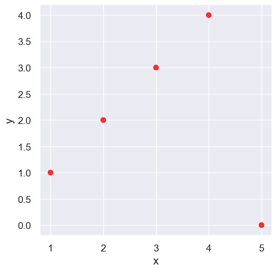
pearson_correlation(outlier, 'x', 'y')
0.0
False Correlations due to Data Aggregation#
sat2014 = Table.read_table('data/sat2014.csv').sort('State')
sat2014
| State | Participation Rate | Critical Reading | Math | Writing | Combined |
|---|---|---|---|---|---|
| Alabama | 6.7 | 547 | 538 | 532 | 1617 |
| Alaska | 54.2 | 507 | 503 | 475 | 1485 |
| Arizona | 36.4 | 522 | 525 | 500 | 1547 |
| Arkansas | 4.2 | 573 | 571 | 554 | 1698 |
| California | 60.3 | 498 | 510 | 496 | 1504 |
| Colorado | 14.3 | 582 | 586 | 567 | 1735 |
| Connecticut | 88.4 | 507 | 510 | 508 | 1525 |
| Delaware | 100 | 456 | 459 | 444 | 1359 |
| District of Columbia | 100 | 440 | 438 | 431 | 1309 |
| Florida | 72.2 | 491 | 485 | 472 | 1448 |
... (41 rows omitted)
sat2014.scatter('Critical Reading', 'Math')
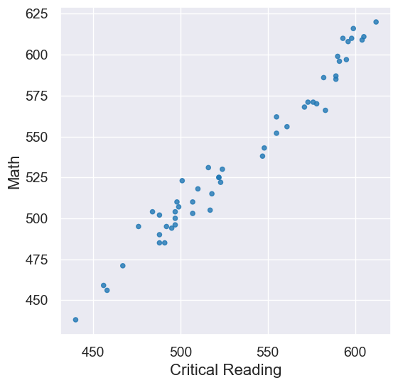
pearson_correlation(sat2014, 'Critical Reading', 'Math')
0.9847558411067432