Histograms
Contents
Histograms#
from datascience import *
from cs104 import *
import numpy as np

%matplotlib inline
0. Error practice#
majors = Table().read_table("data/majors.csv")
majors.show(5)
| Major | Division | 2008-2012 | 2018-2021 |
|---|---|---|---|
| American Studies | 2 | 10 | 9 |
| Anthropology | 2 | 8 | 4 |
| Arabic Studies | 1 | 4 | 7 |
| Art | 1 | 55 | 31 |
| Asian Studies | 1 | 8 | 6 |
... (32 rows omitted)
# Select only division 3 majors
div3 = majors.where("Division", are.equal_to(3)
div3
  Cell In[4], line 2
    div3 = majors.where("Division", are.equal_to(3)
                       ^
SyntaxError: '(' was never closed
# Get the number of majors across both time periods
majors.select("2008-2012") + majors.select("2018-2021")
---------------------------------------------------------------------------
TypeError                                 Traceback (most recent call last)
Cell In[5], line 2
      1 # Get the number of majors across both time periods
----> 2 majors.select("2008-2012") + majors.select("2018-2021")

TypeError: unsupported operand type(s) for +: 'Table' and 'Table'
1. Overlaid graphs#
Sometimes we want to see more than one plot on a single graph.
Overlaid bar charts#
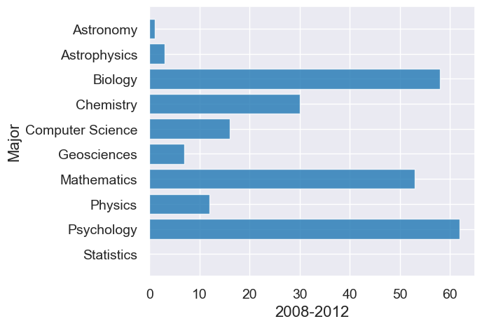
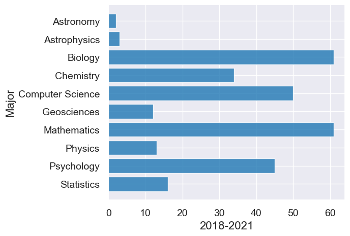
div3 = majors.where("Division", are.equal_to(3)).drop("Division")
div3
| Major | 2008-2012 | 2018-2021 |
|---|---|---|
| Astronomy | 1 | 2 |
| Astrophysics | 3 | 3 |
| Biology | 58 | 61 |
| Chemistry | 30 | 34 |
| Computer Science | 16 | 50 |
| Geosciences | 7 | 12 |
| Mathematics | 53 | 61 |
| Physics | 12 | 13 |
| Psychology | 62 | 45 |
| Statistics | 0 | 16 |
# First graph for 2008-2012
div3.barh("Major", "2008-2012")
# Second graph from 2018-2021
div3.barh("Major", "2018-2021")
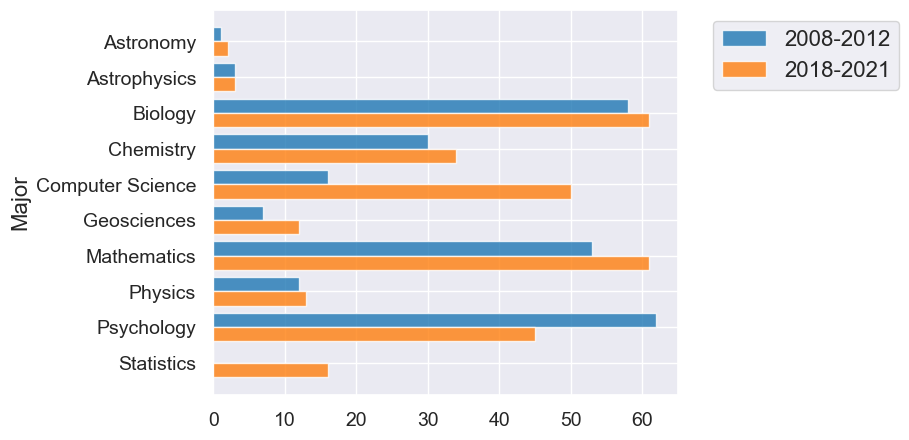
Overlaid graph puts the two graphs together to make comparison easier.
The package we’re using will automatically make overlaid graphs with the remainder of the columns if you give it just one parameter.
div3.barh("Major")
Overlaid line plots#
temps_by_month = Table().read_table("data/temps_by_month_upernavik.csv")
temps_by_month.show(5)
| Year | Jan | Feb | Mar | Apr | May | Jun | Jul | Aug | Sep | Oct | Nov | Dec |
|---|---|---|---|---|---|---|---|---|---|---|---|---|
| 1875 | -15.6 | -19.7 | -25.9 | -14.7 | -9.6 | -0.4 | 4.7 | 2.9 | -0.1 | -4.5 | -5.5 | -14 |
| 1876 | -24.5 | -21.2 | -20.8 | -14.9 | -6.3 | 0.9 | 3.9 | 2.4 | 3.2 | -6.2 | -9.4 | -14.4 |
| 1877 | -21.1 | -26.5 | -17.8 | -12 | -1.7 | 1.4 | 4.6 | 5.2 | 3 | -2.8 | -10 | -19.2 |
| 1878 | -22.9 | -26.9 | -19.6 | -13 | -5.6 | 1.9 | 3.2 | 4.3 | -0.9 | -4 | -2 | -3.7 |
| 1879 | -13.5 | -25.4 | -21.3 | -13 | -2.7 | 0 | 5.2 | 5.8 | -1.1 | -5.5 | -8.2 | -16.5 |
... (104 rows omitted)
As with bar charts, if you supply only one parameter, the plot method will plot a line for every other column.
temps_by_month.plot("Year")
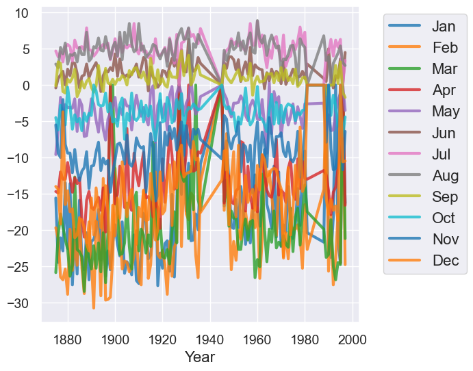
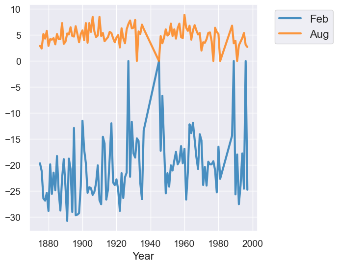
Qualitatively, we can see that the plot above has too much information on it which makes it not very useful for understand trends.
temps_by_month.select("Year", "Feb", "Aug").plot("Year")
Overlaid scatter plots#
We want to plot points (the values of two numerical variables) from different groups on the same graph.
A new approach. Use categorical variable to break the rows into groups of related points in the plot.
finch_1975 = Table().read_table("data/finch_beaks_1975.csv")
finch_1975.show(6)
| species | Beak length, mm | Beak depth, mm |
|---|---|---|
| fortis | 9.4 | 8 |
| fortis | 9.2 | 8.3 |
| scandens | 13.9 | 8.4 |
| scandens | 14 | 8.8 |
| scandens | 12.9 | 8.4 |
| fortis | 9.5 | 7.5 |
... (400 rows omitted)
finch_1975.scatter("Beak length, mm", "Beak depth, mm", group="species")
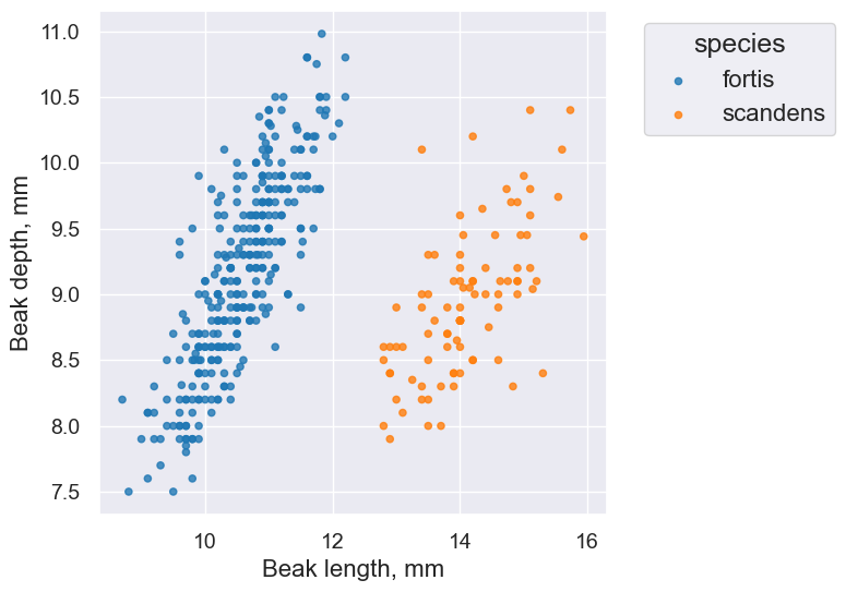
Takeaway: The overlaid scatter plot above helps us very quickly discern differences between groups. In this case, we can quickly tell that the two Finch species have evolved (via natural selection) to have different beak characteristics.
2. Histograms#
A Histogram shows us the distribution of a numerical variable.
Midterm scores#
scores = Table().read_table("data/scores_by_section.csv")
scores = scores.relabeled("Midterm", "Midterm 1")
scores
| Section | Midterm 1 |
|---|---|
| 1 | 22 |
| 2 | 12 |
| 2 | 23 |
| 2 | 14 |
| 1 | 20 |
| 3 | 20 |
| 4 | 19 |
| 1 | 24 |
| 1 | 0 |
| 1 | 13 |
... (111 rows omitted)
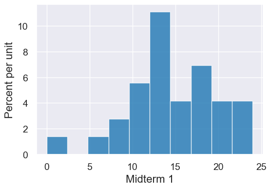
Let’s subset to just section 4 for now.
scores_sec4 = scores.where("Section", 4)
scores_sec4
| Section | Midterm 1 |
|---|---|
| 4 | 19 |
| 4 | 14 |
| 4 | 24 |
| 4 | 12 |
| 4 | 0 |
| 4 | 13 |
| 4 | 19 |
| 4 | 22 |
| 4 | 13 |
| 4 | 18 |
... (20 rows omitted)
A histogram can give us a sense of the data as a whole: What are the common values? What are uncommon? How much variability is there? What are the extremes?
scores_sec4.hist("Midterm 1")
Class survey: Distance from home#
Load Data#
survey = Table().read_table("data/prelab01-survey-fall2025.csv")
survey.show(5)
| Favorite icecream flavor | Favorite planet | Height (in inches) | Distance Home (in miles) | Birthday month | Left or right handed? |
|---|---|---|---|---|---|
| Mint chocolate chip | Neptune | 67 | 49 | September | Right handed |
| Vanilla | Neptune | 72 | 178 | December | Right handed |
| Purple Cow | Earth | 72 | 3058.6 | April | Right handed |
| Strawberry | Earth | 62 | 66 | July | Right handed |
| Strawberry | Earth | 66.5 | 185 | June | Left handed |
... (54 rows omitted)
survey.labels
('Favorite icecream flavor ',
 'Favorite planet',
 'Height (in inches)',
 'Distance Home (in miles)',
 'Birthday month',
 'Left or right handed? ')
distance_home = survey.column('Distance Home (in miles)')
distance_home
array([   49. ,   178. ,  3058.6,    66. ,   185. ,  2851.8,   162. ,
         120. ,    18.4,   137. ,   146. ,   219. ,   420. ,  7580. ,
        1009. ,  3645. ,   165. ,  2964.9,   220. ,   154. ,   185.6,
        4000. ,   154. ,   321. ,   190. ,  1268.7,   144. ,  2893.7,
         138. ,   229. ,   140. ,  2971.5,   123. ,  6959. ,   145. ,
          28.8,   208. ,    98. ,    45. ,  1287. ,   200.1,  1074. ,
         185.6,   180. ,   671. ,  2500. ,   652. ,   156. ,   224. ,
         143. ,   246. , 10000. ,   157.4,  1686. ,  8000. ,    90. ,
         159. ,    40. ,  3000. ])
Some basic info about the distances:
len(distance_home)
59
np.mean(distance_home)
1258.3406779661018
max(distance_home)
10000.0
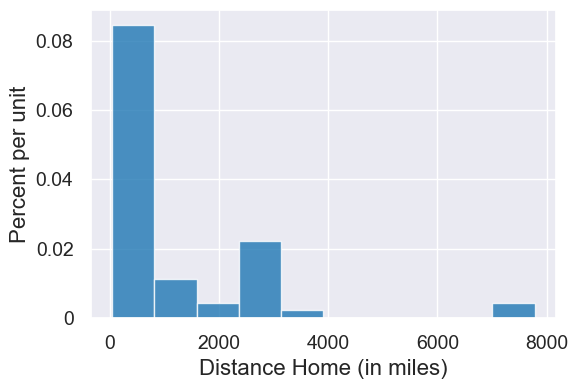
Sneak preview of a histogram for those distances
survey.hist('Distance Home (in miles)', bins=np.arange(0, 12000, 2000))
3. Binning#
survey.show(3)
| Favorite icecream flavor | Favorite planet | Height (in inches) | Distance Home (in miles) | Birthday month | Left or right handed? |
|---|---|---|---|---|---|
| Mint chocolate chip | Neptune | 67 | 49 | September | Right handed |
| Vanilla | Neptune | 72 | 178 | December | Right handed |
| Purple Cow | Earth | 72 | 3058.6 | April | Right handed |
... (56 rows omitted)
We have a method in our package that can make bins automatically: table.bin.
our_range = np.arange(0,12000,2000)
our_range
array([ 0, 2000, 4000, 6000, 8000, 10000])
binned_distance_home = survey.bin('Distance Home (in miles)', bins=our_range)
binned_distance_home
| bin | Distance Home (in miles) count |
|---|---|
| 0 | 46 |
| 2000 | 8 |
| 4000 | 1 |
| 6000 | 2 |
| 8000 | 2 |
| 10000 | 0 |
Let’s add a column that is the percentage in each bin.
percent = binned_distance_home.column('Distance Home (in miles) count') / survey.num_rows * 100
percent_table = binned_distance_home.with_columns('Percent', percent)
percent_table
| bin | Distance Home (in miles) count | Percent |
|---|---|---|
| 0 | 46 | 77.9661 |
| 2000 | 8 | 13.5593 |
| 4000 | 1 | 1.69492 |
| 6000 | 2 | 3.38983 |
| 8000 | 2 | 3.38983 |
| 10000 | 0 | 0 |
Histogram of distances from home#
survey.hist('Distance Home (in miles)', bins= np.arange(0,12000,2000))
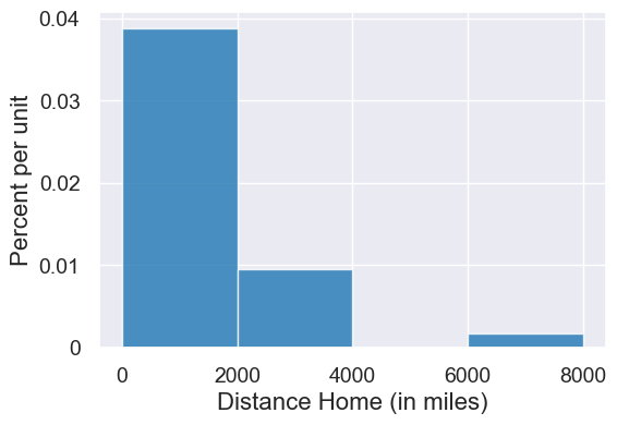
Think-pair-share: Calculate the area of each bar in the histogram (estimating the height). Then show the sum of the area of all the bars equals 100.
#Possible approximations
widths = make_array(2000, 2000, 2000, 2000, 2000)
heights = make_array(0.038, 0.007, 0.001, 0.002, 0.002)
areas = widths*heights
areas
array([76., 14., 2., 4., 4.])
sum(areas)
100.0
Let’s check our estimates.
percent_table
| bin | Distance Home (in miles) count | Percent |
|---|---|---|
| 0 | 46 | 77.9661 |
| 2000 | 8 | 13.5593 |
| 4000 | 1 | 1.69492 |
| 6000 | 2 | 3.38983 |
| 8000 | 2 | 3.38983 |
| 10000 | 0 | 0 |
Cool! We’re pretty close to the actual areas! Great!
Let’s work backwards now and see how our hist() method calculated the y-axis.
Let’s look at the first bar/bin.
bin0 = percent_table.take(0)
bin0
| bin | Distance Home (in miles) count | Percent |
|---|---|---|
| 0 | 46 | 77.9661 |
Recall, the height is equal to the (percent of entries in the bin) / width of the bin
percent_in_bin0 =  bin0.column('Percent').item(0)
percent_in_bin0
77.96610169491525
height0 = percent_in_bin0/2000
height0
0.03898305084745762
Fantastic! That’s what we see on the y-axis on the histogram.
More histogram practice#
survey.show(5)
| Favorite icecream flavor | Favorite planet | Height (in inches) | Distance Home (in miles) | Birthday month | Left or right handed? |
|---|---|---|---|---|---|
| Mint chocolate chip | Neptune | 67 | 49 | September | Right handed |
| Vanilla | Neptune | 72 | 178 | December | Right handed |
| Purple Cow | Earth | 72 | 3058.6 | April | Right handed |
| Strawberry | Earth | 62 | 66 | July | Right handed |
| Strawberry | Earth | 66.5 | 185 | June | Left handed |
... (54 rows omitted)
survey.labels
('Favorite icecream flavor ',
 'Favorite planet',
 'Height (in inches)',
 'Distance Home (in miles)',
 'Birthday month',
 'Left or right handed? ')
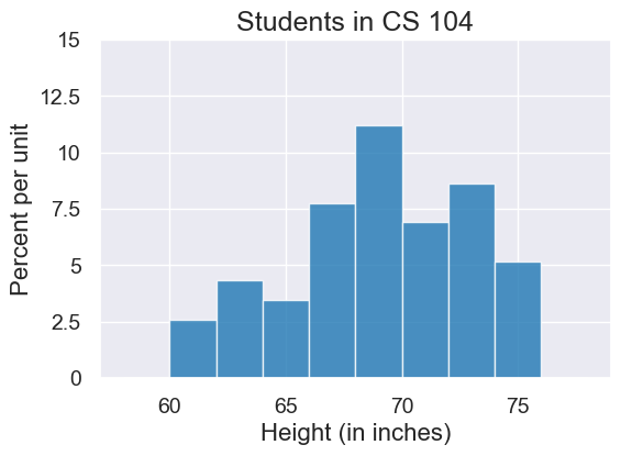
plot = survey.hist('Height (in inches)', bins=np.arange(58,80,2))
plot.set_ylim(0,0.15)
plot.set_title("Students in CS 104")
Overlaid histograms#
Scores#
Circle back around to our midterm data.
scores
| Section | Midterm 1 |
|---|---|
| 1 | 22 |
| 2 | 12 |
| 2 | 23 |
| 2 | 14 |
| 1 | 20 |
| 3 | 20 |
| 4 | 19 |
| 1 | 24 |
| 1 | 0 |
| 1 | 13 |
... (111 rows omitted)
scores_sec4 = scores.where("Section", 4)
scores_sec4.hist("Midterm 1")

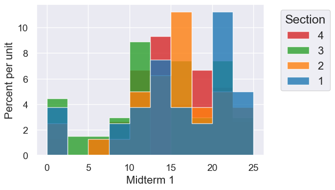
Like scatter we can create overlaid histograms with the group= named variable
scores.hist("Midterm 1", group="Section", bins=10)
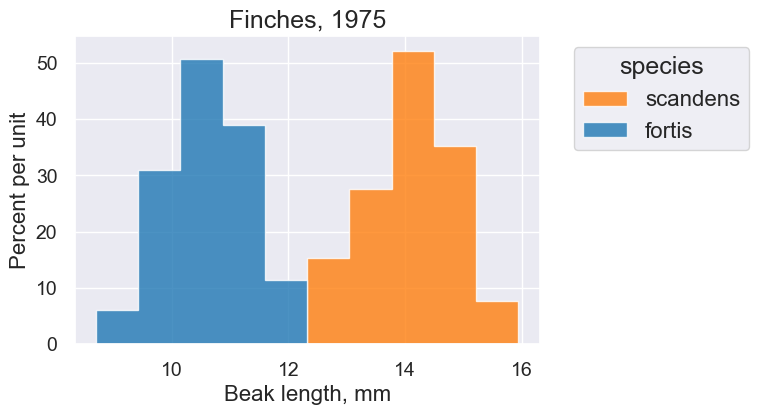
Finches#
One more overlay, for the two finch species.
finch_1975.show(10)
| species | Beak length, mm | Beak depth, mm |
|---|---|---|
| fortis | 9.4 | 8 |
| fortis | 9.2 | 8.3 |
| scandens | 13.9 | 8.4 |
| scandens | 14 | 8.8 |
| scandens | 12.9 | 8.4 |
| fortis | 9.5 | 7.5 |
| fortis | 9.5 | 8 |
| fortis | 11.5 | 9.9 |
| fortis | 11.1 | 8.6 |
| fortis | 9.9 | 8.4 |
... (396 rows omitted)
finch_1975.hist("Beak length, mm", bins=20)

plot = finch_1975.hist("Beak length, mm", group="species")
plot.set_title("Finches, 1975")
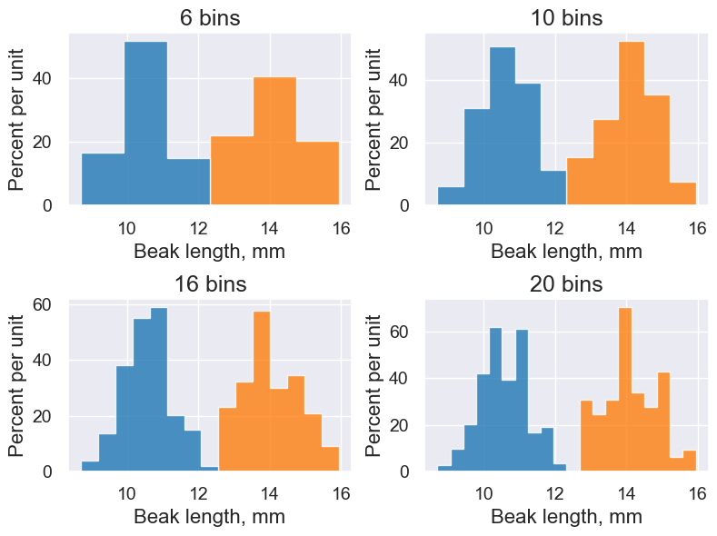
Try different bins to see differences in granularity.
def hist_with_bins(bins):
    finch_1975.hist("Beak length, mm", group="species", legend=False, bins=bins,  title=str(bins) + " bins")

interact(hist_with_bins, bins=Slider(1,20))
A few different histograms side-by-side:
with Figure(2,2, figsize=(4,3)):
    finch_1975.hist("Beak length, mm", group="species", legend=False, bins=6,  title="6 bins")
    finch_1975.hist("Beak length, mm", group="species", legend=False, bins=10, title="10 bins")
    finch_1975.hist("Beak length, mm", group="species", legend=False, bins=15, title="16 bins")
    finch_1975.hist("Beak length, mm", group="species", legend=False, bins=20, title="20 bins")