Charts
Contents
Charts#
from datascience import *
from cs104 import *
import numpy as np

%matplotlib inline
1. Table and visualization review#
# Load data from the last lecture and clean it up
greenland_climate = Table.read_table('data/climate_upernavik.csv')
greenland_climate = greenland_climate.relabeled('Precipitation (millimeters)', "Precip (mm)")
tidy_greenland = greenland_climate.where('Air temperature (C)', are.not_equal_to(999.99))
tidy_greenland = tidy_greenland.where('Sea level pressure (mbar)', are.not_equal_to(9999.9))
tidy_greenland.show(4)
| Year | Month | Air temperature (C) | Sea level pressure (mbar) | Precip (mm) |
|---|---|---|---|---|
| 1874 | 9 | 0.1 | 1010.7 | 68 |
| 1874 | 10 | -5.4 | 1002.7 | 24 |
| 1874 | 11 | -8 | 1010.5 | 15 |
| 1874 | 12 | -8.4 | 1005.1 | 69 |
... (1255 rows omitted)
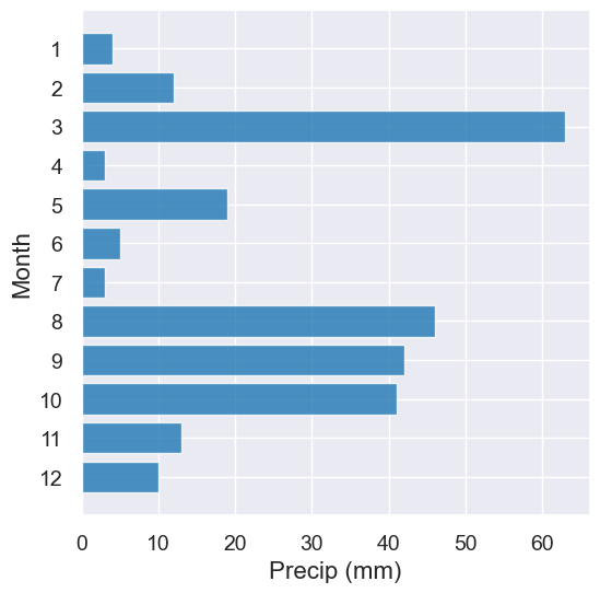
Think-Pair-Share#
Question: For the year 1900, make a visualization of each month and the amount of precipitation. Does visualization confirm your intuition of what you should expect to see? Why or why not?
Hint: Think carefully about what type of visualization you should use.
tidy_greenland.where('Year', are.equal_to(1900)).barh('Month', 'Precip (mm)')
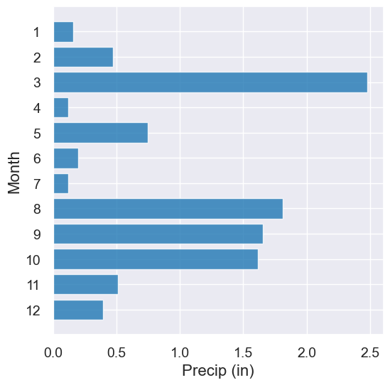
Question: How about if we want the data in inches?
Hint: 25.4 millimeters are equal to one inch.
precip_in_inches = tidy_greenland.with_column("Precip (in)",
                                             tidy_greenland.column("Precip (mm)") / 25.4)

precip_in_inches.where('Year', are.equal_to(1900)).barh('Month', 'Precip (in)')
A Little Practice Fixing Programming Mistakes#
For fun, let’s look at only recent data between 1950 and 1995. Here’s our first attempt
recent = tidy_greenland.where(Year, are.strictly_between("1950","1995")) #should throw an error
---------------------------------------------------------------------------
NameError                                 Traceback (most recent call last)
Cell In[6], line 1
----> 1 recent = tidy_greenland.where(Year, are.strictly_between("1950","1995")) #should throw an error

NameError: name 'Year' is not defined
How do we debug this error message?
# Ok. Try to fix something
recent = tidy_greenland.where("Year", are.strictly_between("1950", "1995")) #should throw an error
---------------------------------------------------------------------------
TypeError                                 Traceback (most recent call last)
Cell In[7], line 2
      1 # Ok. Try to fix something
----> 2 recent = tidy_greenland.where("Year", are.strictly_between("1950", "1995")) #should throw an error

TypeError: '>' not supported between instances of 'numpy.ndarray' and 'str'
Always good to read the documentation for the functions and methods you are using. Docs for are.strictly_between. What types of parameters does that method take take?
#print out types and comment out pieces of code to debug
type("1950")
type(1950) #comment this line to see the previous line
int
The fixed version:
recent = tidy_greenland.where("Year", are.strictly_between(1950, 1995))
recent.show(3)
| Year | Month | Air temperature (C) | Sea level pressure (mbar) | Precip (mm) |
|---|---|---|---|---|
| 1951 | 1 | -15.8 | 1005 | 1 |
| 1951 | 2 | -24.2 | 1012 | 3 |
| 1951 | 3 | -18.3 | 1028 | 11 |
... (434 rows omitted)
Great! No errors, but did we get the correct answer? How could we sanity check? Look for smallest and largest year left in the table.
years_chosen = recent.column("Year")
print(min(years_chosen))
print(max(years_chosen))
1951
1994
That doesn’t look right. Back to the docs for are.strictly_between…
recent = tidy_greenland.where("Year", are.between_or_equal_to(1950, 1995))
years_chosen = recent.column("Year")
print(min(years_chosen))
print(max(years_chosen))
1950
1995
That looks good. Let’s visualize the Februrary temperatures in the recent table.
Plot customizations#
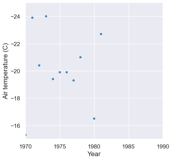
feb = recent.where('Month', are.equal_to(2))
plot = feb.scatter('Year', 'Air temperature (C)')
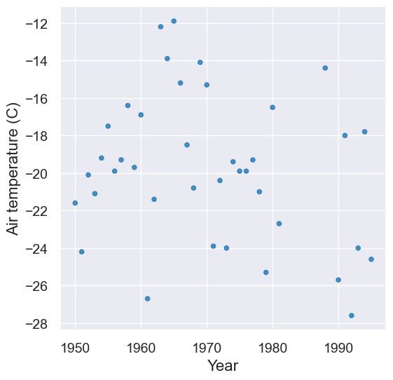
Let’s “zoom in”!
plot = feb.scatter('Year', 'Air temperature (C)')
plot.set_ylim(-15, -25)
plot.set_xlim(1970, 1990)
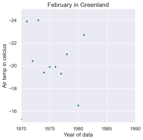
We can change the title and labels on the graph.
plot = feb.scatter('Year', 'Air temperature (C)')
plot.set_ylim(-15, -25)
plot.set_xlim(1970, 1990)
plot.set_title("February in Greenland")
plot.set_ylabel("Air temp in celcius")
plot.set_xlabel("Year of data")
2. Visualization Discussion#
Choosing betweeen visualizations#
Question: What’s wrong with this visualization? How could we fix it?
tidy_greenland.plot('Sea level pressure (mbar)', 'Precip (mm)')
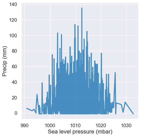
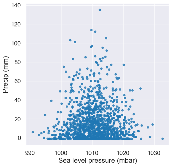
A: Line plots should only be used when it’s meaningful to connect points along the x-axis (e.g. time or distance). We can change this to a scatter plot to analyze the relationship between these two numerical variables.
tidy_greenland.scatter('Sea level pressure (mbar)', 'Precip (mm)')
Think-pair-share#
Question: Does a warmer July correlate with a warmer August? Best we can do with our current table
with Figure(1,2):
    tidy_greenland.where("Month", are.equal_to(7)).plot("Year", 'Air temperature (C)', title='July')
    tidy_greenland.where("Month", are.equal_to(8)).plot("Year", 'Air temperature (C)', title='Aug')
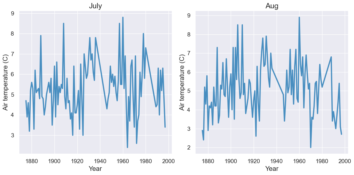
How can we improve on this?
What table would be useful to have?
How would you visualize the data in that table?
temps_by_month = Table().read_table("data/temps_by_month_upernavik.csv")
temps_by_month.show(5)
| Year | Jan | Feb | Mar | Apr | May | Jun | Jul | Aug | Sep | Oct | Nov | Dec |
|---|---|---|---|---|---|---|---|---|---|---|---|---|
| 1875 | -15.6 | -19.7 | -25.9 | -14.7 | -9.6 | -0.4 | 4.7 | 2.9 | -0.1 | -4.5 | -5.5 | -14 |
| 1876 | -24.5 | -21.2 | -20.8 | -14.9 | -6.3 | 0.9 | 3.9 | 2.4 | 3.2 | -6.2 | -9.4 | -14.4 |
| 1877 | -21.1 | -26.5 | -17.8 | -12 | -1.7 | 1.4 | 4.6 | 5.2 | 3 | -2.8 | -10 | -19.2 |
| 1878 | -22.9 | -26.9 | -19.6 | -13 | -5.6 | 1.9 | 3.2 | 4.3 | -0.9 | -4 | -2 | -3.7 |
| 1879 | -13.5 | -25.4 | -21.3 | -13 | -2.7 | 0 | 5.2 | 5.8 | -1.1 | -5.5 | -8.2 | -16.5 |
... (104 rows omitted)
temps_by_month.select("Year", "Jul", "Aug").plot("Year") # overlay two lines -- more on this below!
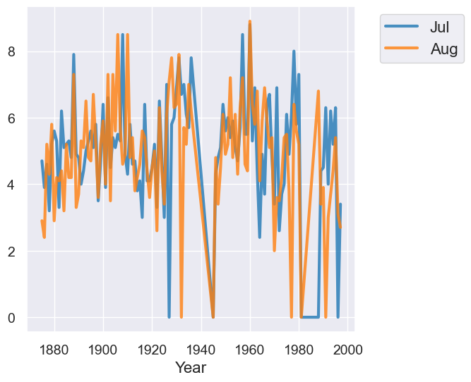
Sort of see a correlation, but does time actually matter here??? Pick a plot that focusses on the two variables we care about: July temps and August temps.
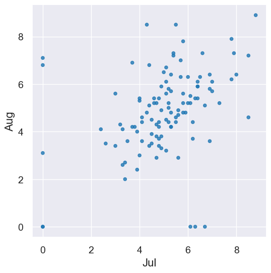
temps_by_month.scatter("Jul", "Aug")
Making it interactive. We can’t resist making an interactive visualization for looking at any two months in the same calendar year. We’ll look at the code in more detail in a week or two, so for now, just enjoy!
def month_correlations(first, second):
    plot = temps_by_month.scatter(first, second)
    plot.set_title("Correlation between " + first + " and " + second + " Temps");

months = make_array("Jan", "Feb", "Mar", "Apr", "May", "Jun", "Jul", "Aug", "Sep", "Oct", "Nov", "Dec")
interact(month_correlations, first=Choice(months), second=Choice(months))
Right now, we’re looking at everything qualitatively. By the end of this class, we’ll be able to quantify this relationship (if you’re curious–we’ll use correlation coefficients).
3. Overlaid graphs#
Overlaid bar charts#
majors = Table.read_table("data/majors.csv")
div3 = majors.where("Division", are.equal_to(3)).drop("Division")
div3
| Major | 2008-2012 | 2018-2021 |
|---|---|---|
| Astronomy | 1 | 2 |
| Astrophysics | 3 | 3 |
| Biology | 58 | 61 |
| Chemistry | 30 | 34 |
| Computer Science | 16 | 50 |
| Geosciences | 7 | 12 |
| Mathematics | 53 | 61 |
| Physics | 12 | 13 |
| Psychology | 62 | 45 |
| Statistics | 0 | 16 |
# First graph for 2008-2012
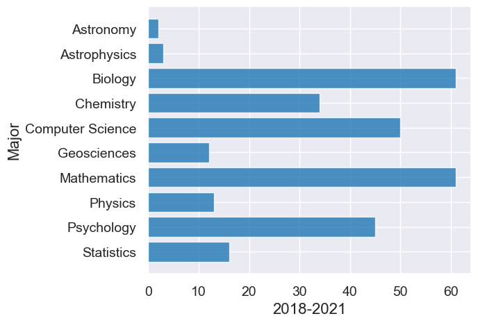
div3.barh("Major", "2008-2012")
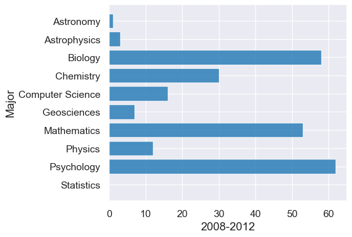
# Second graph from 2018-2021
div3.barh("Major", "2018-2021")
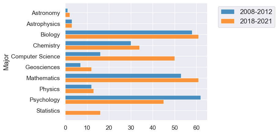
Overlaid graph puts the two graphs together to make comparison easier.
The package we’re using will automatically make overlaid graphs with the remainder of the columns if you give it just one parameter.
div3.barh("Major")
Overlaid line plots#
temps_by_month.show(5)
| Year | Jan | Feb | Mar | Apr | May | Jun | Jul | Aug | Sep | Oct | Nov | Dec |
|---|---|---|---|---|---|---|---|---|---|---|---|---|
| 1875 | -15.6 | -19.7 | -25.9 | -14.7 | -9.6 | -0.4 | 4.7 | 2.9 | -0.1 | -4.5 | -5.5 | -14 |
| 1876 | -24.5 | -21.2 | -20.8 | -14.9 | -6.3 | 0.9 | 3.9 | 2.4 | 3.2 | -6.2 | -9.4 | -14.4 |
| 1877 | -21.1 | -26.5 | -17.8 | -12 | -1.7 | 1.4 | 4.6 | 5.2 | 3 | -2.8 | -10 | -19.2 |
| 1878 | -22.9 | -26.9 | -19.6 | -13 | -5.6 | 1.9 | 3.2 | 4.3 | -0.9 | -4 | -2 | -3.7 |
| 1879 | -13.5 | -25.4 | -21.3 | -13 | -2.7 | 0 | 5.2 | 5.8 | -1.1 | -5.5 | -8.2 | -16.5 |
... (104 rows omitted)
As with bar charts, if you supply only one parameter, the plot method will plot a line for every other column.
temps_by_month.plot("Year")
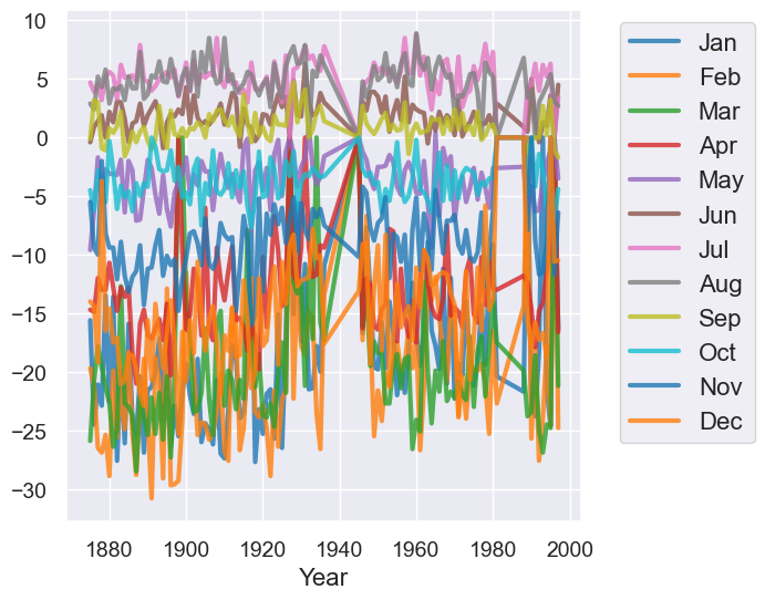
Qualitatively, we can see that the plot above has too much information on it which makes it not very useful for understand trends.
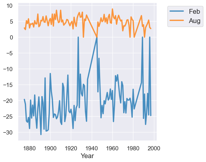
temps_by_month.select("Year", "Feb", "Aug").plot("Year")
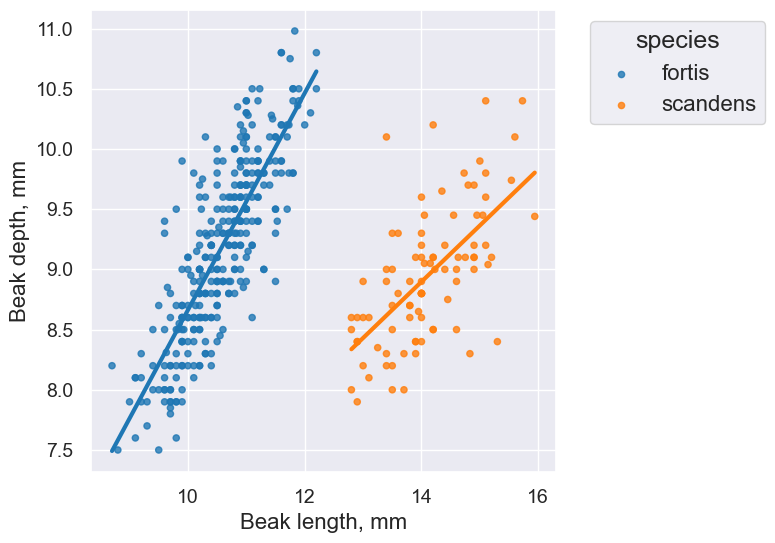
Overlaid scatter plots#
We want to plot points (the values of two numerical variables) from different groups on the same graph.
A new approach. Use categorical variable to break the rows into groups of related points in the plot.
finch_1975 = Table().read_table("data/finch_beaks_1975.csv")
finch_1975.show(6)
| species | Beak length, mm | Beak depth, mm |
|---|---|---|
| fortis | 9.4 | 8 |
| fortis | 9.2 | 8.3 |
| scandens | 13.9 | 8.4 |
| scandens | 14 | 8.8 |
| scandens | 12.9 | 8.4 |
| fortis | 9.5 | 7.5 |
... (400 rows omitted)
finch_1975.scatter("Beak length, mm", "Beak depth, mm", group="species")
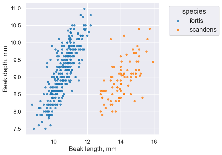
Takeaway: The overlaid scatter plot above helps us very quickly discern differences between groups. In this case, we can quickly tell that the two Finch species have evolved (via natural selection) to have different beak characteristics.
One last plot, this time with lines fitted to the data:
finch_1975.scatter("Beak length, mm", "Beak depth, mm", group="species", fit_line=True)