Tables and Visualization
Contents
Tables and Visualization#
from datascience import *
from cs104 import *
import numpy as np

%matplotlib inline
1. Notebook Tips#
Viewing Intermediate Results#
Tip: You can comment out lines to look at intermediate work.
num_movies_in_20th_century = 30
second_variable = num_movies_in_20th_century * 3
third_variable = second_variable + make_array(1, 2, 3)
num_movies_in_20th_century = 30
second_variable = num_movies_in_20th_century * 3
second_variable
# third_variable = second_variable + make_array(1, 2, 3)
90
Tab Completion#
If you have a long variable or function name, no need to type it every time! Just type the first few letters at hit tab to auto-complete.
Using and Reading Checks#
In our library, the check function tests a boolean (True or False) expresssion.
1 > 0
True
answer = 1 > 0
answer
True
type(answer)
bool
check(1 > 0)
check(0 > 1)
🐝 check(0 > 1)
      `0 > 1` is false because
        0 <= 1
In Python == is the equality operator. It returns True (a boolean) if the expression to the left of == is equal to the expression on the right of == and False if the two are not equal.
'a' == 'a'
True
'a' == 'b'
False
x = 'a'
x == 'b'
False
check(x == 'a')
check(x == 'b')
🐝 check(x == 'b')
      `x == 'b'` is false because
        `x` is 'a' and 'a' != 'b'
2. Table Review: Important Data Questions#
Let’s examine (hypothetical) responses to the “most important data” question.
Recall, last lecture we made a Table from scratch via arrays.
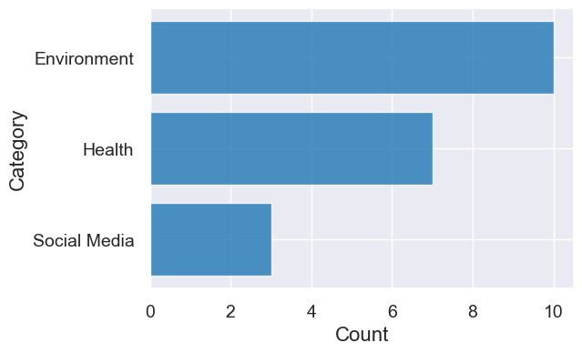
categories = make_array('Economic Inequality', 'Data and AI Impact', 'Climate Change')
counts = make_array(7, 3, 10)
question_categories = Table().with_columns(
         'Category', categories,
         'Count', counts)

question_categories
| Category | Count |
|---|---|
| Economic Inequality | 7 |
| Data and AI Impact | 3 |
| Climate Change | 10 |
question_categories = question_categories.sort('Count', descending=True)
question_categories
| Category | Count |
|---|---|
| Climate Change | 10 |
| Economic Inequality | 7 |
| Data and AI Impact | 3 |
question_categories.barh('Category', 'Count')

print('Num categories', question_categories.num_rows)
print('Number of survey responses', sum(question_categories.column('Count')))
Num categories 3
Number of survey responses 20
Question: Add a column with the proportion of questions touching on each category.
total_count = sum(question_categories.column('Count'))

question_categories = question_categories.with_columns(
    "Proportion", question_categories.column("Count") / total_count)

question_categories
| Category | Count | Proportion |
|---|---|---|
| Climate Change | 10 | 0.5 |
| Economic Inequality | 7 | 0.35 |
| Data and AI Impact | 3 | 0.15 |
3. Greenland climate data#
You can explore this dataset and more data from National Snow and Ice Data Center here.
greenland_climate = Table.read_table('data/climate_upernavik.csv')
greenland_climate.show(5)
| Year | Month | Air temperature (C) | Sea level pressure (mbar) | Precipitation (millimeters) |
|---|---|---|---|---|
| 1873 | 9 | 0.4 | 9999.9 | 15 |
| 1873 | 10 | -5.3 | 9999.9 | 34 |
| 1873 | 11 | -9.4 | 9999.9 | 30 |
| 1873 | 12 | 999.99 | 9999.9 | 29 |
| 1874 | 1 | -29.6 | 9999.9 | 9 |
... (1360 rows omitted)
greenland_climate.num_columns
5
greenland_climate.num_rows
1365
We can print out the column labels so they’re easy to copy and paste.
greenland_climate.labels
('Year',
 'Month',
 'Air temperature (C)',
 'Sea level pressure (mbar)',
 'Precipitation (millimeters)')
Sometimes the column names may be cumbersome and we may want to shorten them.
greenland_climate.relabeled('Precipitation (millimeters)', "Precip (mm)")
| Year | Month | Air temperature (C) | Sea level pressure (mbar) | Precip (mm) |
|---|---|---|---|---|
| 1873 | 9 | 0.4 | 9999.9 | 15 |
| 1873 | 10 | -5.3 | 9999.9 | 34 |
| 1873 | 11 | -9.4 | 9999.9 | 30 |
| 1873 | 12 | 999.99 | 9999.9 | 29 |
| 1874 | 1 | -29.6 | 9999.9 | 9 |
| 1874 | 2 | -19.6 | 9999.9 | 22 |
| 1874 | 9 | 0.1 | 1010.7 | 68 |
| 1874 | 10 | -5.4 | 1002.7 | 24 |
| 1874 | 11 | -8 | 1010.5 | 15 |
| 1874 | 12 | -8.4 | 1005.1 | 69 |
... (1355 rows omitted)
Remember that changes will not persist unless we reassign the updated table to the original name greenland_climate:
greenland_climate.show(3)
| Year | Month | Air temperature (C) | Sea level pressure (mbar) | Precipitation (millimeters) |
|---|---|---|---|---|
| 1873 | 9 | 0.4 | 9999.9 | 15 |
| 1873 | 10 | -5.3 | 9999.9 | 34 |
| 1873 | 11 | -9.4 | 9999.9 | 30 |
... (1362 rows omitted)
greenland_climate = greenland_climate.relabeled('Precipitation (millimeters)', "Precip (mm)")
greenland_climate
| Year | Month | Air temperature (C) | Sea level pressure (mbar) | Precip (mm) |
|---|---|---|---|---|
| 1873 | 9 | 0.4 | 9999.9 | 15 |
| 1873 | 10 | -5.3 | 9999.9 | 34 |
| 1873 | 11 | -9.4 | 9999.9 | 30 |
| 1873 | 12 | 999.99 | 9999.9 | 29 |
| 1874 | 1 | -29.6 | 9999.9 | 9 |
| 1874 | 2 | -19.6 | 9999.9 | 22 |
| 1874 | 9 | 0.1 | 1010.7 | 68 |
| 1874 | 10 | -5.4 | 1002.7 | 24 |
| 1874 | 11 | -8 | 1010.5 | 15 |
| 1874 | 12 | -8.4 | 1005.1 | 69 |
... (1355 rows omitted)
Data cleaning#
Hmmmm… those 999.99 and 9999.9 values should look really odd. If you read the documentation for this dataset, it says that they recorded 999.99, and 9999.9 when there are missing values in the columns Air temperature (C), and Sea level pressure (mbar) columns respectively.
Let’s clean this dataset up by removing all rows with missing values (we will revist this assumption for data cleaning later on in the class and talk about alternatives).
We can see these missing values by checking for the min and max:
min_temp = min(greenland_climate.column('Air temperature (C)'))
max_temp = max(greenland_climate.column('Air temperature (C)'))
print('min temp:', min_temp, 'max temp:', max_temp)
min temp: -30.8 max temp: 999.99
We’ll now just remove the rows with those values using where.
tidy_greenland = greenland_climate.where('Air temperature (C)', are.not_equal_to(999.99))
tidy_greenland = tidy_greenland.where('Sea level pressure (mbar)', are.not_equal_to(9999.9))
tidy_greenland
| Year | Month | Air temperature (C) | Sea level pressure (mbar) | Precip (mm) |
|---|---|---|---|---|
| 1874 | 9 | 0.1 | 1010.7 | 68 |
| 1874 | 10 | -5.4 | 1002.7 | 24 |
| 1874 | 11 | -8 | 1010.5 | 15 |
| 1874 | 12 | -8.4 | 1005.1 | 69 |
| 1875 | 1 | -15.6 | 1009.4 | 17 |
| 1875 | 2 | -19.7 | 1005.5 | 63 |
| 1875 | 3 | -25.9 | 1016.2 | 77 |
| 1875 | 4 | -14.7 | 1017.9 | 40 |
| 1875 | 5 | -9.6 | 1016.3 | 12 |
| 1875 | 6 | -0.4 | 1008.1 | 1 |
... (1249 rows omitted)
Q: How can I count the number of rows I just dropped because they have missing values?
num_dropped = greenland_climate.num_rows - tidy_greenland.num_rows
num_dropped
106
Remember: Never repeat yourself! Add new variables to avoid recomputing the same value.
temps = tidy_greenland.column('Air temperature (C)')
min_temp = min(temps)
max_temp = max(temps)
print('min temp:', min_temp, 'max temp:', max_temp)
min temp: -30.8 max temp: 8.9
4. Visualizations#
We’ve been using bar charts for awhile now. In the plot below:
x-axis : Count (numerical variable)
y-axis: Categories (categorical variable)
question_categories.barh('Category', 'Count')
# Our package will throw an error if the x-axis is not a numerical variable
question_categories.barh('Count', 'Category')
---------------------------------------------------------------------------
ValueError                                Traceback (most recent call last)
Cell In[33], line 2
      1 # Our package will throw an error if the x-axis is not a numerical variable
----> 2 question_categories.barh('Count', 'Category')

ValueError: The column 'Category' contains non-numerical values. A plot cannot be drawn for this column.
Question: What’s the relationship between the year and the temperature?
tidy_greenland.show(3)
| Year | Month | Air temperature (C) | Sea level pressure (mbar) | Precip (mm) |
|---|---|---|---|---|
| 1874 | 9 | 0.1 | 1010.7 | 68 |
| 1874 | 10 | -5.4 | 1002.7 | 24 |
| 1874 | 11 | -8 | 1010.5 | 15 |
... (1256 rows omitted)
tidy_greenland.plot('Year', 'Air temperature (C)')
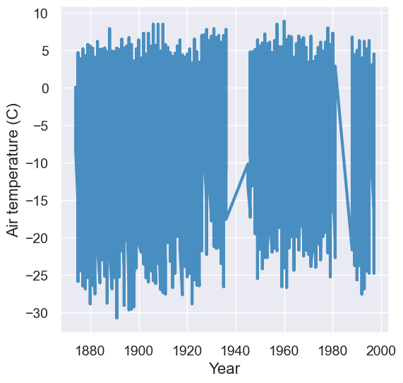
Yikes! We see really big fluctuations! What’s going on here? Why are there these huge fluctuations?
A: We probably need to account for seasonal differences in temperature.
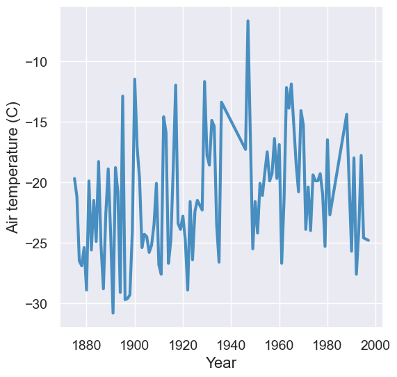
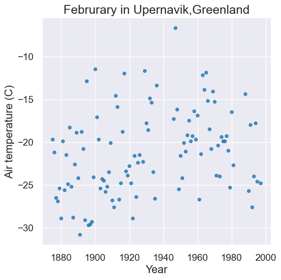
Let’s just look at February for now!
feb = tidy_greenland.where('Month', are.equal_to(2))
feb.plot('Year', 'Air temperature (C)')
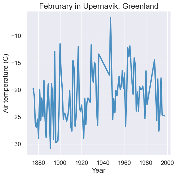
We can add a title to make it more meaningful for viewers of our visualization. To do this, store the result of calling plot into a new variable, and then use our plot annotation methods on it.
plot = feb.plot('Year', 'Air temperature (C)')
plot.set_title('Februrary in Upernavik, Greenland')
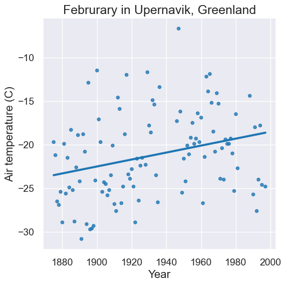
We could look at the same data with a scatter plot instead of a line plot. A line plot draws lines to connect points in our visualization.
plot = feb.scatter('Year', 'Air temperature (C)')
plot.set_title('Februrary in Upernavik,Greenland')
You might be asking yourself, “Has the average temperature during February gone up over time? Can we see climate change here?” This previews “hypothesis testing” which we will tackle later in the course.
Spoiler: Yes! We can add trend lines to our scatter plots (which we’ll talk about in much more detail later).
plot = feb.scatter('Year', 'Air temperature (C)', fit_line=True)
plot.set_title('Februrary in Upernavik, Greenland')
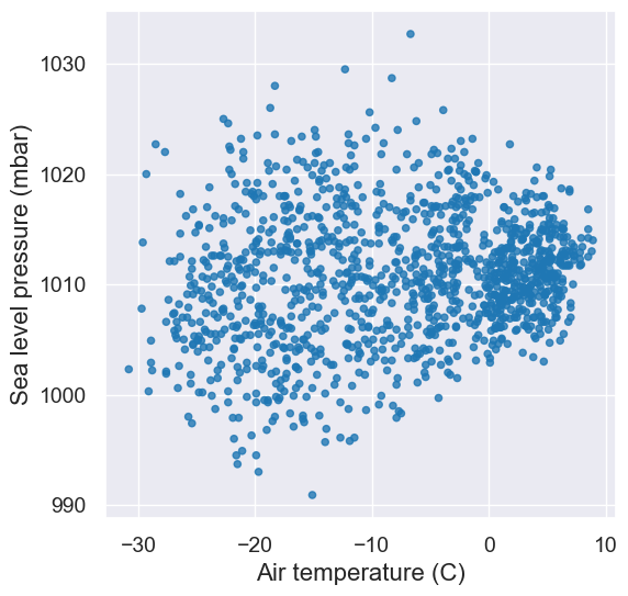
Let’s use a scatter plot to examine the relationship between other numerical variables.
tidy_greenland.scatter('Sea level pressure (mbar)', 'Precip (mm)')
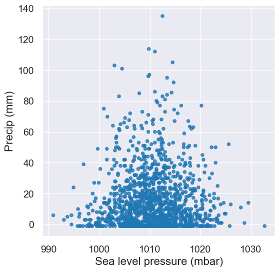
It looks like there’s not really a relationship between precipitation and sea level pressure. This is ok! Scatter plots are also very usual tools to tell us quickly when there are not correlations.
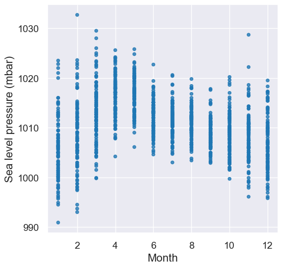
Here are two more scatter plots. Correlations this time?
tidy_greenland.scatter('Month', 'Sea level pressure (mbar)')
tidy_greenland.scatter('Air temperature (C)', 'Sea level pressure (mbar)')
Let’s return to temperature and look at other months than Feburary.
plot = tidy_greenland.where("Month", are.equal_to(8)).scatter('Year', 'Air temperature (C)', fit_line=True)
plot.set_title('August in Upernavik, Greenland')
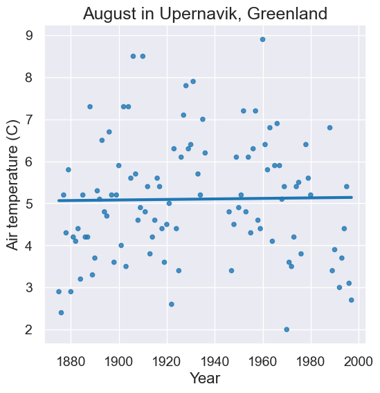
Interesting, that’s flatter than the trend line for February? What about other summer months???
Interactive Widget to Examine Every Month#
We’re so close to having all the Python we need to create interactive visualizations, but we can’t resist throwing one in here to look at air temperatures in each month. Enjoy, but don’t sweat the code – we’ll get there soon!
# A function that plots the temperates for one month of the year (0-11).
def temps_for_month(month):
    plot = tidy_greenland.where('Month', are.equal_to(month)).scatter('Year', 'Air temperature (C)', fit_line=True)
    plot.set_title('Month ' + str(month) + ' in Upernavik, Greenland')
    plot.set_ylim(-30,15)

interact(temps_for_month, month=Slider(1,12))