Data Analysis & Plotting
Today, we will discuss the following:
Using the data structures we’ve learned about to perform some exploratory data analysis
Using matplotlib to create plots
Premise
You are a talent scout for a big English football (soccer) club. The club you work for has a good defense, but a weak offense. So, you’ve been tasked with identifying a star striker to help score more goals! You decide to identify candidates in a data-driven manner.
Peaking into the data
You’ve managed to procure some CSV files containing stats on every player in the league for 3 prior seasons – 2018-19, 2019-20, and 2020-21. Let’s take a look at the first few lines of one of these files using the head command in the terminal.
!head seasonStats/season2018-19.csv
Name,Goals,Passes,Fouls
Rolando Aarons,0,0,0
Abdul Rahman Baba,0,0,0
Tammy Abraham,0,0,0
Adrián,0,0,0
Adrien Silva,0,79,0
Benik Afobe,0,0,0
Sergio Agüero,21,771,21
Daniel Agyei,0,0,0
Soufyan Ahannach,0,0,0
Reading the file into a dictionary
The files look messy to us, but the first line (called the header) defines what values to expect in each column. So, we see that the 1st column in the file corresponds to the names of the players, the 2nd column is the number of goals they scored in the season, the 3rd column is the number of passes they completed, and the 4th is the number of fouls they committed. Let’s now write a function that reads in such files and produces a dictionary mapping player names (keys) to goals (values).
def readFile(filename):
    """
    Function that takes in a file name and
    outputs a dictionary mapping player names
    to the number of goals they scored.
    """

    nameGoalDict = {}

    with open(filename) as file:

        # the first line of the file is just the header
        # describing what each column is so we read it in
        # before we iterate over the rest of the file
        header = file.readline()

        # we now iterate over the rest of the file
        # and add key-value pairs of name: goals
        for line in file:

            line = line.strip().split(',')
            nameGoalDict[line[0]] = int(line[1])

    return nameGoalDict

season1Dict = readFile("seasonStats/season2018-19.csv")
season2Dict = readFile("seasonStats/season2019-20.csv")
season3Dict = readFile("seasonStats/season2020-21.csv")
# to get a sense of how many players we're trying to pick from
# we'll also print out the length of one of these dictionaries
print(len(season1Dict))
884
Sorting players by number of goals scored
Now that we have all these dictionaries, we’d like to use them to determine who the top goal scorers are each season. For this, we sort the dictionaries by value.
def returnGoals(nameGoalTuple):
    """
    Function that returns the number of goals scored
    from a given tuple.
    """
    return nameGoalTuple[1]

sortedGoals1 = sorted(season1Dict.items(), key=returnGoals, reverse=True)
sortedGoals2 = sorted(season2Dict.items(), key=returnGoals, reverse=True)
sortedGoals3 = sorted(season3Dict.items(), key=returnGoals, reverse=True)
#sortedGoals1
Using maplotlib to visualize the data
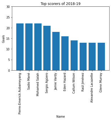
Now from these sorted lists of tuples, we can start to form a short list by looking at the top 10 goal scorers in each season. So let’s focus on the 2018-19 season for now. We can print the first 10 elements of the sorted list of tuples, but it’s not very visually appealing to view results that way. Instead, let’s try to make a bar chart of the top 10 goal scorers in 2018-19.
# let's first look at some basic matplotlib functionality
import matplotlib.pyplot as plt

# we can create a simple line plot as follows
# this corresponds to points (1,10), (2,14), etc
plt.plot([1, 2, 3, 4], [10, 14, 15, 18])
plt.show()
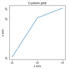
Decorating a Plot
We can specify length, width, title, name of labels etc to decorate our plot.
# a more advanced example where we customize the line plot
plt.figure(figsize=(4, 4)) # create a 4 by 4 figure
plt.plot([0, 5, 10], [4, 12, 14])
plt.xticks([0, 5, 10],          # x values of axis ticks
           ['x1', 'x2', 'x3'])  # values to show for ticks

# rotate the y tick labels, because are shown horizontally
plt.yticks([4, 12, 14], ['y1', 'y2', 'y3'], rotation=90)

# axis labels and title
plt.xlabel("x axis")
plt.ylabel("y axis")
plt.title("Custom plot")
plt.show()
Creating a bar plot
Let’s return to our initial goal of creating a bar graph that illustrates the top goal scorers.
# Going back to our initial goal of creating a bar plot

# the names of the top ten scorers will form our labels
# for the x axis
topTenNames = [item[0] for item in sortedGoals1[0:10]]

# the x axis values are just 0-10 to provide even spacing for each bar
xValues = list(range(10))

# the y axis values are determined by the number of goals scored
yValues = [item[1] for item in sortedGoals1[0:10]]

# Create a new figure:
plt.figure()
# Create a bar chart
plt.bar(xValues, yValues)

# Set x tick labels from names
# rotate by 90 so labels are vertical and do not overlap
plt.xticks(xValues, topTenNames, rotation=90)
# Set title and label axes
plt.title("Top scorers of 2018-19")
plt.xlabel("Name")
plt.ylabel("Goals")
plt.ylim([0, 30])

# Show our chart:
plt.show()
# if you'd like to save the plot as a PDF:
# this line just ensures the longer labels on the x axis don't get cut out
# plt.tight_layout()
# plt.savefig('topScorers.pdf')
Using sets to find the intersection of players that do well across all seasons
We can make similar visualizations for the other seasons. However, we’d like to recruit a player that’s consistent across all 3 seasons. So let’s try to get a short list of players that appear in the top 10 in all 3 seasons. This is a good place to make use of sets and the intersection() operator!
topTen1 = [item[0] for item in sortedGoals1[0:10]]
topTen2 = [item[0] for item in sortedGoals2[0:10]]
topTen3 = [item[0] for item in sortedGoals3[0:10]]
consistentPlayers = set(topTen1) & set(topTen2) & set(topTen3)
consistentPlayers
{'Jamie Vardy', 'Mohamed Salah'}
And that’s our final short list of players who we can try to recruit to score more goals for our team!