Lab 6: What’s In A Name?
Contents
Lab 6: What’s In A Name?
Objectives
In this lab we will look at data from the Social Security Administration 1 about the popularity of baby names from 1880-2021. In doing so, you will gain experience with the following:
Reading data from CSV (common separated values) files
Using dictionaries in Python
Plotting data using Python’s
matplotliblibrary
Understanding the Data
The Social Security Administration collects data on the relative frequency of given names in the population of U.S. births. In the data/namesDataAll.csv data file, you will find comma-delimited records containing name data. Each line has the format “year,name,sex,number” where year is 1880 to 2021, name is 2 to 15 characters, sex is M (male) or F (female), and number is the number of occurrences of the name. The data is sorted numerically by year, then by sex, and finally by the number of occurrences of the name in descending order. When there is a tie on the number of occurrences, names are listed in alphabetical order. The data only includes names with at least 5 occurrences.
For reference, here are the first few lines of the file:
1880,Mary,F,7065
1880,Anna,F,2604
1880,Emma,F,2003
1880,Elizabeth,F,1939
1880,Minnie,F,1746
1880,Margaret,F,1578
Getting Started
Before you begin, clone this week’s repository in the usual manner:
git clone https://evolene.cs.williams.edu/cs134-labs/23xyz3/lab06.git ~/cs134/lab06
where your CS username replaces 23xyz3.
You will find several CSV files in the data folder of your repository. The primary CSV file we will be using is data/namesDataAll.csv. This file contains data as described above. The file data/namesData.csv is a smaller data file containing only the data from 2000 to 2021 and can be used for testing purposes.
Part 0: Configuring your machine for matplotlib
IMPORTANT: Before starting this lab, you will need to have either installed matplotlib on your personal computer (as described in the setup guides on the course website), or you will need to setup and use a virtual environment. The lab machines are already configured for you.
Part 1: Analyzing Data
Review names.py. Before writing any code, review the
names.pymodule. Notice that we have given you the headers for each of the functions you must implement, as well as a few doctests associated with each function. We’ve marked places that require your attention with apassstatement; replace eachpasswith your own code. We have provided some initial doctests to help you debug, but you may want to create your own additional tests as you evaluate your functions.Read the SSA name data. We are ready to start coding! Start by implementing the function
readNames(filename)innames.py. When given the filenamedata/namesDataAll.csv, this function should read the contents of that CSV file. It should create and return a new dictionary of dictionaries with integeryearsas keys and dictionaries as values in the “outer” dictionary, and stringnameas keys and integerfrequenciesas values for the “inner” dictionaries. Make sure you convert both the years and frequencies to integers. Note that if multiple entries exist for a name in a given year (such as an entry for the same name as both M and F), the totals for the name should be summed in the dictionary. A visualization of a portion of this dictionary is shown below: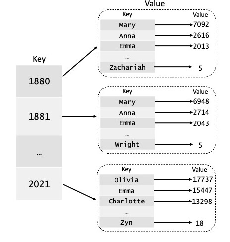
Compute the popularity of a name. Next, implement the
nameFrequency(yearDB, name)function innames.py. Given a dictionary of dictionariesyearDB, such as the one returned byreadNames(), and a stringname, return a list of frequencies (ints) for the given name across all years (1880-2021 fornamesDataAll.csvdata set). If a name does not exist in a given year, you should enter a total of 0 for that year in your list.To demonstrate that your implementation of
nameFrequency()is functional, please add two new doctests of your own design to the function.
Part 2: Plotting Data
Plot the frequencies. Implement the function
plotNameFrequency(yearList, freqList)innames.py. This method takes a list of yearsyearListand a list of integer frequenciesfreqList, such as the one returned bynameFrequency(). The function should plot the year (x-axis) vs. the frequency of the name (y-axis) using line-style plotting to suggest trends.You will want to use code similar to the following to actually generate the plot, where
xValuesandyValuesare lists. Update the title of the plot to be something reasonable:plt.title('The Title of Your Plot') plt.xlabel('Year') plt.ylabel('Frequency') plt.plot(xValues, yValues, 'b-') plt.savefig("nameFreq.png")
When plotted correctly, the graph showing the frequency of the name “Jeannie” over time will have the following form:
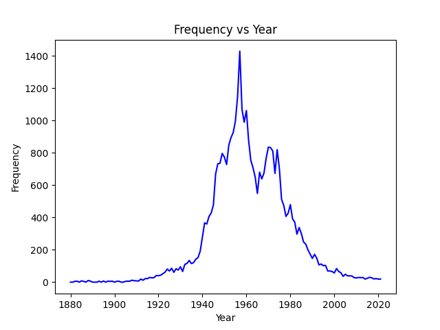
You can verify that your code produces the same figure for “Jeannie” by uncommenting the lines in the
if __name__ == "main"block at the bottom ofnames.py. The filenameFreq.pngwill be generated in yourlab06directory. Try some other names!
Part 3: Exploring Letter Frequencies
Now we will explore the frequency of letters that appear as the first letter of names.
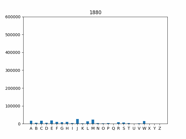
Implement letterFrequency(). Implement the function
letterFrequency(yearDB, year)that takes a dictionary of dictionariesyearDB, such as the one returned byreadNames(), and an integeryear, and returns a list of integer frequencies indicating how many names start with each letter. Remember to take the frequency of the name into account, as well; that is, if “Mary” shows up 50 times, the letter “M” should be incremented by 50 when processing “Mary”. Be careful with this step!The resulting list returned by your function should have 26 entries corresponding to the frequency of each letter in the alphabet in alphabetical order. For example, in your resulting list, entry 0 should correspond to the frequency of names that start with “A”, index 1 should correspond to the frequency of names that start with “B”, and so on. You may assume that every name starts with a capital letter.
Implement the
plotLetterFrequency(letterFreqList)function. This function takes a list of integer letter frequenciesletterFreqList, such as the one returned by theletterFrequency()function. Using matplotlib, create a bar graph that shows the letters of the alphabet (A-Z) on the x-axis and frequency of each letter (corresponding to the number of names that start with that letter) for a given year on the y-axis.You will want to use code similar to the following to actually generate the bar graph using matplotlib, where
xValuesandyValuesare lists. Update the title of the plot to be something reasonable:plt.figure(figsize = (10, 5)) plt.bar(xValues, yValues, width = .5) plt.title('The Title of Your Plot') plt.xlabel('Letter') plt.ylabel('Frequency') plt.savefig("letterFreq.png")
Uncomment the code in the
if __name__ == "main"block to generate the plot for 2020. If you are curious, you can try other years, too. Your final output for the year 2020 should look like this: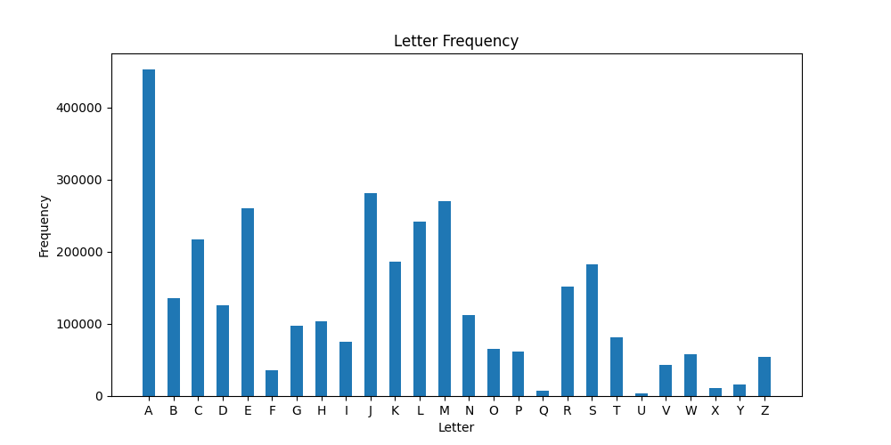
Animate your bar graph. As a final step, let’e explore how the frequency of first letters has changed over time. One interesting way to investigate this trend is by using an animated graph that cycles through the years in our data set. The code is provided for you to handle the animation. All you need to do is uncomment the remaining lines in the
if __name__ == "main"block at the bottom of the file to generate the animation.Your final output should look like this:
Test your code. As you complete the steps outlined above, you should run your code as a script from the Terminal. Make sure you uncomment the appropriate steps in the
if __name__ == "main"block at the bottom of the file as you go. The comments indicate which lines go with each part of the lab. This will test your code. Note: Please recomment the bottom two lines inif __name__ == "main"before pushing your work.python3 names.py
As always, make sure you add, commit, and push your work—
names.py—to the server.
Possible Extensions
There are several possible extensions that you can explore using the provided data. For example, do any names appear every year? What is the most popular name across all years? How does the animated graph of letter frequencies change if you plot percentages rather than raw totals? Make sure you document and describe any extensions in your code using comments. Also, please do not change any of the required functions as you implement optional extensions. Indicate using comments what each extension does.
Submitting your work
When you’re finished, commit and push your work (names.py) to the server as in previous labs. (We will check to see that your script generates the desired plots; you need not submit the png files.)
Functionality and programming style are important, just as both the content and the writing style are important when writing an essay. Make sure your variables are named well, and your use of comments, white space, and line breaks promote readability. We expect to see code that makes your logic as clear and easy to follow as possible. Python Style Guide is available on the course website to help you with stylistic decisions.
Do not forget to add, commit, and push your work as it progresses! Test your code often to simplify debugging.