This week's lab will be devoted to learning the basics of how to work with graphics on the web. There are an enormous number of tricks, techniques, skills and concepts that are required to truly claim "expertise" in graphic design for the web. We will just scratch the surface this week. The main topic in this lab will be the use of Adobe Photoshop, an application designed for the processing of digital images. The goal is for you to become sufficiently proficient with Photoshop to prepare and include scanned digital images in a web page.
Even concentrating on Photoshop alone, we will only be able to cover a small subset of the features one might use. For those who want to learn more on their own, try the Ultimage Photoshop page (don't you like humility in a web page creator). Among other things, it has a list of links to web-based Photoshop tutorials.
Again, the lab is divided into two parts. Part I is a tutorial which we hope you will all finish during the lab period. You will, however, probably have to hurry a bit to accomplish this. This week's secheduled labs promise to be a "three ring circus". While your focus will be on the completion of the image editing tasks described below, we will also be having you briefly work individually with one of the TA's to learn how to use the image scanner available in the lab. As a result, this week's Part II starts with a few guided exercises we would have included in Part I if we weren't afraid you would run out of time. In addition, Part II asks you to complete some more independent work intended to give you further experience with Photoshop.
To prepare for lab it would be useful to skim the entire description of Part I. In particular, you should carefully read the material up to the section entitled "Modifying an Image's Size"
If you have questions about the instructions for either part of this lab, you are encouraged to ask them through the discussion area for this lab in the course discussion forum. You may be lucky and find that your question has already been asked and answered.
First, you will learn to use Photoshop to prepare image files appropriate for inclusion in a web page. To give you something to work with, we will provide several sample images we've obtained using a scanner or a digital camera. You will access these files from a folder within the "Courses" volume of the "Cider Press" file server (which will be automatically available on any of the machines in our Macintosh lab).
After you modify these images following the instructions below, you will have to save the results of your efforts to a folder in your file server account. So, before you begin using Photoshop you should:
Now, work you way through the following procedures:
You will find an icon for the PhotoShop application in the Launcher on our lab machines once you have selected the "CS 105" box at the top of the launcher. To start PhotoShop, simply click on this icon.
If you wish to use PhotoShop from machines outside our lab, you will have to be a bit careful to get the correct version. We will be using version 5.0 of PhotoShop in lab. The computer center still has copies of versions 2.5 and 3.0 on its Greylock server. To get 5.0 you need to connect to the server "Helen" in the "Williams" zone, log in with your Netware account and choose the volume "Macinstosh Applications". You will still need to be careful. They have both versions 4.0 and 5.0 of Photoshop on this server. Actually, at the risk of some confusion due to changes in the interface, you may want to get version 4.0 if the machine you are using is not loaded with memory and disk space.
We will try to make a copy of version 5.0 available to you in the "Launchables" folder of the "Public" volume of our "Cider Press" file server as well. As I write this, however, there is insufficient disk space on Cider Press.
Once Photoshop starts:
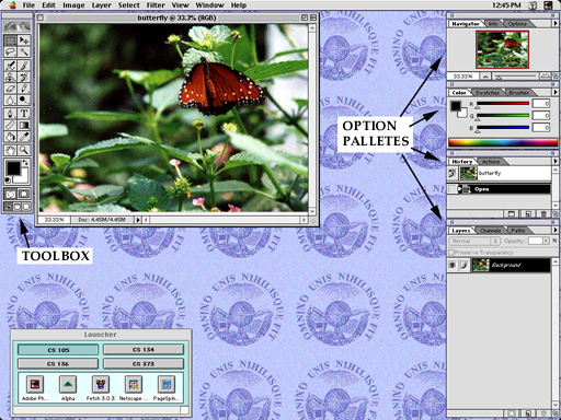
At this point, you screen should look very much like the image shown below:
You will quickly notice that Photoshop presents you with more tool-filled windows than you might be used to. To get comfortable with all these windows, let's take a quick tour.
In addition to the window(s) for the images being processed, Photoshop displays two types of windows:
 The toolbox is initially located on the left side of your
screen.
If it (or any other window) gets in your way, however, you
can drag it to a new location using the titlebar.
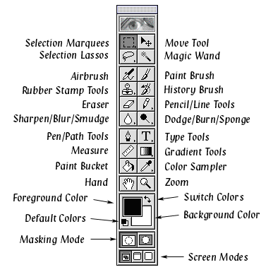
The toolbox is divided into seven regions of tool icons
(of unequal size).
These regions contain icons used to select tools for drawing
and editing operations and controls for the colors used when drawing.
The toolbox is initially located on the left side of your
screen.
If it (or any other window) gets in your way, however, you
can drag it to a new location using the titlebar.
The toolbox is divided into seven regions of tool icons
(of unequal size).
These regions contain icons used to select tools for drawing
and editing operations and controls for the colors used when drawing.
If you have used any Macintosh drawing program, some of the icons in this toolbox should look familiar:
You will notice a small arrowhead in the bottom right corner of each of these tool icons. When an icon in the PhotoShop toolbox contains this little arrow head, it indicates that several other related tools are actually hidden under the displayed tool. When you depress the mouse on such a tool, a pull-out menu displaying the other tools appears and you can select whichever tool is most appropriate for your task from this menu.
Although I have grouped these two tools together because of many similarities in their behavior, Photoshop actually groups the pencil tool and the line tool in one pull-out menu.
The toolbox also contains some icons that may not be so familiar. We will be using three of these tools during this lab:
Many of the painting and drawing operations Photoshop provides depend on the current settings of the foreground and background colors. Near the bottom of the toolbox you will find a region used to control these colors.
Clicking on either the large black or white square in this region will cause the Macintosh to display a color selection dialog box from which you can pick a new foreground color (if you clicked in the black square) or a new background color (if you clicked in the white square). The colors of these squares will change to reflect the current foreground and background.
To see how this works:
To see the effect of changing the foreground color, you have to do a little drawing. In later parts of this tutorial we will crop the butterfly picture to eliminate all but the area around the butterfly. Since the lower left corner of the picture will be discarded later, it is safe to do some scribbling on it now.
Clicking on the curved double-ended arrow exchanges the foreground color and the background color. Clicking on the miniature replica of the black and white squares switches to the default foreground and background (black and white). You should click on these small squares now to restore the default black foreground color.
Option palettes are initially located along the right edge of the screen. The palettes provide the means to set options that control the behavior of the various tools. For example, when you first start the program, the "Color" palette appears in the window one down from the upper right corner of the screen. Varying the positions of the sliders shown in this pallete provide an alternate mechanism for selecting foreground and background colors.
We will not try to describe all the options available through these palettes at this point. That would take far too long. Instead, we will introduce you to general mechanisms for controlling the palettes themselves.
Notice that each palette displays a set of labeled "tabs" just below the title bar. For example the tabs in the colors palette are labeled "Colors", "Swatches" and "Brushes". The tabs are used to switch between various option palettes located in a single window. For example:
Double-clicking on these tabs has a different effect. It collapses the palette window so that it takes up less screen area. Double-clicking a tab in a collapsed palette window restores it to its full size. Try it!
Like the toolbox, you can always move the palettes out of your way when necessary. If the palettes are really in your way, you can close them completely by clicking on the close box at the left end of the title bar. If you need to bring a closed palette back, just select the appropriate "Show" item from the "Palettes" sub-menu of the "Windows" menu.
The butterfly image you opened using Photoshop is a bit too large to fit nicely on a web page and the butterfly itself is a bit small (relative to the rest of the image). We will fix this using Photoshop's features for cropping and image resizing.
When we say the original image is too large, we are not just talking about good taste. When used on the web it is important to consider an image's size not just in inches but in bits. How many pixels does the image contain? The more pixels, the longer it will take to transmit the picture through the network to a remote computer. This can be particularly significant if the remote computer is connected through a modem -- even the fastest modem!
If you look in the lower left hand corner of the window displaying the butterfly you will see the amount of computer memory Photoshop is using to hold this image. It should show that the image requires 4.44 million 8-bit units of memory.
To see why the image is so large:
As a first step in reducing the number of pixels in this image we will crop the image so that it includes just the butterfly and a little bit of the surrounding greenery. To do this:
You are ready to crop the picture. First, however, let's see what options you have before you take this drastic step.
As you move the mouse around the window, the cursor displayed chages to indicate the action PhotoShop would perform if you were to depress the mouse button at that screen position.
The cursor becomes a two-headed arrow drawn on a diagonal.
PhotoShop adjusts the size of the cropping box so that the corner you selected follows the mouse.
You should discover that:
By this point you will probably have completely messed up the selection I asked you to make initially. So, you really don't want to crop. To cancel the cropping operation:
Next, repeat the steps used to draw the original cropping box.
At this point, you should save your modified image to your CS bull account.
Throughout this lab you should save your work after each major step is completed.
Now, the cropped image occupies only a fraction of the screen. If you look at the title bar of the image window, you will notice that it includes the picture's name and something like "33.3%". The "33.3%" indicates that each pixel on the screen is actually being used to take the place of a 3x3 square of pixels in the actual image. To see the actual details of the image we should enlarge the display so that each screen pixel corresponds to one image pixel.
This can be done using the zoom tool:
If you look carefully, you will notice that we forgot to dust before scanning in this image. In the dark background near the upper left corner of the image there are little specks that look like dust (if they aren't clear, zoom in on that portion of the picture a bit and then return to the 1:1 ratio). We will now process the image to reduce these flaws and learn how to use Photoshop's tools for selection in the process.
Photoshop includes a "filter" designed to deal with imperfections like the dust in our picture. It is called "Dust & Scratches". To see how it works:
The "Dust & Speckles filter works by blurring adjacent pixels together. This is great for removing dust, but as you should have noticed it also makes the details in the image look blurry. Accordingly, to apply it effectively it must be applied to carefully selected subregions of the image rather than the entire image.
We will show how to do this using several of Photoshop's selection tools.
The Magic Wand tool lets you select groups of adjacent pixels of similar color. We will use it to select the dark region at the upper left of the picture and then you will apply "Dust & Scratches" to just that region.
Now that you are more sensitive about dust, take a look at the butterfly's wings. There are nice white spots on the black edges, but there are also some smaller white spots on the dark red regions -- dust again! If you use "Dust & Speckles" on any large portion of the red region of the wings, you will blur the veins on the wings. So instead, we will work with more precise selections. You may find it helpful to zoom in on the dust a bit for this work.
At this point, the task of cleaning up specks of dust one at a time may seem a bit tedious. We can speed things up by selecting several regions at the same time and applying the filter to all of them at once.
Photoshop includes a filter than can be used to make a picture look sharper by increasing the contrast. This filter is usually safe to apply to the entire image.
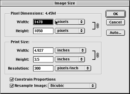
This is it, the last step. Actually this is two steps in one. You will complete your work by resizing the image and adjusting its resolution.
You may recall that this image is stored using 300 pixels per inch. This is much higher than what most monitors can display. For printing, 300 pixels per inch might be appropriate, but for screen display in a web browser 72 pixels per inch is better and requires far less transmission time.
Adobe Photoshop combines the setting of image resolution with image size so we will take care of both now.
Also make sure that "Bicubic" is selected as the resampling method. This is the method PhotoShop will use to generate the new set of pixels used to represent the image after resizing.
To make your image usable on a web page, we must save it in either GIF or JPEG format. We will do both -- JPEG first:
The JPEG format in which you just saved your butterfly image is probably the most appropriate format for a "natural" image. The original butterfly image we started with was saved in a format peculiar to the Photoshop program. Photoshop's format preserves all the details of the image, but the JPEG version requires roughly one tenth the space in the computer's memory. A third file format one could use is the GIF format.
The GIF option was not available when you saved your JPEG file because GIF files can only be used with 8-bit color images and you have been working with 24-bit color. In fact, you had to work with 24-bit color. The filters we used are not available if an image is stored in 8-bit color.
Photoshop makes it easy to switch back an forth between 24-bit and 8-bit, but you must recognize that when you go from 24-bit to 8-bit, information is lost. Although you can go back to a 24-bit representation of the image, it won't be the same image as the original 24-bit representation.
You should notice a significant change in your picture after this change. The program has done the best job it can of approximating the original with the system palette, but the difference is noticeable. Photoshop can do better if you let it pick the best set of 256 colors it can find.
Congratulations. You are finished preparing the butterfly image.
Note that when you saved in GIF format Photoshop didn't require you to select an image quality. This is because while GIF only allows you to store 256-color images it stores them exactly. While the step of switching your image from RGB color (24 bit color) to indexed color (8-bit color) may have reduced the quality of the image, there is no additional loss of quality involved in the process of saving it as a GIF image. This is not the case with JPEG images.
As a result of this difference there are situations where it is preferable to use GIF. If you have an image with only a small number of colors (a pie chart produced using a spread sheet for example), saving it as a GIF will enable you to save space without any loss of quality.
Having said all this about the relative advantages of GIF and JPEG, we also need to talk about the third format you used for saving files above, PhotoShop format. The advantages of this format is that it preserves the quality of your image, save details of not just the image but items you have used to manipulate the image (like selections) and can be quickly read and written by the PhotoShop application.
The disadvantage of this format is that the files produced are often enormous.
So, while it is wise to keep images in this format while you are editing them. Once you have produced a final gif or jpeg version of the image you should delete them (or risk filling up our entire file server). So,
Remember the page for CS 105 labs you created last week? Well, I'd like you to create a new page now and add a link to that page to your CS 105 labs page. Start up Pagespinner to create the new page. Give the new page a title and heading indicating that it is a gallery for the pictures you produced in your second CS 105 lab. Then, save the new page in your CS bull account's "www" directory. To make it easy for the graders to find this new page, please name the file "gallery.html". Also, make sure you add a link from your "cs105labs.html" page to your image gallery page so that we can find it using a browser. The text of the link should indicate that it will lead to the images you produced in lab 2.
Now, let's actually add the cropped butterly image to your gallery page. To do this:
Now save your new web page and view it through Netscape Navigator to make sure that the image appears correctly.
So far, we have only used Photoshop to improve an existing image. You can also use the program to create simple graphics for a web page "from scratch". You should be aware that there are plenty of places on the web giving away images (or nearly giving them away). It's nice, however, to know how to make some of them yourself.
Our goal here will be to create a simple "home" button like the one shown below (which won't take you home).
First we will make a basic button, then we will fill in the text.
To begin, get back into Photoshop. Then:
Photoshop provides a mechanism called "Layers" that lets you manipulate your image as if it were drawn of a series of transparent sheets of plastic. Drawing separate portions of an image on such separate layers makes it easy to manipulate one portion of an image without modifying others.
In the Layers option pallete you should now have two boxes labelled "background" and "Layer 1". "Layer 1" is the new layer you just create. It is highlighted indicating that any editing you will perform will effect this layer.
One of the advantages of using Layers is that PhotoShop provides a number of effect that you can apply to the content of a layer. We will add a frame-like border to your button using one of these effects.
Save your button to the "graphics" folder in your CS bull account. Set the "Format" to "Photoshop" in the save dialog box.
To start, restore the default foreground color (black) by clicking on the miniature color squares at the bottom left of the color controls in the toolbox. Now:
To make it easy to manipulate, PhotoShop has placed your text on a separate layer above the background.
Any editing you do in an image with several layers only effects the selected layer. To see this,
PhotoShop allows you to apply special effects to layers.
Congratulations, you made a button. Save it as a JPEG file into your graphics directory. Then, change the mode from RGB-COLOR to indexed color and save it as a GIF file. Compare the quality of the two images and the size of the files to decide which one you want to use.
At the end of the last lab, I asked you to put a "take me to your home page" link on the CS 105 labs page you created. Now, you should replace that textual link with an image link. The textual link was produced by placing the text between an <A> tag with an appropriate HREF attribute and a </A> tag. You can make a link out of the "HOME" button by placing an <IMG> tag whose SRC attribute refers to the image between the same <A> and </A> tags that surrounded your text link.
Try it out.
The open-ended portion of this lab's "Part II" will be organized around images you scan in and the picture we take of you in lab with our digital camera. Basically, we would like you to crop, touch-up or otherwise transform these images using whichever of the techniques you learned in Part I seem appropriate and then include the images in your web page in an appropriate way.
By "appropriate" we mean to encourage you to be as imaginative as you would like in how you edit/transform the pictures and how you use them on your page (emboss yourself, fix your teeth, change you hair color, paste yourself into a scene with Elvis,...). So that we can appreciate your editing/transforming skills, we ask you to include both your edited images and the originals in the "image gallery" page we instructed you to create during Part II. The digital photo can be included on the gallery page "as is".
To give you a slightly larger repertoire of Photoshop techniques to work with, we have included two "guided" (i.e. Part I-like) editing tasks in this week's Part II. Now that you are somewhat familiar with Photoshop, however, the guidance won't be quite as detailed as it was in Part I. Also, since there isn't pressure to get things finished in 75 minutes, you are encouraged to take the time to explore various alternative approaches as you perform these tasks and see which works best. Include the images you produce during these guided exercises in the image gallery created in Part I.
If you have questions about the instructions for this part of this lab, you are again encouraged to ask them through the discussion area for this lab in the course discussion forum.
In the "Lab 2 Images" folder within the CS 105 folder on Cider Press's Courses volume you will find an image named "griffin.jpeg". It is a picture of Griffin Hall. The picture has (at least) two flaws that we would like you to fix: the sky was too gray when it was taken and the camera wasn't quite level. With PhotoShop's help, however, you can turn it into a nice little postcard.
So, copy "griffin.jpeg" to your "graphics" folder. Launch Photoshop and open the image.
Correcting the fact that Griffin is a bit tilted in the original is fairly easy. It can be fixed while cropping the picture. Use the cropping tool to select a rectangular region in the picture as if you were planning to crop right along the foundation of the building. Now, before you do the cropping, position the mouse outside of the cropping marquee, depress the mouse button and drag it around a bit. You will discover you can rotate the cropping marquee. Rotate the marquee so that the edge of the marquee is as close to parallel to the base of the building as you can get it.
Once the edge of the marquee and the edge of the building appear to be parallel, let go of the mouse button. Position the mouse on each of the corners of the cropping marquee and drag these corners as close to the edges of the window as you can. The idea is to crop off as little of the image as possible while keeping the crop rotated enough to straighten out the building. Once the marquee is stretched, press return.
Remember, if you are not happy with the result you can select "Undo" from the "File" menu and try again.
Now, let's make the sky a bit bluer. First, you need to select the pixels that represent the sky. This can be tricky (especially since you want to include the bits of the sky that peek through the trees), but it is good practice using Photoshop's selection tools. There are a number of techniques you may want to try.
Use the magic wand with the shift key depressed to select most of the sky by clicking several times in different regions of the sky. As you do this, you may want to adjust the tolerance that controls how similar a color needs to be to the one you clicked on before the wand will select it. To do this, recall that PhotoShop will display the Magic Wand options pallette if you double-click on the wand tool icon. There is a box in this options palette where you can type a tolerance value. Large numbers make the wand more tolerant when deciding if colors are similar. You can experiment by setting a tolerance value, clicking a portion of the image with the magic wand and then choosing "Undo" from the "Edit" menu if too much gets selected.
Try using the "Grow" item in the "Select" menu to extend the selection. This adds pixels that are adjacent and similar in color to the current selection to the selection. Its notion of "similar in color" can also be adjusted by changing the "tolerance" in the "Magic Wand Options".
Selecting "Similar" from the "Select" menu adds pixels that are similar in color to the current selection whether or not they are adjacent to the current selection. With the tolerance set correctly this can be a good way to get the bits of sky peeking through the trees. Don't forget that you can use the "Undo" button to let you experiment with tolerance values.
You can use the lasso or rectangular selection tool with the shift key depressed to add stubborn pixels. In addition you can use them with the "Option"' key to remove regions that are selected but should not be. For example, suppose you choose "Similar" from the "Select" menu and almost get what you wanted but discover a few pixels from the building are selected. You can hold down the option key and draw a circle around the region that should not have been selected with the lasso to unselect them.
Keep trying until you are happy with the selection. Don't worry if it takes a while. Becoming skillful with the selection tools in Photoshop is one of the keys to using the program effectively.
Once you are happy with the selection, go to the "Image" menu and select "Color balance" from the "Adjust" sub-menu. Use the sliders to increase the "blueness" of the selected region and/or decrease the redness. Try various combinations until the sky looks a bit more like a sunny day. Click "OK", but don't undo the selection yet. First, use the "Hide Edges" item in the "View" menu to get rid of the selection marquee so that you can get a good look at what you have done. If the "horizon" where the new sky meets the tree, ground or building looks a bit too harsh, undo the "Color balance". Then, choose the "Feather" item from the "Select" menu. Roughly, feathering a selection tells the program to smooth out the transition along the edges when you apply an effect to a selection. Enter 3 or 4 for the radius, click "OK" and try adjusting the color again. Remember, you can always undo this adjustment and try another approach if you don't like the results.
Even after you are happy with the sky, don't undo the selection. Instead, choose "Inverse" from the "Select" menu. Now, everything but the sky is selected. We will use this selection to make the brightness of the building more appropriate for the suddenly sunny day.
From the "Image" menu select "Brightness/Contrast" from the "Adjust" sub-menu. Use the sliders to slightly raise both the brightness and the contrast. Play around with these controls until you like the results. If the flashing marquee gets in your way you can hide by holding down the "Apple" key and typing an "h" (this is a shortcut for choosing "Hide Edges" from the "View" menu).
If you want to complete the "Postcard" effect, use the text tool to add something like "Greetings from Williamstown" in the sky above the building.
When all this is done, save the result in your "graphics" folder and add the final image to your gallery page.
Sometimes it is handy to select one item in a picture so that you can move it around or add it to another image. To experiment with this, we have include two sub-folders of images in our "Lab 2 Images" folder. One folder is named "plates". It contains photos of two porcelain bowls normally displayed in my living room. The other folder is named "backgrounds". It contains some shots I took on my walk home one day that I thought might make good backgrounds.
Pick one of the four plate pictures. You can open them all with Photoshop to decide which one you like. Each image shows a plate on a stand on a display shelf. The plates aren't quite upright in all the photos and there is more background than you really need in most of them. Use the cropping tool to trim out the background and rotate the image until the plate is standing up straight.
The shelves form a fairly monotone background and the plate has a well-defined edge. So, it should not be hard to select everything in the picture other than the plate and its stand using some combination of the magic wand, lasso and shift key. Do it.
Once just the plate is selected, choose "Cut" from the "Edit" menu. This should leave the plate on a plain white background. Select "None" from the "Select" menu to remove the marquee so that you can make sure the background has been removed cleanly. If not, either reload the image and try again or use the zoom tool, the selection tools or even the eraser tool to clean up the problem.
Once you have all the background removed, click the magic wand in the background to select the entire background. Now, select "Inverse" from the Select menu. This inverts the selection so that now the plate rather than the background is selected. At this point choose "Copy" from the "Edit" menu.
Now pick one of the background files. Once the background file you like is open on your screen, select "Paste" from the "Edit menu" to paste the plate onto this new background. This should create a new layer shown as Layer1 in the layers pallete. Use the "Move" tool to position the plate over a nice section of the background image. Use the cropping tool to trim off most of the background. Try this with a few backgrounds to see which you like best.
Flatten all the layers in your image together and then save the image as a JPEG file and put it on your images gallery page.
Now, look for your picture on the "Lab roster" pages we have created for the course. If you click on either of the thumbnails of yourself you should find on your labs page, you will get a full-size (and very large) picture of yourself. (At the moment, some of your thumbnails are "broken", but if you click in the blank area where the thumbnail should be you will probably be able to get to the full size picture). You can save it by pointing the mouse at the picture, holding the mouse button down until a menu appears and then selecting the "Save" item from the menu. Now, work on editing your own picture and the image you scanned in as we requested at the beginning of the description of Part II.
If you have questions about the instructions for this part of this lab, you are again encouraged to ask them through the discussion area for this lab in the course discussion forum.