Linear Regression Diagnostics
from datascience import *
%matplotlib inline
import matplotlib.pyplot as plots
plots.style.use('fivethirtyeight')
import numpy as np
import warnings
warnings.simplefilter(action='ignore', category=np.VisibleDeprecationWarning)
warnings.simplefilter(action='ignore', category=UserWarning)

from ipywidgets import interact, interactive, fixed, interact_manual, FloatSlider
import ipywidgets as widgets
from mpl_toolkits import mplot3d
import matplotlib.colors as colors
#load data from the lecture 7 and clean it up
greenland_climate = Table().read_table('data/climate_upernavik.csv')
greenland_climate = greenland_climate.relabeled('Precipitation (millimeters)', "Precip (mm)")
tidy_greenland = greenland_climate.where('Air temperature (C)', are.not_equal_to(999.99))
tidy_greenland = tidy_greenland.where('Sea level pressure (mbar)', are.not_equal_to(9999.9))
#select values for february
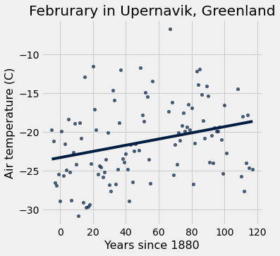
feb = tidy_greenland.where('Month', are.equal_to(2))
#redo table w/ x-axis as Years since 1880
x = feb.column('Year') - 1880
y = feb.column('Air temperature (C)')
x_y_table = Table().with_columns("x", x, "y", y)
x_y_table.scatter("x", "y", fit_line=True)
plots.xlabel("Years since 1880")
plots.ylabel("Air temperature (C)");
plots.title('Februrary in Upernavik, Greenland');
0. Using Our Code!
We’ve moved all code to cs104_inference.py and we’re loading this file here.
We’ve put a copy of this file in everyone’s project directory for the Final Project.
Just include the line in the cell below to import the functions.
If you don’t see it, close your Jupyter window, go to our homepage, and click on the
Red “Project 2” button, and then the link to the project template, and you will get
a copy of that new file in your project directory
It is also on the web at https://www.cs.williams.edu/~cs104/_static/cs104_inference.py. You may download it from there and add it to other projects.
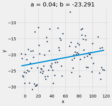
from cs104_inference import *
optimal = linear_regression(x_y_table, 'x', 'y')
a = optimal.item(0)
b = optimal.item(1)
plot_scatter_with_line(x_y_table, 'x', 'y', a, b)
1. Mean Square Errors
# Review of last time
def mean_squared_error(table, x_label, y_label, a, b):
    y_hat = line_predictions(a, b, table.column(x_label))
    residual = table.column(y_label) - y_hat
    return np.mean(residual**2)
mean_squared_error(x_y_table, 'x', 'y', 0.03, -23)
22.361508571428576
2. Fit the Best Line Manually
def visualize_full_mse():
    a_space = np.linspace(-0.5, 0.5, 200)
    b_space = np.linspace(-35, -8, 200)

    _ = widgets.interact(plot_regression_line_and_mse_heat,
                     table = fixed(x_y_table),
                     x_label = fixed('x'),
                     y_label = fixed('y'),
                     a = (-0.5,0.5,0.01),
                     b = (-35,-8,0.1),
                     show_mse=[None, "2d", "3d"],
                     a_space = fixed(a_space),
                     b_space = fixed(b_space))
visualize_full_mse()
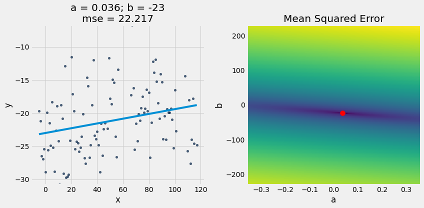
3. Fit the Best Line with Brute Force
# Brute force loop to find a and b
lowest_mse = np.inf
a_for_lowest = 0
b_for_lowest = 0

for a in np.arange(0.02, 0.08, 0.001):
    for b in np.arange(-30, 30, 1):
        mse = mean_squared_error(x_y_table, 'x', 'y', a, b)
        if mse < lowest_mse:
            lowest_mse = mse
            a_for_lowest = a
            b_for_lowest = b
lowest_mse, a_for_lowest, b_for_lowest
(22.216645485714285, 0.03600000000000002, -23)
plot_regression_line_and_mse_heat(x_y_table, 'x', 'y', a_for_lowest, b_for_lowest, show_mse="2d")
4. Fit the Best Line with minimize()
The minimize function finds the arguments to a function that minimizes the returned value. It uses gradient descent!
def f(x,y):
    return abs((x**2-25)*(y+2))

minimize(f)
array([ 5., -2.])
We can use it to implement a general linear_regression function:
def linear_regression(table, x_label, y_label):
    """
    Return an array containing the slope and intercept of the line best fitting
    the table's data according to the mean square error loss function.  Example:

    optimal = linear_regression(fortis, 'Beak length, mm', 'Beak depth, mm')
    a = optimal.item(0)
    b = optimal.item(1)

    OR

    a,b = linear_regression(fortis, 'Beak length, mm', 'Beak depth, mm')

    """

    # A helper function that takes *only* the two variables we need to optimize.
    # This is necessary to use minimize below, because the function we want
    # to minimize cannot take any parameters beyond those it will solve for.
    def mse_for_a_b(a, b):
        return mean_squared_error(table, x_label, y_label, a, b)

    # We can use a built-in function `minimize` that uses gradiant descent
    # to find the optimal a and b for our mean squared error function
    return minimize(mse_for_a_b)
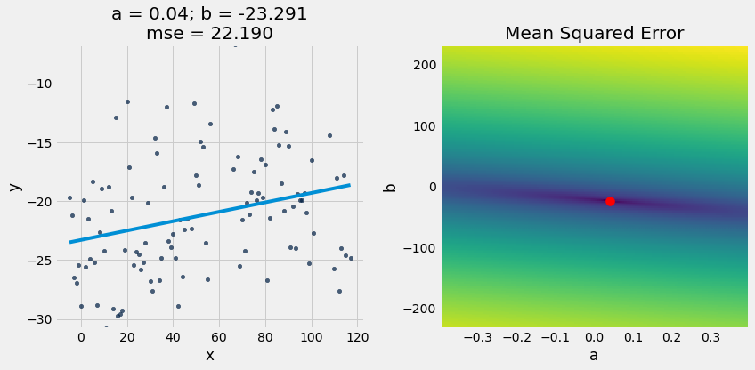
optimal = linear_regression(x_y_table, 'x', 'y')
a_optimal = optimal.item(0)
b_optimal = optimal.item(1)
plot_regression_line_and_mse_heat(x_y_table, 'x', 'y', a_optimal, b_optimal, show_mse="2d")

a_optimal,b_optimal = linear_regression(x_y_table, 'x', 'y')
plot_regression_line_and_mse_heat(x_y_table, 'x', 'y', a_optimal, b_optimal, show_mse="2d")
5. Diagnostics
def calculate_residuals(table, x_label, y_label, a, b):
    x = table.column(x_label)
    y = table.column(y_label)
    y_hat = line_predictions(a, b, x)
    residual = y - y_hat
    return residual
def r2_score(table, x_label, y_label, a, b):
    residual = calculate_residuals(table, x_label, y_label, a, b)
    numerator = sum(residual**2)
    y = table.column(y_label)
    y_mean = np.mean(y)
    denominator = sum((y-y_mean)**2)
    return 1 - numerator/denominator
r2_score(x_y_table, 'x', 'y', a_optimal, b_optimal)
0.08285898226812227
# Load finch data
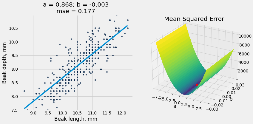
fortis = Table().read_table("data/finch_beaks_1975.csv").where('species', 'fortis')
fortis_a, fortis_b = linear_regression(fortis, 'Beak length, mm', 'Beak depth, mm')
plot_regression_line_and_mse_heat(fortis, 'Beak length, mm', 'Beak depth, mm', fortis_a, fortis_b, show_mse='3d')
r2_score(fortis, 'Beak length, mm', 'Beak depth, mm', fortis_a, fortis_b)
0.6735536808265523

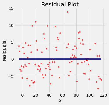
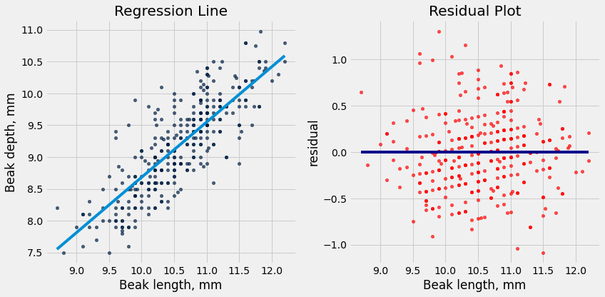
Residual plots
Residual plots help us make visual assessments of the quality of a linear regression analysis
plot_residuals(x_y_table, 'x', 'y', a_optimal, b_optimal)
but usually we like to see regression and residuals at same time:
plot_regression_line_and_residuals(x_y_table, 'x', 'y', a_optimal, b_optimal)
r2_score(x_y_table, 'x', 'y', a_optimal, b_optimal)
0.08285898226812227
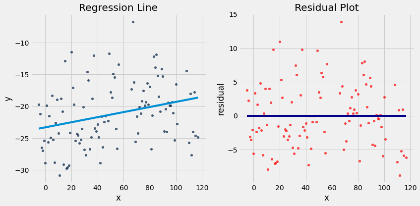
Notice how the residuals are distributed fairly symmetrically above and below the horizontal line at 0, corresponding to the original scatter plot being roughly symmetrical above and below.
The residual plot of a good regression shows no pattern. The residuals look about the same, above and below the horizontal line at 0, across the range of the predictor variable.
Diagnostics and residual plot on other datasets
Dugongs
dugong = Table().read_table('data/dugong.csv')
dugong.show(3)
| Length | Age |
|---|---|
| 1.8 | 1 |
| 1.85 | 1.5 |
| 1.87 | 1.5 |
... (24 rows omitted)
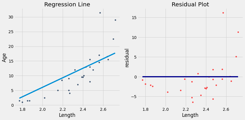
a_dugong, b_dugong = linear_regression(dugong, 'Length', 'Age')
r2_score(dugong, 'Length', 'Age', a_dugong, b_dugong)
0.6139645762184565
plot_regression_line_and_residuals(dugong, 'Length', 'Age', a_dugong, b_dugong)
Hybrids
cars = Table().read_table('data/hybrid.csv')
cars.show(3)
| vehicle | year | msrp | acceleration | mpg | class |
|---|---|---|---|---|---|
| Prius (1st Gen) | 1997 | 24509.7 | 7.46 | 41.26 | Compact |
| Tino | 2000 | 35355 | 8.2 | 54.1 | Compact |
| Prius (2nd Gen) | 2000 | 26832.2 | 7.97 | 45.23 | Compact |
... (150 rows omitted)
# Fit the line to the data
a_cars, b_cars = linear_regression(cars, 'acceleration', 'mpg')
# Plot the regression line
plot_scatter_with_line(cars, 'acceleration', 'mpg', a_cars, b_cars)
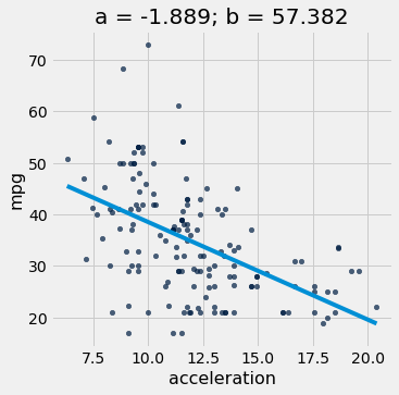
r2_score(cars, 'acceleration', 'mpg', a_cars, b_cars)
0.25610723394360513
#plot the residuals
plot_regression_line_and_residuals(cars, 'acceleration', 'mpg', a_cars, b_cars)
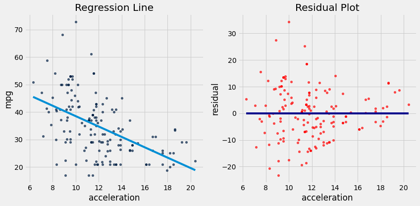
If the residual plot shows uneven variation about the horizontal line at 0, the regression estimates are not equally accurate across the range of the predictor variable.
The residual plot shows that our linear regression for this dataset is heteroscedastic, that x and the residuals are not independent.
6. Confidence Intervals for Predictions
# Load finch data
finch_1975 = Table().read_table("data/finch_beaks_1975.csv")
fortis = finch_1975.where('species', 'fortis')
scandens = finch_1975.where('species', 'scandens')
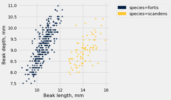
finch_1975.scatter('Beak length, mm', 'Beak depth, mm', group='species')
# Example using our code that optimizes correctly
fortis_a, fortis_b = linear_regression(fortis, 'Beak length, mm', 'Beak depth, mm')
plot_regression_line_and_mse_heat(fortis, 'Beak length, mm', 'Beak depth, mm', fortis_a, fortis_b, show_mse='3d')
print("R^2 Score is ", r2_score(fortis, 'Beak length, mm', 'Beak depth, mm', fortis_a, fortis_b))
plot_regression_line_and_residuals(fortis, 'Beak length, mm', 'Beak depth, mm', fortis_a, fortis_b)
R^2 Score is 0.6735536808265523
def bootstrap_prediction(x_target_value, observed_sample, x_label, y_label, num_trials):
    """
    Create boostrap resamples and predict y given x_target_value
    """

    bootstrap_statistics = make_array()

    for i in np.arange(0, num_trials):

        simulated_resample = observed_sample.sample()
        a,b = linear_regression(simulated_resample, x_label, y_label)
        resample_statistic = line_predictions(a,b,x_target_value)

        bootstrap_statistics = np.append(bootstrap_statistics, resample_statistic)

    return bootstrap_statistics
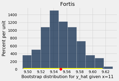
x_target_value = 11 # the x-value for which we want to predict y-values
bootstrap_statistics = bootstrap_prediction(x_target_value, fortis, 'Beak length, mm', 'Beak depth, mm', 100)

results = Table().with_columns("Bootstrap distribution for y_hat given x="+str(x_target_value), bootstrap_statistics)
results.hist()

plots.scatter(line_predictions(fortis_a, fortis_b, x_target_value), 0, color='red', s=100, zorder=10, clip_on=False);
left_right = percentile_method(95, bootstrap_statistics)
plots.plot(left_right, [0, 0], color='yellow', lw=8)
plots.title('Fortis');
# Ignore this code -- just focus on the visualization below.
def visualize_prediction_ci(observed_sample, x_label, y_label, plot_title):

    xs = observed_sample.column(x_label)
    xlims = make_array(min(xs),max(xs))

    def bootstrap_prediction_ci(x, num_trials):
        bootstrap_statistics = make_array()
        a,b = linear_regression(observed_sample, x_label, y_label)
        plots.figure(figsize=(10,10))
        plots.scatter(observed_sample.column(x_label), observed_sample.column(y_label),color=Table.chart_colors[0],s=20,alpha=0.7)
        plots.plot(xlims, a * xlims + b, lw=4)
        plots.xlabel(x_label)
        plots.ylabel(y_label)

        if num_trials > 0:
            for i in np.arange(0, num_trials):

                simulated_resample = observed_sample.sample()
                a,b = linear_regression(simulated_resample, x_label, y_label)
                resample_statistic = line_predictions(a,b,x)
                plots.plot(xlims, a * xlims + b, lw=1,color='lightblue',zorder=1)

                bootstrap_statistics = np.append(bootstrap_statistics, resample_statistic)

            left_right = percentile_method(95, bootstrap_statistics)
            plots.plot([x,x], left_right, color='yellow', lw=4);
            plots.title(plot_title+'\n y_hat 95% Confidence Interval: ' + str(np.round(left_right,2)))
        else:
            plots.scatter(x,line_predictions(a,b,x),s=100)
            plots.title(plot_title +'\n y_hat=' + str(np.round(line_predictions(a,b,x),2)))

    _ = widgets.interact(bootstrap_prediction_ci,
             x = (xlims.item(0), xlims.item(1)),
             num_trials = [1000, 100, 50, 10, 0])
visualize_prediction_ci(fortis, 'Beak length, mm', 'Beak depth, mm', 'Fortis')
scandens_a, scandens_b = linear_regression(scandens, 'Beak length, mm', 'Beak depth, mm')
visualize_prediction_ci(scandens, 'Beak length, mm', 'Beak depth, mm', 'Scandens')