Groups
from datascience import *
import numpy as np

%matplotlib inline
import matplotlib.pyplot as plots
plots.style.use('fivethirtyeight')

import warnings
warnings.simplefilter('ignore', FutureWarning)
warnings.simplefilter('ignore', np.VisibleDeprecationWarning)

from ipywidgets import interact, interactive, fixed, interact_manual
import ipywidgets as widgets
1. Prediction using functions and apply
We’re following the example in Ch. 8.1.3
Q: Can we use the average of a child’s parents’ heights to predict the child’s height?
galton = Table.read_table('data/galton.csv')
heights = galton.select('father', 'mother', 'childHeight').relabeled(2, 'child')
heights.show(10)
| father | mother | child |
|---|---|---|
| 78.5 | 67 | 73.2 |
| 78.5 | 67 | 69.2 |
| 78.5 | 67 | 69 |
| 78.5 | 67 | 69 |
| 75.5 | 66.5 | 73.5 |
| 75.5 | 66.5 | 72.5 |
| 75.5 | 66.5 | 65.5 |
| 75.5 | 66.5 | 65.5 |
| 75 | 64 | 71 |
| 75 | 64 | 68 |
... (924 rows omitted)
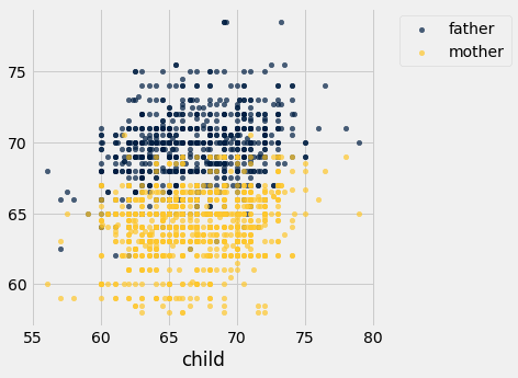
Another scatter plot (Note: Usually we create scatter plot by specifying two columns: one for x-values and one for y-values, and use a categorical column to group points by color when creating an overlay. If we have a table where we have two columns for y-values that share the same column for x-values, we can create an overlay plot just by specifying the column containing those shared x-values.)
heights.scatter('child')
As review, we can use .apply() to apply a function to one or multiple columns in a table.
heights.show(6)
| father | mother | child |
|---|---|---|
| 78.5 | 67 | 73.2 |
| 78.5 | 67 | 69.2 |
| 78.5 | 67 | 69 |
| 78.5 | 67 | 69 |
| 75.5 | 66.5 | 73.5 |
| 75.5 | 66.5 | 72.5 |
... (928 rows omitted)
def average(x, y):
    """Compute the average of two values"""
    return (x+y)/2
parent_avg = heights.apply(average, 'mother', 'father')
parent_avg.take(np.arange(0, 6))
array([72.75, 72.75, 72.75, 72.75, 71. , 71. ])
Add a column with parents’ average height to the height table.
heights = heights.with_columns(
    'parent average', parent_avg
)
heights
| father | mother | child | parent average |
|---|---|---|---|
| 78.5 | 67 | 73.2 | 72.75 |
| 78.5 | 67 | 69.2 | 72.75 |
| 78.5 | 67 | 69 | 72.75 |
| 78.5 | 67 | 69 | 72.75 |
| 75.5 | 66.5 | 73.5 | 71 |
| 75.5 | 66.5 | 72.5 | 71 |
| 75.5 | 66.5 | 65.5 | 71 |
| 75.5 | 66.5 | 65.5 | 71 |
| 75 | 64 | 71 | 69.5 |
| 75 | 64 | 68 | 69.5 |
... (924 rows omitted)
heights.scatter('parent average', 'child')
plots.axvline(68, color='gold', linestyle='--', lw=2);
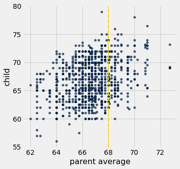
Think-pair-share: Suppose researchers encountered a new couple, similar to those in this dataset, and wondered how tall their child would be once their child grew up. What would be a good way to predict the child’s height, given that the parent average height was, say, 68 inches?
A: One initial approach would be to base the prediction on all observations (child, parent pairs) that are “close to” 68 inches for the parent.
Let’s take “close to” to mean within a half-inch
Let’s draw these with red lines
heights.scatter('parent average', 'child')
plots.plot([67.5, 67.5], [55, 80], color='red', lw=2)
plots.plot([68.5, 68.5], [55, 80], color='red', lw=2)
plots.axvline(68, color='gold', linestyle='--', lw=2);
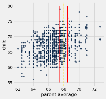
Let’s now identify all points within that red strip.
close_to_68 = heights.where('parent average', are.between(67.5, 68.5))
close_to_68
| father | mother | child | parent average |
|---|---|---|---|
| 74 | 62 | 74 | 68 |
| 74 | 62 | 70 | 68 |
| 74 | 62 | 68 | 68 |
| 74 | 62 | 67 | 68 |
| 74 | 62 | 67 | 68 |
| 74 | 62 | 66 | 68 |
| 74 | 62 | 63.5 | 68 |
| 74 | 62 | 63 | 68 |
| 74 | 61 | 65 | 67.5 |
| 73.2 | 63 | 62.7 | 68.1 |
... (175 rows omitted)
And take the average to make a prediction about the child.
np.average(close_to_68.column('child'))
67.62
Ooo! A function to compute that child mean height for any parent average height
def predict_child(parent_avg_height):
    close_points = heights.where('parent average', are.between(parent_avg_height - 0.5, parent_avg_height + 0.5))
    return close_points.column('child').mean()
predict_child(68)
67.62
predict_child(65)
65.83829787234043
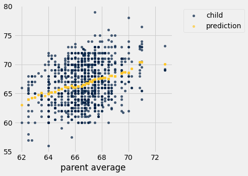
Apply predict_child to all the parent averages.
predicted = heights.apply(predict_child, 'parent average')
predicted.take(np.arange(0,10))
array([70.1       , 70.1       , 70.1       , 70.1       , 70.41578947,
       70.41578947, 70.41578947, 70.41578947, 68.5025    , 68.5025    ])
#extend our table with these new predictions
height_pred = heights.with_columns('prediction', predicted)
height_pred.select('child', 'parent average', 'prediction').scatter('parent average')
Preview: Throughout this course we’ll keep moving towards making our predictions better!
Extra: How close is close enough for prediction?
The choice of say two heights are “close to” eachother if they are within a half-inch was a somewhat arbitrary choice. We chould have chosen other values instead. What would happen if we changed that constant to be 0.25, 1, 2, or 5?
This visualization demostrates the impact that choice has on our predictions.
from functools import lru_cache as cache

@cache  # saves tables for each delta we compute to avoid recomputing.
def vary_range(delta):
    """Use a window of +/- delta when predicting child heights."""
    def predict_child(parent_avg_height):
        close_points = heights.where('parent average', are.between(parent_avg_height - delta, parent_avg_height + delta))
        return close_points.column('child').mean()

    predicted = heights.apply(predict_child, 'parent average')
    height_pred = heights.with_columns('prediction', predicted)
    return height_pred.select('child', 'parent average', 'prediction')

def visualize_predictions(delta = 0.5):
    predictions = vary_range(delta)
    predictions.scatter('parent average', s=50) # make dots a little bigger than usual

_ = interact(visualize_predictions, delta = make_array(0,0.25, 0.5, 1, 3, 5, 10))
2. Groups
We must often divide rows into groups according to some feature, and then compute a basic characteristic for each resulting group.
# table of 98 tiles from Scrabble game (excludes the two blanks)
scrabble_tiles = Table().read_table('data/scrabble_tiles.csv')
scrabble_tiles.sample(10)
| Letter | Score | Vowel |
|---|---|---|
| E | 1 | Yes |
| U | 1 | Yes |
| W | 4 | No |
| F | 4 | No |
| E | 1 | Yes |
| I | 1 | Yes |
| N | 1 | No |
| C | 3 | No |
| I | 1 | Yes |
| S | 1 | No |
scrabble_tiles.group('Letter')
| Letter | count |
|---|---|
| A | 9 |
| B | 2 |
| C | 2 |
| D | 4 |
| E | 12 |
| F | 2 |
| G | 3 |
| H | 2 |
| I | 9 |
| J | 1 |
... (16 rows omitted)
scrabble_tiles.group('Vowel')
| Vowel | count |
|---|---|
| No | 56 |
| Yes | 42 |
scrabble_tiles.group('Vowel', sum)
| Vowel | Letter sum | Score sum |
|---|---|---|
| No | 145 | |
| Yes | 42 |
Notes:
When we pass in a function to
groupthat is not the default (e.g.sum), the name of that function is appended to the column name.Some of the columns are empty because
sumcan only be applied to numerical (not categorial) variables. Our package is smart about this and leaves the columns empty (e.g.Letter sum).
scrabble_tiles.group('Vowel', max)
| Vowel | Letter max | Score max |
|---|---|---|
| No | Z | 10 |
| Yes | U | 1 |
Applying aggregation functions (e.g.
max) to some columns (e.g.Letter) are not meaningful. That’s ok. But we’ll have to use our understanding about the dataset to ignore these aggregations.
Group multiple columns
small_scrabble = scrabble_tiles.sample(10)
small_scrabble = small_scrabble.with_columns('Used', make_array('Yes', 'Yes', 'Yes', 'No', 'No',
                                                            'No', 'No', 'No', 'No', 'No'))
small_scrabble
| Letter | Score | Vowel | Used |
|---|---|---|---|
| I | 1 | Yes | Yes |
| I | 1 | Yes | Yes |
| O | 1 | Yes | Yes |
| U | 1 | Yes | No |
| W | 4 | No | No |
| I | 1 | Yes | No |
| C | 3 | No | No |
| N | 1 | No | No |
| E | 1 | Yes | No |
| O | 1 | Yes | No |
Q: How many vowels do I have left that I have not used?
small_scrabble.group(make_array('Vowel', 'Used'))
| Vowel | Used | count |
|---|---|---|
| No | No | 3 |
| Yes | No | 4 |
| Yes | Yes | 3 |
Q: What’s the total score of the non-values I have used and not used?
# Notice the different syntax for the array of column names.  You'll see this form in
# the book and some examples, but it is the same as the make_array('Vowel', 'Used') form.
small_scrabble.group(['Vowel', 'Used'], sum)
| Vowel | Used | Letter sum | Score sum |
|---|---|---|---|
| No | No | 8 | |
| Yes | No | 4 | |
| Yes | Yes | 3 |
Groups for Galton heights
galton = Table().read_table("data/galton.csv")
galton.show(3)
| family | father | mother | midparentHeight | children | childNum | gender | childHeight |
|---|---|---|---|---|---|---|---|
| 1 | 78.5 | 67 | 75.43 | 4 | 1 | male | 73.2 |
| 1 | 78.5 | 67 | 75.43 | 4 | 2 | female | 69.2 |
| 1 | 78.5 | 67 | 75.43 | 4 | 3 | female | 69 |
... (931 rows omitted)
Q: How many children does each family have?
by_family = galton.group('family')
by_family.show(5)
| family | count |
|---|---|
| 1 | 4 |
| 10 | 1 |
| 100 | 3 |
| 101 | 4 |
| 102 | 6 |
... (200 rows omitted)
# Relabel based on what we know about this particular dataset
# (each row is a child)
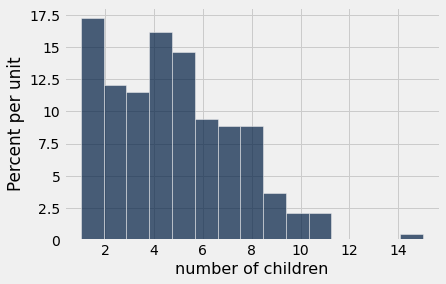
by_family = by_family.relabeled("count", "number of children")
by_family.hist("number of children", bins=15)
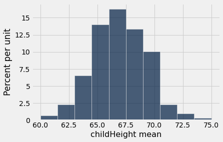
Q: Per family, what is the average height of the children?
by_family = galton.select('family', 'childHeight').group('family', np.mean)
by_family.show(5)
by_family.hist('childHeight mean')
| family | childHeight mean |
|---|---|
| 1 | 70.1 |
| 10 | 65.5 |
| 100 | 70.7333 |
| 101 | 72.375 |
| 102 | 66.1667 |
... (200 rows omitted)
Groups for Obama gifts
Let’s examine the dataset of Obama gifts we looked at previously. Now imagine we’re an auditor and want to investigate the relationship between countries and the number and amount of gifts their giving. We’ll use the .group() method for this.

“President Barack Obama receives a gift from Saudi King Abdullah at the start of their bilateral meeting in Riyadh, Saudi Arabia, on June 3, 2009. The large gold medallion was among several gifts given that day that were valued at $34,500, the State Department later said” –CBS News
gifts = Table().read_table('data/obama-gifts.csv')
gifts = gifts.where('donor_country', are.not_equal_to('nan')) #clean up and remove the nans
gifts.show(5)
| year_received | donor_country | value_usd | gift_description |
|---|---|---|---|
| 2009 | Mexico | 400 | Book entitled ``The National Palace of Mexico''; red and ... |
| 2009 | Japan | 1495 | Mikimoto desk clock; black basketball jersey. Rec'd--2/2 ... |
| 2009 | United Kingdom | 16510 | Black and gold pen with a wooden pen holder, made from t ... |
| 2009 | Algeria | 500 | Four boxes of dates and twelve bottles of wine. Rec'd--3 ... |
| 2009 | Denmark | 388 | Book entitled ``Restoring the Balance''; book entitled ` ... |
... (608 rows omitted)
Grouping by a single column
by_country = gifts.group('donor_country')
by_country.show(5)
| donor_country | count |
|---|---|
| Afghanistan | 7 |
| Algeria | 6 |
| Argentina | 5 |
| Armenia | 1 |
| Australia | 5 |
... (118 rows omitted)
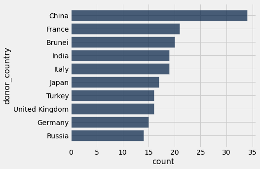
Q: What are the top ten countries by number of gifts given? Show in a bar chart.
by_country.sort('count', descending=True).take(np.arange(0, 10)).barh('donor_country', 'count');
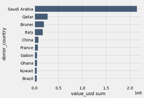
Q: What are the top ten countries by total value of all the gifts given by that country? Show in a bar chart.
by_country_sum = gifts.group('donor_country', sum)
by_country_sum.show(5)
| donor_country | year_received sum | value_usd sum | gift_description sum |
|---|---|---|---|
| Afghanistan | 14077 | 9263 | |
| Algeria | 12082 | 4312.28 | |
| Argentina | 10069 | 3977.98 | |
| Armenia | 2010 | 2985 | |
| Australia | 10064 | 4365.48 |
... (118 rows omitted)
sort_table = by_country_sum.sort('value_usd sum', descending=True)
sort_table.take(np.arange(0, 10)).barh('donor_country', 'value_usd sum');
Grouping by multiple columns
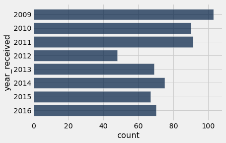
Q: How many gifts did countries give in each year?
by_year = gifts.group('year_received')
by_year.barh('year_received')
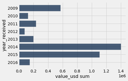
Q: What was the total value of gifts given in each year?
value_by_year = gifts.group('year_received', sum)
value_by_year.barh('year_received', "value_usd sum")
Q: How many gifts did each country give in each year?
by_year_and_country = gifts.group(make_array('year_received', 'donor_country'))
by_year_and_country
| year_received | donor_country | count |
|---|---|---|
| 2009 | Afghanistan | 1 |
| 2009 | Algeria | 1 |
| 2009 | Argentina | 1 |
| 2009 | Brazil | 1 |
| 2009 | Brunei | 2 |
| 2009 | Burkina Faso | 1 |
| 2009 | Chile | 1 |
| 2009 | China | 6 |
| 2009 | Czechia | 3 |
| 2009 | Denmark | 2 |
... (336 rows omitted)
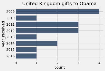
Let’s make a visualization for a particular country.
uk = by_year_and_country.where('donor_country', are.equal_to('United Kingdom'))
uk.barh('year_received', 'count')
plots.title('United Kingdom gifts to Obama');

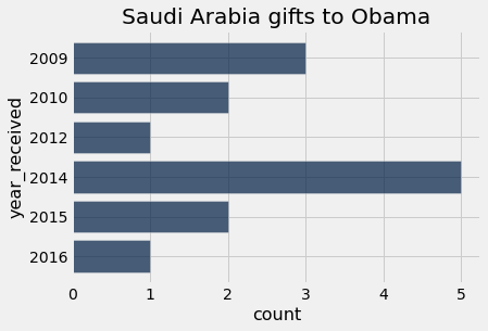
Think-pair-share: Let’s write a function to make these plots for any country we’d want!
Note: In this function, we will specifically not return anything. We’ll just make code to make a plot appear. This is not uncommon to create functions without return–those that make visualizations and use print() statements.
def plot_country_yearly_gifts(donor_country_name):
    gifts_from_donor = by_year_and_country.where('donor_country', are.equal_to(donor_country_name))
    gifts_from_donor.barh('year_received', 'count')
    title = donor_country_name + ' gifts to Obama'
    plots.title(title);
Q: Which are the variables that are local to the function? Which are the global variables?
plot_country_yearly_gifts("United Kingdom")
plot_country_yearly_gifts("Saudi Arabia")
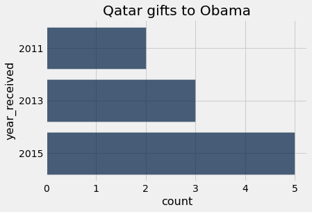
plot_country_yearly_gifts("Qatar")
countries = gifts.sort('donor_country',distinct=True).column('donor_country')
_ = interact(plot_country_yearly_gifts, donor_country_name=countries)
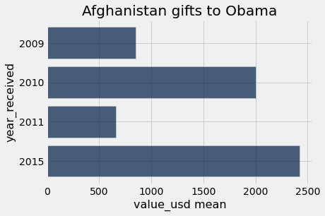
A more general function
We’ve talked about how computer science is all about abstraction. Let’s write a function that takes as a parameter any aggregation function we can pass into .group(), and the function groups by country, year, and that aggregation function. The function then plots the results for a specific country.
gifts.show(3)
| year_received | donor_country | value_usd | gift_description |
|---|---|---|---|
| 2009 | Mexico | 400 | Book entitled ``The National Palace of Mexico''; red and ... |
| 2009 | Japan | 1495 | Mikimoto desk clock; black basketball jersey. Rec'd--2/2 ... |
| 2009 | United Kingdom | 16510 | Black and gold pen with a wooden pen holder, made from t ... |
... (610 rows omitted)
def country_group_generic(donor_country_name, aggregation_function):
    group_gifts = gifts.group(make_array('year_received', 'donor_country'), aggregation_function)

    gifts_from_donor = group_gifts.where('donor_country', are.equal_to(donor_country_name))

    # The aggregate value_usd column will have a different name, depending on which
    # aggregation function we employ.  So, we just refer to that column by its column
    # index, 2, instead of its name when make the bar chart.
    gifts_from_donor.barh('year_received', 2)

    title = donor_country_name + ' gifts to Obama'
    plots.title(title);
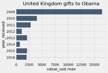
country_group_generic("United Kingdom", max)
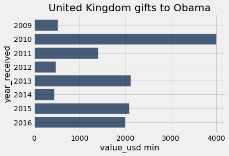
country_group_generic("United Kingdom", min)
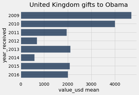
country_group_generic("United Kingdom", np.mean)
country_group_generic("Afghanistan", np.mean)
_ = interact(country_group_generic, donor_country_name=countries, aggregation_function=[('sum',sum),('min',min),('max',max),('mean',np.mean)])