Histograms
from datascience import *
import numpy as np

%matplotlib inline
import matplotlib.pyplot as plots
plots.style.use('fivethirtyeight')

import warnings
warnings.simplefilter('ignore', FutureWarning)
warnings.simplefilter('ignore', np.VisibleDeprecationWarning)

from ipywidgets import interact, interactive, fixed, interact_manual
import ipywidgets as widgets
1. Overlaid graphs
Sometimes we want to see more than one plot on a single graph.
Overlaid bar charts
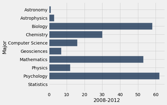
majors = Table.read_table("data/majors.csv")
div3 = majors.where("Division", are.equal_to(3)).drop("Division")
div3
| Major | 2008-2012 | 2018-2021 |
|---|---|---|
| Astronomy | 1 | 2 |
| Astrophysics | 3 | 3 |
| Biology | 58 | 61 |
| Chemistry | 30 | 34 |
| Computer Science | 16 | 50 |
| Geosciences | 7 | 12 |
| Mathematics | 53 | 61 |
| Physics | 12 | 13 |
| Psychology | 62 | 45 |
| Statistics | 0 | 16 |
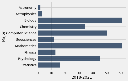
# First graph for 2008-2012
div3.barh("Major", "2008-2012")
# Second graph from 2018-2021
div3.barh("Major", "2018-2021")
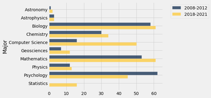
Overlaid graph puts the two graphs together to make comparison easier.
The package we’re using will automatically make overlaid graphs with the remainder of the columns if you give it just one parameter.
div3.barh("Major")
Overlaid line plots
temps_by_month = Table().read_table("data/temps_by_month_upernavik.csv")
temps_by_month.show(5)
| Year | Jan | Feb | Mar | Apr | May | Jun | Jul | Aug | Sep | Oct | Nov | Dec |
|---|---|---|---|---|---|---|---|---|---|---|---|---|
| 1875 | -15.6 | -19.7 | -25.9 | -14.7 | -9.6 | -0.4 | 4.7 | 2.9 | -0.1 | -4.5 | -5.5 | -14 |
| 1876 | -24.5 | -21.2 | -20.8 | -14.9 | -6.3 | 0.9 | 3.9 | 2.4 | 3.2 | -6.2 | -9.4 | -14.4 |
| 1877 | -21.1 | -26.5 | -17.8 | -12 | -1.7 | 1.4 | 4.6 | 5.2 | 3 | -2.8 | -10 | -19.2 |
| 1878 | -22.9 | -26.9 | -19.6 | -13 | -5.6 | 1.9 | 3.2 | 4.3 | -0.9 | -4 | -2 | -3.7 |
| 1879 | -13.5 | -25.4 | -21.3 | -13 | -2.7 | 0 | 5.2 | 5.8 | -1.1 | -5.5 | -8.2 | -16.5 |
... (104 rows omitted)
As with bar charts, if you supply only one parameter, the plot method will plot a line for every other column.
temps_by_month.plot("Year")
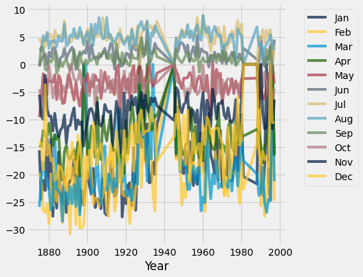
Qualitatively, we can see that the plot above has too much information on it which makes it not very useful for understand trends.
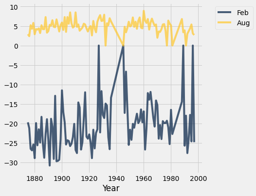
temps_by_month.select("Year", "Feb", "Aug").plot("Year")
Overlaid scatter plots
We want to plot points (the values of two numerical variables) from different groups on the same graph.
A new approach. Use categorical variable to break the rows into groups of related points in the plot.
finch_1975 = Table().read_table("data/finch_beaks_1975.csv")
finch_1975.show(6)
| species | Beak length, mm | Beak depth, mm |
|---|---|---|
| fortis | 9.4 | 8 |
| fortis | 9.2 | 8.3 |
| scandens | 13.9 | 8.4 |
| scandens | 14 | 8.8 |
| scandens | 12.9 | 8.4 |
| fortis | 9.5 | 7.5 |
... (400 rows omitted)
finch_1975.scatter("Beak length, mm", "Beak depth, mm", group="species")
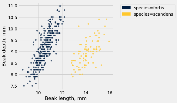
Takeaway: The overlaid scatter plot above helps us very quickly discern differences between groups. In this case, we can quickly tell that the two Finch species have evolved (via natural selection) to have different beak characteristics.
2. Histograms
A Histogram shows us the distribution of a numerical variable.
A few examples
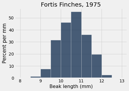
A quick look at the Fortis finch beak lengths in 1975. A histogram gives us a sense of the data as a whole: What are common lengths? What are uncommon? How much variability is there? What are the extremes?
finch_1975.where("species", "fortis").relabeled("Beak length, mm", "Beak length").hist("Beak length", unit="mm",bins=np.arange(8,13.1,0.5))
plots.title("Fortis Finches, 1975");
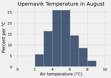
We can do the same for the average August temperate in Upernavik. What is a common average temperature for August, what are the extremes, etc?
greenland_climate = Table.read_table('data/climate_upernavik.csv')
greenland_climate = greenland_climate.relabeled('Precipitation (millimeters)', "Precip (mm)")
tidy_greenland = greenland_climate.where('Air temperature (C)', are.not_equal_to(999.99))
tidy_greenland = tidy_greenland.where('Sea level pressure (mbar)', are.not_equal_to(9999.9))
tidy_greenland.where("Month", are.equal_to(8)).relabeled("Air temperature (C)", "Air temperature").hist('Air temperature', unit="°C", bins=np.arange(0,10.1,1))
plots.title("Upernavik Temperature in August");
Class survey: Distance from home
Load Data
survey = Table().read_table("data/prelab01-survey-fall2022.csv")
survey = survey.drop('Month', 'Day', 'Hour', 'Year at Williams')
survey.show(5)
| Favorite icecream flavor | Favorite planet | Height (in inches) | Distance Home (in miles) | Birth Month | Left or right handed? |
|---|---|---|---|---|---|
| Vanilla | Jupiter | 68 | 6679 | March | Right |
| Strawberry | Neptune | 65 | 650 | January | Right |
| Mint chocolate chip | Pluto | 64 | 368 | April | Left |
| Mint chocolate chip | Jupiter | 65 | 1199 | October | Right |
| Coffee | Earth | 66 | 2838 | January | Right |
... (40 rows omitted)
survey.labels
('Favorite icecream flavor',
 'Favorite planet',
 'Height (in inches)',
 'Distance Home (in miles)',
 'Birth Month',
 'Left or right handed?')
distance_home = survey.column('Distance Home (in miles)')
distance_home
array([6679.  ,  650.  ,  368.  , 1199.  , 2838.  ,  146.  , 2857.  ,
        322.  , 2877.  ,  200.  ,  256.  , 1800.  ,  167.  , 5030.  ,
        160.  , 2946.  ,   45.  ,  111.  ,  190.  , 4878.  ,  101.  ,
        882.5 ,  172.9 , 3000.  ,  141.  ,  160.  , 8000.  ,  147.39,
        159.  , 1905.  ,  394.  ,  285.  , 4536.  , 2845.  ,  168.  ,
        117.  ,  400.  ,  102.  , 7756.  ,  154.  ,  800.  , 1559.2 ,
       3529.  ,  169.9 ,  167.7 ])
Some basic info about the distances:
len(distance_home)
45
np.mean(distance_home)
1586.0131111111111
max(distance_home)
8000.0
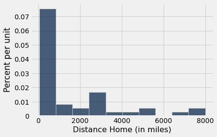
Sneak preview of a histogram for those distances
survey.hist('Distance Home (in miles)')
Binning
Think-pair-share: Bin students into two groups: home is (1) less than 180 miles from campus or (2) greater than or equal to 180 miles.
group_close = survey.where('Distance Home (in miles)', are.below(180))
group_far = survey.where('Distance Home (in miles)', are.above_or_equal_to(180))
prop_group_close = group_close.num_rows / survey.num_rows
prop_group_far = group_far.num_rows / survey.num_rows
print('Proportion of class <180 miles from home: ', prop_group_close)
print('Proportion of class >=180 miles from home: ', prop_group_far)
Proportion of class <180 miles from home:  0.37777777777777777
Proportion of class >=180 miles from home:  0.6222222222222222
#proportions should sum to 1
prop_group_close + prop_group_far
1.0
We have a method in our package that can make bins automatically: table.bin.
binned_distance_home = survey.bin('Distance Home (in miles)', bins= make_array(0, 180, 8001))
binned_distance_home
| bin | Distance Home (in miles) count |
|---|---|
| 0 | 17 |
| 180 | 28 |
| 8001 | 0 |
Let’s practice creating a proportion column and adding it to the table.
proportion = binned_distance_home.column('Distance Home (in miles) count') / survey.num_rows
binned_distance_home.with_columns('Proportion', proportion)
| bin | Distance Home (in miles) count | Proportion |
|---|---|---|
| 0 | 17 | 0.377778 |
| 180 | 28 | 0.622222 |
| 8001 | 0 | 0 |
Remember proportions should always sum to 1.
sum(proportion)
1.0
Histogram of distances from home
# let's relabel a column to make the visualization a little prettier
survey = survey.relabeled('Distance Home (in miles)', 'Distance Home')
survey.hist('Distance Home', unit='mile', bins=4)
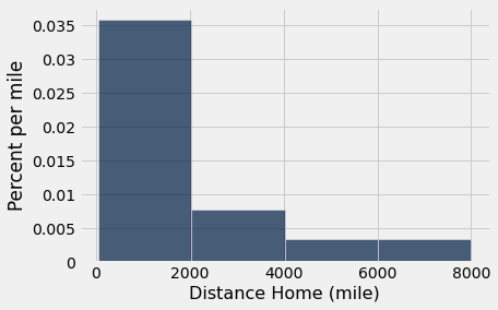
Think-pair-share: Calculate the area of each bar in the histogram (estimating the height). Then show the sum of the area of all the bars equals 100.
#think-pair-share approximations
#let's practice array broadcasting while we're at it
widths = make_array(2000, 2000, 2000, 2000)
heights = make_array(0.035, 0.0075, 0.003, 0.003)
areas = widths*heights
areas
array([70., 15., 6., 6.])
sum(areas)
97.0
#let's check our estimates!
hist_bins = survey.bin('Distance Home', bins=np.arange(0, 10000, 2000))
proportion = hist_bins.column('Distance Home count') / survey.num_rows
hist_bins = hist_bins.with_columns('Proportion', proportion)
hist_bins
| bin | Distance Home count | Proportion |
|---|---|---|
| 0 | 32 | 0.711111 |
| 2000 | 7 | 0.155556 |
| 4000 | 3 | 0.0666667 |
| 6000 | 3 | 0.0666667 |
| 8000 | 0 | 0 |
Cool! We’re pretty close to the actual areas! Great!
Let’s work backwards now and see how our hist() method calculated the y-axis.
#add a percentage
hist_bins = hist_bins.with_columns('Percentage', hist_bins.column('Proportion')*100)
hist_bins
| bin | Distance Home count | Proportion | Percentage |
|---|---|---|---|
| 0 | 32 | 0.711111 | 71.1111 |
| 2000 | 7 | 0.155556 | 15.5556 |
| 4000 | 3 | 0.0666667 | 6.66667 |
| 6000 | 3 | 0.0666667 | 6.66667 |
| 8000 | 0 | 0 | 0 |
#let's just look at the first bar/bin
bin0 = hist_bins.take(0)
bin0
| bin | Distance Home count | Proportion | Percentage |
|---|---|---|---|
| 0 | 32 | 0.711111 | 71.1111 |
#height = percent of entries in bin / width of bar
percent_in_bin0 =  bin0.column('Percentage').item(0)
percent_in_bin0
71.11111111111111
height0 = percent_in_bin0/2000
height0
0.035555555555555556
Fantastic! That’s what we see on the y-axis on the histogram.
More histogram practice
survey.show(5)
| Favorite icecream flavor | Favorite planet | Height (in inches) | Distance Home | Birth Month | Left or right handed? |
|---|---|---|---|---|---|
| Vanilla | Jupiter | 68 | 6679 | March | Right |
| Strawberry | Neptune | 65 | 650 | January | Right |
| Mint chocolate chip | Pluto | 64 | 368 | April | Left |
| Mint chocolate chip | Jupiter | 65 | 1199 | October | Right |
| Coffee | Earth | 66 | 2838 | January | Right |
... (40 rows omitted)
survey.labels
('Favorite icecream flavor',
 'Favorite planet',
 'Height (in inches)',
 'Distance Home',
 'Birth Month',
 'Left or right handed?')
survey.hist('Height (in inches)', bins=np.arange(59,73.1,1))
plots.ylim(0,.20);
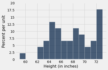
Think-pair-share:
Look at the histogram and approximate the percentage of the class that has height greater than or equal to 70 inches but less than or 71 inches.
How many students is this? We know 45 students responded to our survey.
survey.num_rows
45
answer_q1 = 4.5 * 1
answer_q1
4.5
answer_q2 = answer_q1 / 100 * 45
answer_q2
2.025
We can’t have a fraction of a student so our approximation was probably slightly incorrect. There were two students that have height 70 inches.
survey.where('Height (in inches)', are.equal_to(70))
| Favorite icecream flavor | Favorite planet | Height (in inches) | Distance Home | Birth Month | Left or right handed? |
|---|---|---|---|---|---|
| Vanilla | Jupiter | 70 | 285 | March | Right |
| Strawberry | Earth | 70 | 7756 | May | Right |
survey.where('Height (in inches)', are.equal_to(70)).num_rows
2
Overlaid histograms
Like scatter we can create overlaid histograms with the group= named variable
survey.hist('Distance Home', group='Left or right handed?', bins=8)
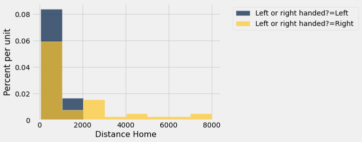
Hmmmmm… all the people far from home are right handed. Curious. Are there societal norms at play here? One would probably have to do a lot more survey work to explain some of these differences.
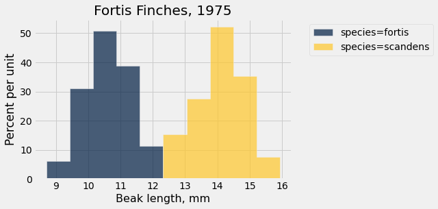
One more overlay, for the two finch species.
finch_1975.show(10)
| species | Beak length, mm | Beak depth, mm |
|---|---|---|
| fortis | 9.4 | 8 |
| fortis | 9.2 | 8.3 |
| scandens | 13.9 | 8.4 |
| scandens | 14 | 8.8 |
| scandens | 12.9 | 8.4 |
| fortis | 9.5 | 7.5 |
| fortis | 9.5 | 8 |
| fortis | 11.5 | 9.9 |
| fortis | 11.1 | 8.6 |
| fortis | 9.9 | 8.4 |
... (396 rows omitted)
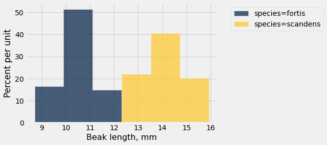
finch_1975.hist("Beak length, mm", group="species")
plots.title("Fortis Finches, 1975");
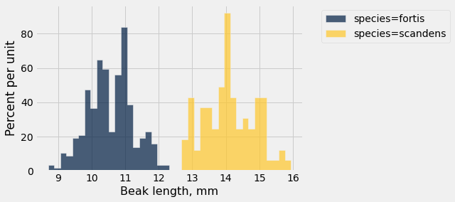
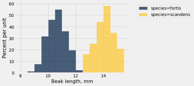
Try different bins to see differences in granularity.
finch_1975.hist("Beak length, mm", group="species", bins=6)
finch_1975.hist("Beak length, mm", group="species", bins=40)
finch_1975.hist("Beak length, mm", group="species", bins=np.arange(8,16,0.5))