Tables and Visualization
from datascience import *
import numpy as np

%matplotlib inline
import matplotlib.pyplot as plots
plots.style.use('fivethirtyeight')

from ipywidgets import interact, interactive, fixed, interact_manual
import ipywidgets as widgets
1. Table Review: Student Big Picture Questions
categories = make_array('Culture', 'Cities', 'Climate change', 'Criminal justice',
                        'Ecology', 'Economics', 'Education', 'Energy',
                        'Health', 'Income inequality', 'Gender', 'Politics',
                        'Race/racism/xenophobia', 'Social Media/Screen Time',
                        'Sports', 'Technology')
counts = make_array(4, 2, 22, 1, 2, 10, 11, 1, 22, 3, 4, 2, 9, 7, 2, 4)

question_categories = Table().with_columns(
         'Category', categories,
         'Count', counts)

question_categories
| Category | Count |
|---|---|
| Culture | 4 |
| Cities | 2 |
| Climate change | 22 |
| Criminal justice | 1 |
| Ecology | 2 |
| Economics | 10 |
| Education | 11 |
| Energy | 1 |
| Health | 22 |
| Income inequality | 3 |
... (6 rows omitted)
question_categories = question_categories.sort('Count', descending=True)
question_categories
| Category | Count |
|---|---|
| Climate change | 22 |
| Health | 22 |
| Education | 11 |
| Economics | 10 |
| Race/racism/xenophobia | 9 |
| Social Media/Screen Time | 7 |
| Culture | 4 |
| Gender | 4 |
| Technology | 4 |
| Income inequality | 3 |
... (6 rows omitted)
question_categories.barh('Category', 'Count')

print('Num categories', question_categories.num_rows)
print('Num questions coded', sum(question_categories.column('Count')))
Num categories 16
Num questions coded 106
We have slightly more than double the number of students in this course because some questions counted towards multiple labels, e.g. “Effect of health on the economy.”
Question: Add a column with the proportion of questions touching on each category.
total_count = sum(question_categories.column('Count'))

question_categories = question_categories.with_column(
    "Proportion", question_categories.column("Count") / total_count)

question_categories
| Category | Count | Proportion |
|---|---|---|
| Climate change | 22 | 0.207547 |
| Health | 22 | 0.207547 |
| Education | 11 | 0.103774 |
| Economics | 10 | 0.0943396 |
| Race/racism/xenophobia | 9 | 0.0849057 |
| Social Media/Screen Time | 7 | 0.0660377 |
| Culture | 4 | 0.0377358 |
| Gender | 4 | 0.0377358 |
| Technology | 4 | 0.0377358 |
| Income inequality | 3 | 0.0283019 |
... (6 rows omitted)
2. Greenland climate data
greenland_climate = Table.read_table('data/climate_upernavik.csv')
greenland_climate.show(5)
| Year | Month | Air temperature (C) | Sea level pressure (mbar) | Precipitation (millimeters) |
|---|---|---|---|---|
| 1873 | 9 | 0.4 | 9999.9 | 15 |
| 1873 | 10 | -5.3 | 9999.9 | 34 |
| 1873 | 11 | -9.4 | 9999.9 | 30 |
| 1873 | 12 | 999.99 | 9999.9 | 29 |
| 1874 | 1 | -29.6 | 9999.9 | 9 |
... (1360 rows omitted)
greenland_climate.num_columns
5
greenland_climate.num_rows
1365
# We can print out the labels so they're easy to copy and paste
greenland_climate.labels
('Year',
 'Month',
 'Air temperature (C)',
 'Sea level pressure (mbar)',
 'Precipitation (millimeters)')
Sometimes the column names may be cumbersome and we may want to shorten them.
greenland_climate.relabeled('Precipitation (millimeters)', "Precip (mm)")
| Year | Month | Air temperature (C) | Sea level pressure (mbar) | Precip (mm) |
|---|---|---|---|---|
| 1873 | 9 | 0.4 | 9999.9 | 15 |
| 1873 | 10 | -5.3 | 9999.9 | 34 |
| 1873 | 11 | -9.4 | 9999.9 | 30 |
| 1873 | 12 | 999.99 | 9999.9 | 29 |
| 1874 | 1 | -29.6 | 9999.9 | 9 |
| 1874 | 2 | -19.6 | 9999.9 | 22 |
| 1874 | 9 | 0.1 | 1010.7 | 68 |
| 1874 | 10 | -5.4 | 1002.7 | 24 |
| 1874 | 11 | -8 | 1010.5 | 15 |
| 1874 | 12 | -8.4 | 1005.1 | 69 |
... (1355 rows omitted)
#Changes will not persist unless we reassign the variable
greenland_climate
| Year | Month | Air temperature (C) | Sea level pressure (mbar) | Precipitation (millimeters) |
|---|---|---|---|---|
| 1873 | 9 | 0.4 | 9999.9 | 15 |
| 1873 | 10 | -5.3 | 9999.9 | 34 |
| 1873 | 11 | -9.4 | 9999.9 | 30 |
| 1873 | 12 | 999.99 | 9999.9 | 29 |
| 1874 | 1 | -29.6 | 9999.9 | 9 |
| 1874 | 2 | -19.6 | 9999.9 | 22 |
| 1874 | 9 | 0.1 | 1010.7 | 68 |
| 1874 | 10 | -5.4 | 1002.7 | 24 |
| 1874 | 11 | -8 | 1010.5 | 15 |
| 1874 | 12 | -8.4 | 1005.1 | 69 |
... (1355 rows omitted)
greenland_climate = greenland_climate.relabeled('Precipitation (millimeters)', "Precip (mm)")
greenland_climate
| Year | Month | Air temperature (C) | Sea level pressure (mbar) | Precip (mm) |
|---|---|---|---|---|
| 1873 | 9 | 0.4 | 9999.9 | 15 |
| 1873 | 10 | -5.3 | 9999.9 | 34 |
| 1873 | 11 | -9.4 | 9999.9 | 30 |
| 1873 | 12 | 999.99 | 9999.9 | 29 |
| 1874 | 1 | -29.6 | 9999.9 | 9 |
| 1874 | 2 | -19.6 | 9999.9 | 22 |
| 1874 | 9 | 0.1 | 1010.7 | 68 |
| 1874 | 10 | -5.4 | 1002.7 | 24 |
| 1874 | 11 | -8 | 1010.5 | 15 |
| 1874 | 12 | -8.4 | 1005.1 | 69 |
... (1355 rows omitted)
Hmmmm… those 999.99 and 9999.9 values should look really odd. If you read the documentation for this dataset, it says that they recorded 999.99, and 9999.9 when there are missing values in the columns Air temperature (C), and Sea level pressure (mbar) columns respectively.
Let’s clean this dataset up by removing all rows with missing values (we will revist this assumption for data cleaning later on in the class and talk about alternatives).
# We can see these missing values by checking for the min and max
min_temp = min(greenland_climate.column('Air temperature (C)'))
max_temp = max(greenland_climate.column('Air temperature (C)'))
print('min temp:', min_temp, 'max temp:', max_temp)
min temp: -30.8 max temp: 999.99
#Q: How do I keep a table with only the non-missing values?
tidy_greenland = greenland_climate.where('Air temperature (C)', are.not_equal_to(999.99))
tidy_greenland = tidy_greenland.where('Sea level pressure (mbar)', are.not_equal_to(9999.9))
tidy_greenland
| Year | Month | Air temperature (C) | Sea level pressure (mbar) | Precip (mm) |
|---|---|---|---|---|
| 1874 | 9 | 0.1 | 1010.7 | 68 |
| 1874 | 10 | -5.4 | 1002.7 | 24 |
| 1874 | 11 | -8 | 1010.5 | 15 |
| 1874 | 12 | -8.4 | 1005.1 | 69 |
| 1875 | 1 | -15.6 | 1009.4 | 17 |
| 1875 | 2 | -19.7 | 1005.5 | 63 |
| 1875 | 3 | -25.9 | 1016.2 | 77 |
| 1875 | 4 | -14.7 | 1017.9 | 40 |
| 1875 | 5 | -9.6 | 1016.3 | 12 |
| 1875 | 6 | -0.4 | 1008.1 | 1 |
... (1249 rows omitted)
#Q: How can I count the number of rows I just dropped because they have missing values?
num_dropped = greenland_climate.num_rows - tidy_greenland.num_rows
num_dropped
106
# We can use variables so that we don't have duplicate code.
temps = tidy_greenland.column('Air temperature (C)')
min_temp = min(temps)
max_temp = max(temps)
print('min temp:', min_temp, 'max temp:', max_temp)
min temp: -30.8 max temp: 8.9
3. Visualizations
We’ve been using bar charts for awhile now. In the plot below:
x-axis : Count (numerical variable)
y-axis: Categories (categorical variable)
# Example of a bar chart
question_categories.barh('Category', 'Count')

# Our package will throw an error if the x-axis is not a numerical variable
# question_categories.barh('Count', 'Category')
Question: What’s the relationship between the year and the temperature?
tidy_greenland.show(3)
| Year | Month | Air temperature (C) | Sea level pressure (mbar) | Precip (mm) |
|---|---|---|---|---|
| 1874 | 9 | 0.1 | 1010.7 | 68 |
| 1874 | 10 | -5.4 | 1002.7 | 24 |
| 1874 | 11 | -8 | 1010.5 | 15 |
... (1256 rows omitted)
# Handy to print out the labels so you can copy and paste into plotting methods
tidy_greenland.labels
('Year',
 'Month',
 'Air temperature (C)',
 'Sea level pressure (mbar)',
 'Precip (mm)')
tidy_greenland.plot('Year', 'Air temperature (C)')
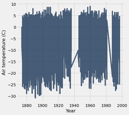
Yikes! We see really big fluctuations! What’s going on here? Why are there these huge fluctuations?
A: We probably need to account for seasonal differences in temperature.
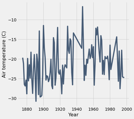
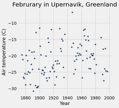
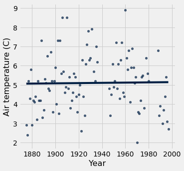
Let’s just look at February for now!
feb = tidy_greenland.where('Month', are.equal_to(2))
feb.plot('Year', 'Air temperature (C)')
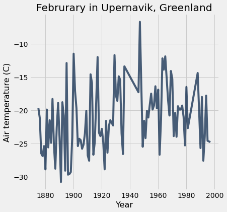
We can add a title to make it more meaningful for viewers of our visualization.
feb.plot('Year', 'Air temperature (C)')
plots.title('Februrary in Upernavik, Greenland');
# the semi-colon just hides a line of messy output
We could look at the same data with a scatter plot instead of a line plot. A line plot draws lines to connect points in our visualization.
feb.scatter('Year', 'Air temperature (C)')
plots.title('Februrary in Upernavik, Greenland');
# the semi-colon just hides a line of messy output
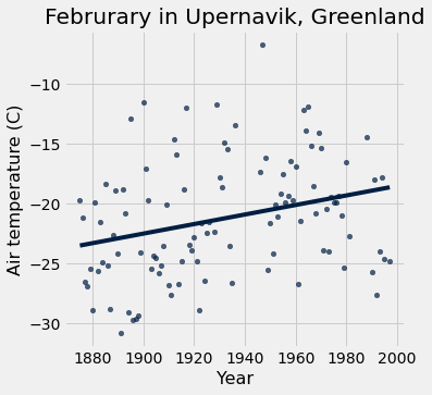
You might be asking yourself, “Has the average temperature during February gone up over time? Can we see climate change here?” This previews “hypothesis testing” which we will tackle later in the course.
Spoiler: Yes! We can add trend lines to our scatter plots (which we’ll talk about in much more detail later).
feb.scatter('Year', 'Air temperature (C)', fit_line=True)
plots.title('Februrary in Upernavik, Greenland');
Let’s use a scatter plot to examine the relationship between other numerical variables.
tidy_greenland.scatter('Sea level pressure (mbar)', 'Precip (mm)')
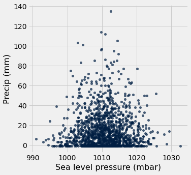
It looks like there’s not really a relationship between precipitation and sea level pressure. This is ok! Scatter plots are also very usual tools to tell us quickly when there are not correlations.
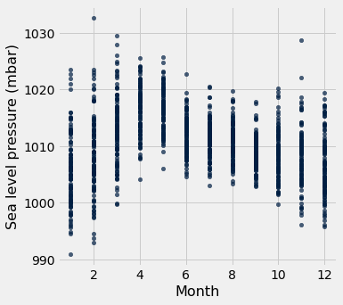
Here are two more scatter plots. Correlations this time?
tidy_greenland.scatter('Month', 'Sea level pressure (mbar)')
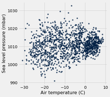
tidy_greenland.scatter('Air temperature (C)', 'Sea level pressure (mbar)')
Let’s return to temperature and look at other months than Feburary.
tidy_greenland.where("Month", are.equal_to(8)).scatter('Year', 'Air temperature (C)', fit_line=True)
Interesting, that’s flatter than the trend line for Feb? What about other summer months???
Interactive Widget to Examine Every Month
We’re so close to having all the Python we need to create interactive visualizations, but we can’t resist throwing one in here to look at air temperatures in each month. Enjoy, but don’t sweat the code – we’ll get there soon!
# Run on our Jupyter Hub to interact with this.  It will not work if you are
# viewing the static web page.
def temps_for_month(month):
    tidy_greenland.where('Month', are.equal_to(month)).scatter('Year', 'Air temperature (C)', fit_line=True)
    plots.ylim(-30,15)

_ = widgets.interact(temps_for_month, month=np.arange(1,13))
Left off in class 2022-09-21.
Think-Pair-Share
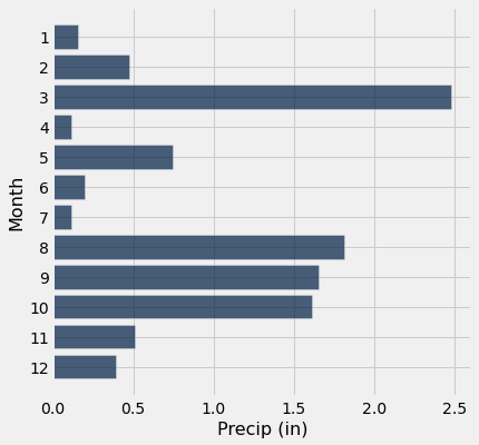
Question: For the year 1900, make a visualization of each month and the amount of precipitation. Does visualization confirm your intuition of what you should expect to see? Why or why not?
Hint: Think carefully about what type of visualization you should use.
tidy_greenland.where('Year', are.equal_to(1900)).barh('Month', 'Precip (mm)')

Question: How about if we want the data in inches?
Hint:
25.4 millimeters are equal to one inch
precip_in_inches = tidy_greenland.with_column("Precip (in)",
                                             tidy_greenland.column("Precip (mm)") / 25.4)

precip_in_inches.where('Year', are.equal_to(1900)).barh('Month', 'Precip (in)')